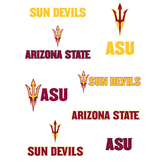
Thus far the majority of the hype surrounding Arizona State University’s change in branding and logo has been focused around ASU’s athletics department. However, Fyresite.com would like to shed some light on the other, more important implications behind this massive change for the university.
 First and foremost a truly successful brand is much more than the sum of its parts: a logo, a color scheme, what an entity says about themselves, and the images they use. The way in which an entity presents themselves and how their target audience perceives them is very important. An audience forms and modifies their opinion of who an entity is every time they are exposed to something that carries our image or endorsement. If an entity, be it a university, corporation, business, or social club are uniform and consistent in their communication as well as their visual identity, and their actions follow suit with the identity they attempt to lay claim to branding can be an unbelievably powerful tool.
According to Arizona State University’s website ASU’s “brand is built upon, and directly reflects, the university’s New American University vision.” ASU further believes that “the success of the ASU brand depends on all of us communicating with consistency and effectiveness.” In implementing the new brand ASU is attempting to rejuvenate their brand and essentially access and harness the power of this tool.
According to ASU, the objectives of the re-branding project were “to create a bold, high- performance athletic image and a promotional campaign that would maximize enthusiasm and interest in supporting the university, but to do so with minimum out-of-pocket costs.” The Nike Graphic Identity Group developed the new ASU brand. The likely success of this new branding effort is increased due to ASU’s long-standing relationship with Nike, a company that knows branding just about as well as anyone in the world. The capability to team up with such a branding powerhouse is definitely an advantage for the school.

Though the original emblem and mascot Sparky who was designed by ASU alumnus and former Disney illustrator Bert Anthony in 1946 has served the school well for 65 years, he has officially now been replaced by the new pitchfork symbol. Sparky will still remain the official mascot of the teams, but will no longer appear on uniforms of ASU’s athletic teams. The new brand includes a new logo of a trident or pitchfork instead of their mascot Sparky the Sundevil, a new athletic font called “Sun Devil Bold,” which was created strictly for the university, as well as the implementation of two additional colors into the school’s color scheme. The new font, according to the ASU press release on the overhaul “incorporates unique characteristics intended to represent the horns of its mascot Sparky or the tines of the pitchfork that he carries.” The legendary colors maroon and gold are of course still the core of the school’s color palette. However, this palette has been expanded to now also include the color black, for a distinctly new look as well as a throwback to the black football helmets worn by ASU players in the 50s. Additionally, the color copper has been added as well to pay homage to Arizona heritage.
 Fyresite