 Reed Steiner
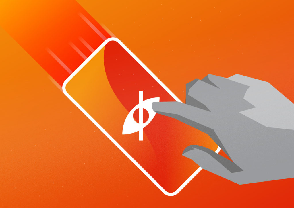
How accessible is your website? It’s probably worse than you think. Even if your website seems accessible, it’s not worth the risk. An inaccessible website can devastate your brand and your SEO. Even worse, your company may face direct legal consequences. In fact, Ever since the Supreme Court’s decision early this October, the risk of litigation is higher than ever before.
So is your website really accessible for everyone?
Where Do You Stand?
One of the best ways to find out is to review the Web Content Accessibility Guidelines (WCAG) guidelines. The most recent version, WCAG 2.1, provides four principles of accessibility. To meet these principles, a website must be…
- Perceivable
- Operable
- Understandable
- Robust
These factors seem easy to meet, but most websites fail to meet them. In fact, more than 70% of websites fail to meet even the most basic accessibility guidelines. To find out where you stand, let’s dive into each principle in a little more depth.
Perceivable
A perceivable website has content that everyone can recognize. Making a website perceivable seems easy, but it’s harder than it looks. A website may look nice, but people of differing abilities may not be able to recognize all the content.
For instance, let’s look at an example. Is this animated gif perceivable?

Most people would probably answer with a yes. After all, they can see the animated image clearly. But what if a visitor has poor vision and can only access the page through a screen-reading program? To find out if the page is perceivable to that user, we need to take a closer look at what the computer sees. Here is the code that describes the image.
<img class=”alignnone wp-image-5322 size-full” src=”https://www.fyresite.com/wp-content/uploads/2015/01/droidgif.gif” alt=”” width=”800″ height=”600″ />
See the part that says alt=”” close to the end? That means that the gif has no alt text. What if a blind person accesses the page with a screen reader? What if the image doesn’t load? In either instance, visitors will not be able to perceive your content. Therefore, the website fails to meet the guidelines for being perceivable.
Operable
Operable websites are equally sneaky. While a website may neem operable on the surface, it may not be operable to everyone. Let’s use this demo website as an example. Open the link in another tab and explore it for a bit. Think about how people of differing abilities may navigate it. Do you think the website is operable for everyone?
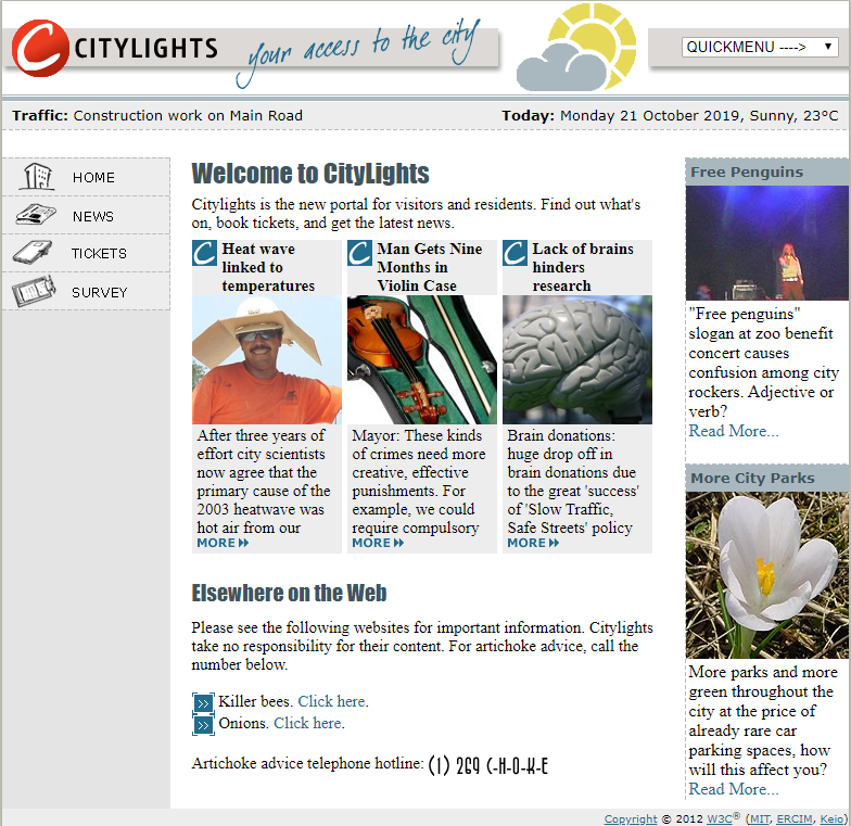
On the surface, it seems easy to navigate. To access content, a visitor just needs to click on a link. However, this web page does not meet the operability guidelines. It’s hard to tell from the image alone, but if you explored the website, you may have noticed that keyboard navigation does not work. Visitors with vision impairment or motor disabilities often use the “tab” key to move between elements. These functions do not work on this website, so it is not operable.
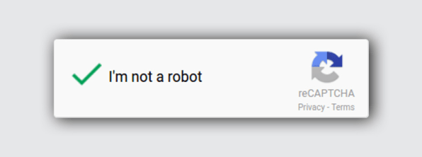
The problem goes much deeper than keyboard navigation. Let’s consider captchas. Remember the good old day when you had to copy distorted text?
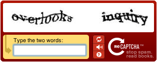
The perennial challenge of Captchas is that not every human can get past them easily. The newest ReCaptcha v3 is significantly better than the old one, but there’s still room for improvement.
For a website to be truly accessible, its entire functionality should be available to every user. Even if your website seems perfect, consider how it could be better.
Understandable
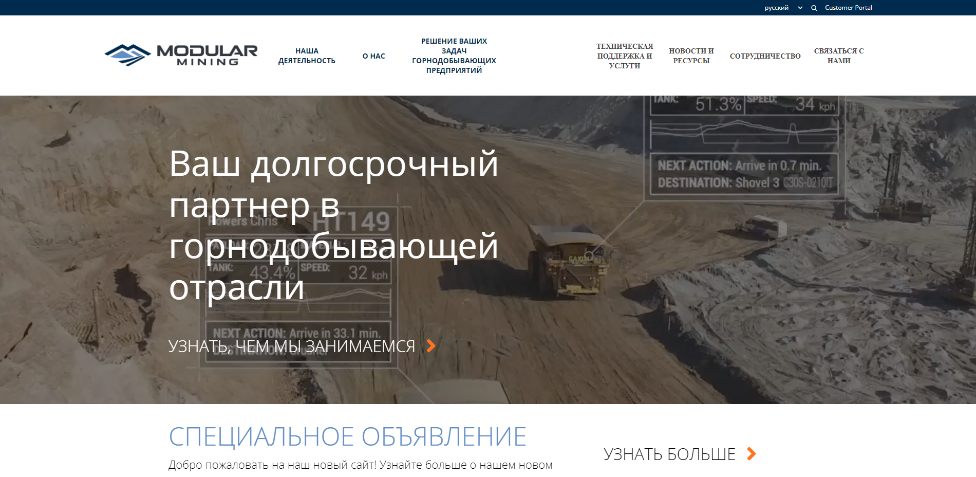
This factor seems similar to “perceivable,” but it differs a bit. On a perceptible website, everyone is able to notice and recognize content. On an understandable website, everyone is able to comprehend it. For instance, consider Modular Mining
On the other hand, consider the Mexican Government website. The website looks great in Spanish.
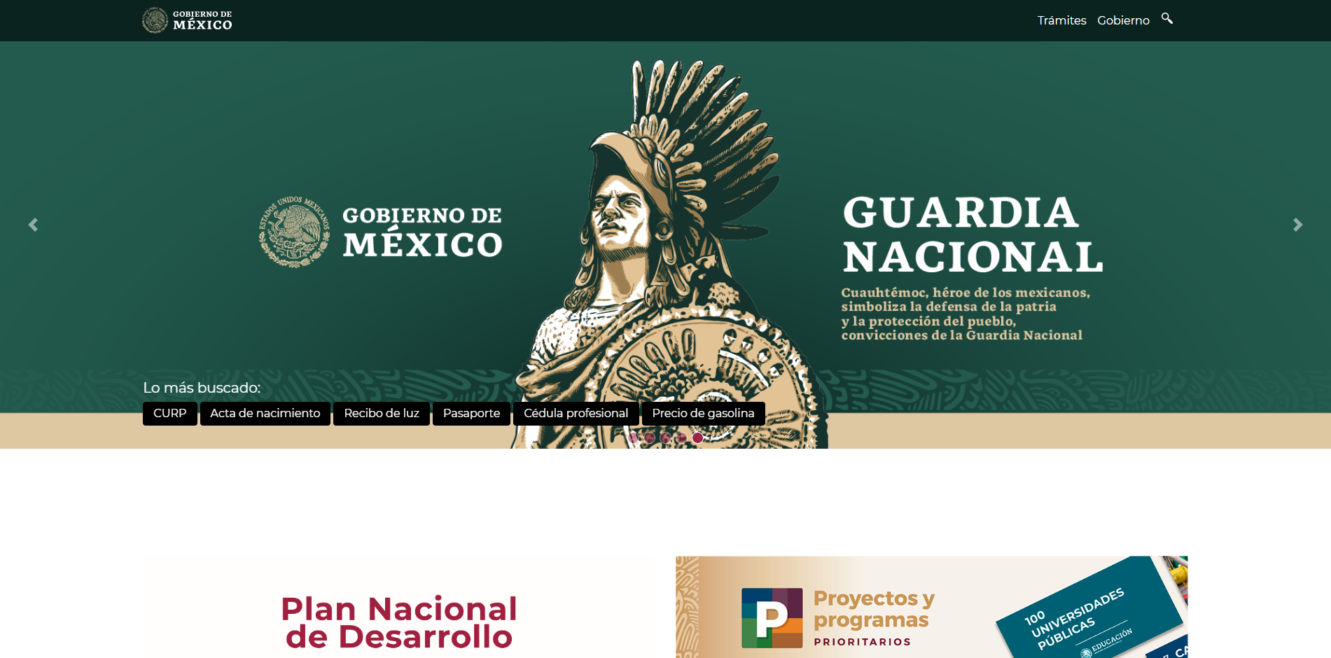
However, if a visitor tries to translate the page into English, only the buttons and menus change.
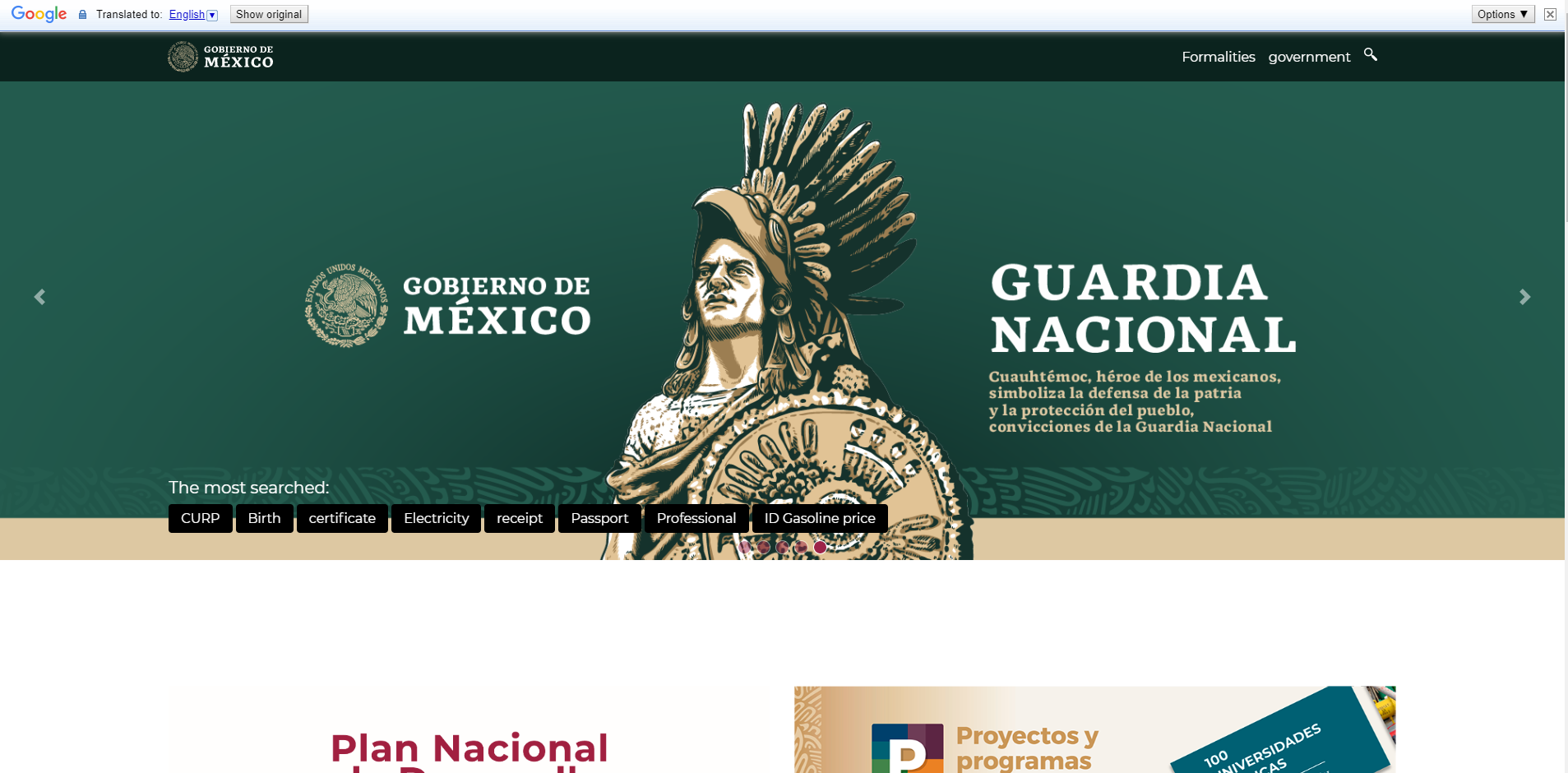
See how the paragraph labeled “Guardia Nacional” didn’t translate? That’s because that text is part of an image. Here’s a general rule of thumb: never include important information in an image alone.
On the other hand, the Modular Mining website meets the guidelines for an understandable website. None of the important text is included exclusively within an image, so translation software can do its job.

Even better, the website is multilingual, so visitors can load the website in a different language.
Understandable websites also need clear functionality. Is there an input field or button? Tag it correctly. Did something go wrong? Tell the user about the error. Clarity is key to being understandable. Make sure page visitors understand what is going on.
Robust
This category encompasses the fewest guidelines, but it is still important. Your website should be able to handle whatever accessibility software people throw at it. Furthermore, achieving that level of robustness is not as hard as it seems. If your code is valid, you’re already most of the way there. Build your website well.
Please note that these descriptions are a brief overview–the entire document is 87 pages long for a reason. For a comprehensive audit of your website’s accessibility, read the WCAG 2.1 text here. Alternatively, the Bureau of Internet Accessibility provides a free compliance report. You can learn more about it in the video below.
However, WCAG 2.1 is not all-inclusive. Federal agencies must also comply with Section 508 of the Rehabilitation Act of 1973. Make sure you read the regulations that apply to your website.
Whether you decide to dredge through tons of legalese or use an automatic solution, it’s important to check where your website needs improvement before you make any changes.
Quick and Easy Changes
Making your website accessible is not as hard as it looks. However, just a few tweaks can make a huge difference. Here are a few fast changes you can do right now.
Improve Your Alt Text
Including well-written alt text in all of your images is the best way to make your website more accessible. It’s fast, easy, and makes a huge difference for differently-abled individuals. Blind people usually browse the internet with specialized software that reads pages. However, images cannot be read. Instead, screen readers use the alt text. However, if your alt text is just “graphic version 3 final,” the visitor will not know what the image contains. Writing descriptive alt text makes all the difference.
If your website uses WordPress, alt text is easy. When you edit an image, this dialogue pops up.
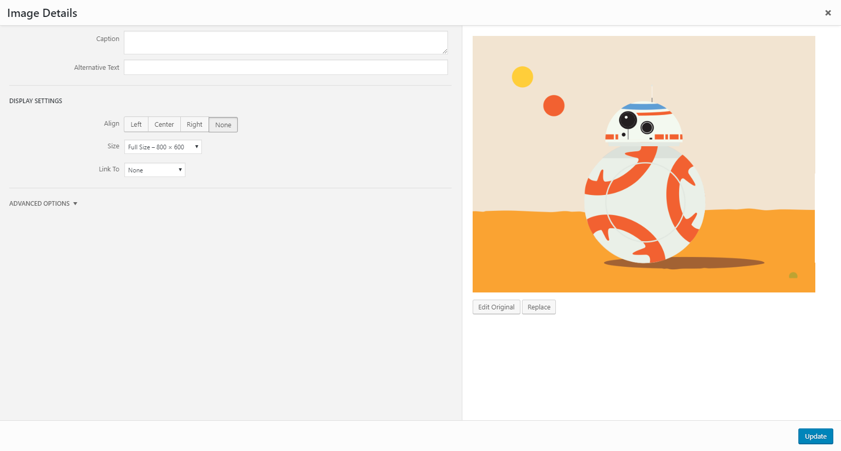
Use the “Alternative Text” box to describe the image. That’s it!
Add Titles and Headers
Headers may be great for readability and SEO, but they are even more important for accessibility. Screen readers use titles and H1 to ID pages and lower-level subheadings to help users navigate.
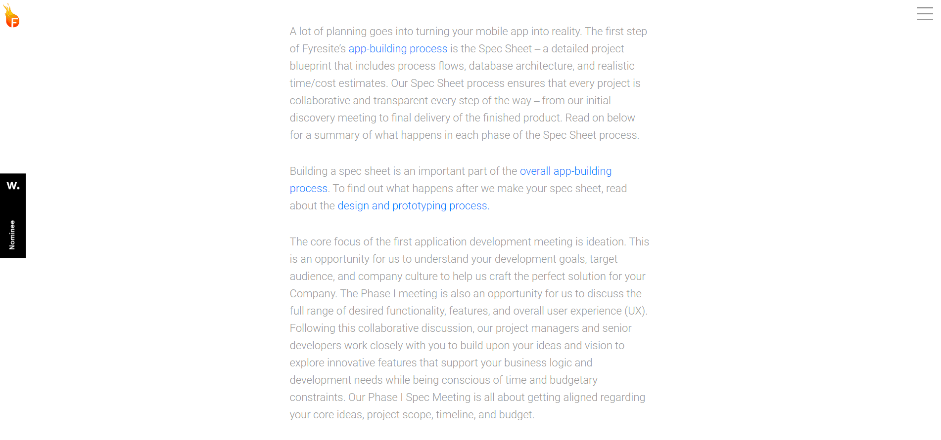
Headers are critical for people using screen readers, but they are useful to everyone who visits your website. For example, here’s what one of our posts would look like without any headings.
And here is what the post looks like right now with headings.
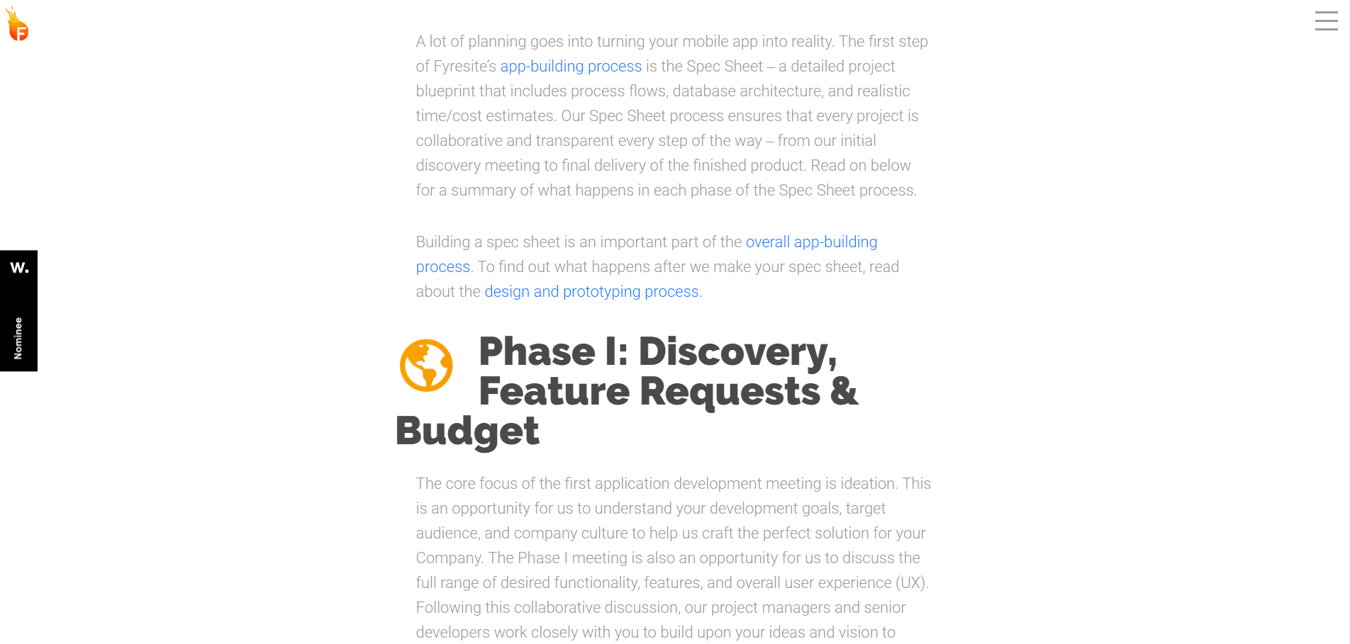
Which version would you rather read?
Use Closed Captions or Transcripts
Video-only content is great for getting a point across quickly and effectively. However, visitors with hearing impairments may have difficulty understanding a video that does not provide text alternatives to audio, such as closed captions or transcripts. Closed captions are also useful for users without hearing impairments. Did you forget your headphones? Turn on closed captions. This video from the web accessibility initiative illustrates the point very well.

Youtube videos usually include a closed caption toggle. However, if you add videos directly to your website, make sure that you include options for people hard of hearing.
Use Contrasting Colors
Color contrast goes much deeper than design. Page visitors with colorblindness, weak vision, or bad displays may not be able to see your content if the colors are too similar. Here is an example from Faculty Central that illustrates both compliant and noncompliant text colors.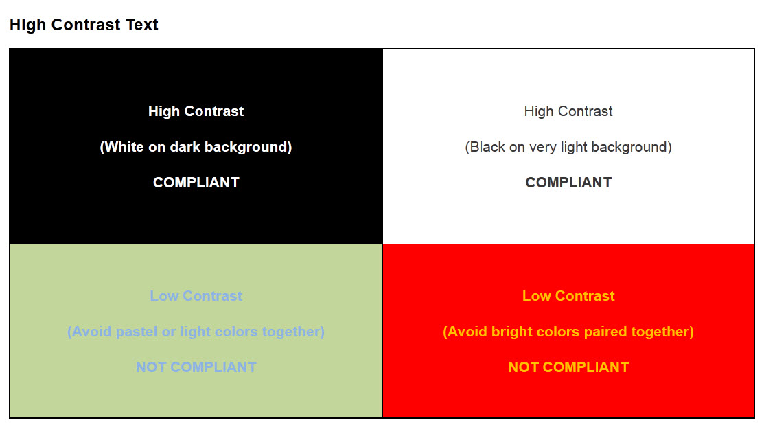
But it doesn’t stop at the text. Graphics need contrasting colors as well. Look at this graph.
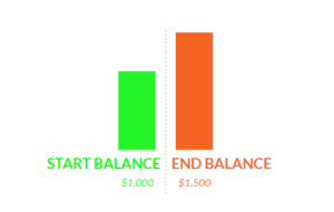
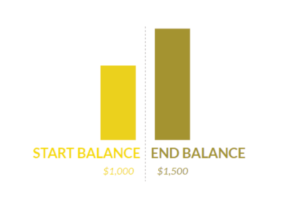
While the graph looks fine (albeit ugly) to most people, a color-blind person may have trouble differentiating between the colors. This is what a person with protanopia will see.
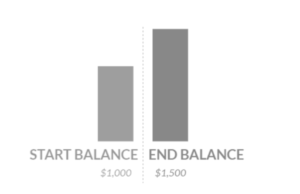
And this is what a person with achromatopsia will see.
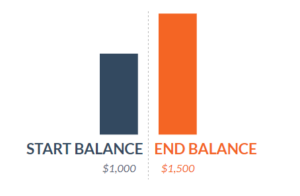
To make the image more accessible, pick contrasting colors and label the different sections.
Check Keyboard Usability
A website is not truly accessible without keyboard-friendly navigation. Some visitors have motor disabilities. Other visitors rely on screen readers. Many other visitors don’t have a disability at all but prefer to use the keyboard.
The easiest way to make sure that your website is friendly is to sit down and navigate it without a mouse. If you can access the entire website’s functionality using only a keyboard, you are on the right track.
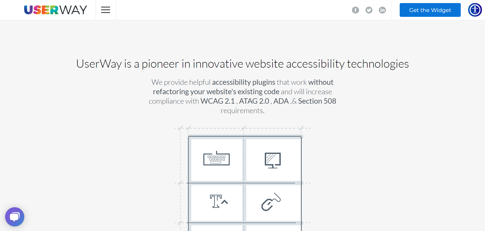
Install Accessibility Plugins
Want to go the extra mile without changing all of your code? Try installing an accessibility plugin. One option is UserWay. After installing the plugin, a small bubble with a stick figure appears in the upper right corner of your page.
When you click on the bubble, out pops a menu full of accessibility tools and options.
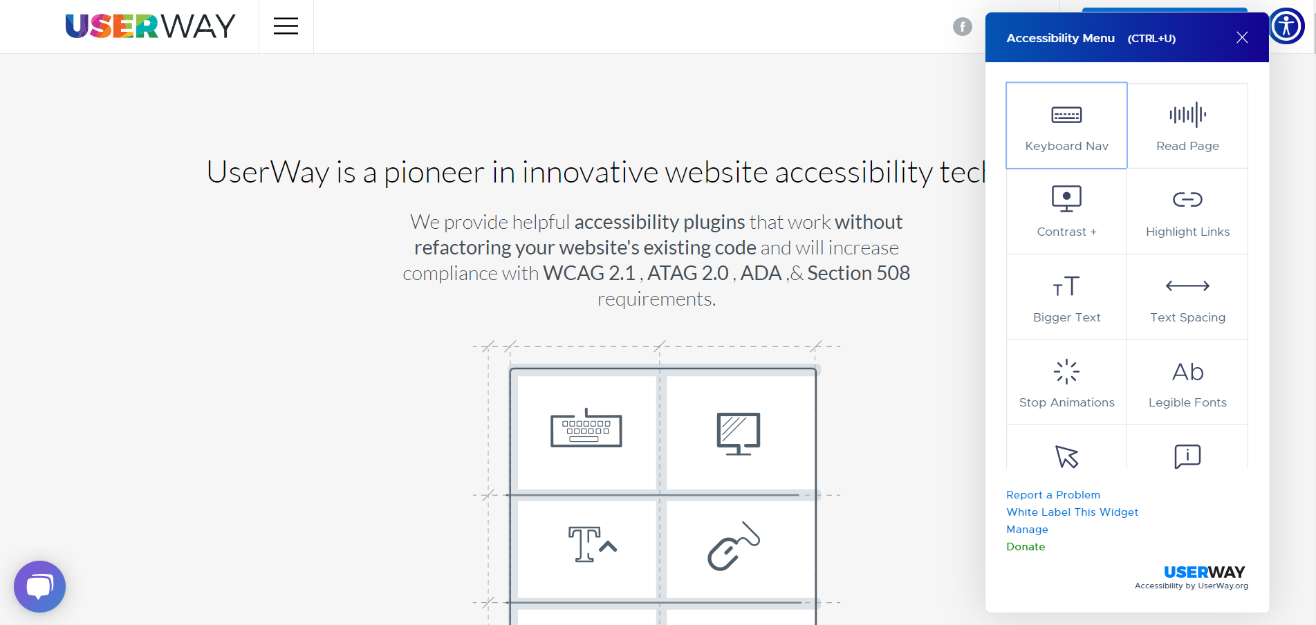
That’s it. Now, visitors can toggle screen readers, keyboard navigators, page contrast settings, and more.
Next Steps
Want to make bigger changes? Below are some great starting points. If you want to chat about how to make your website more accessible or WCAG compliant, reach out online or call us at 888.221.6509.
WCAG 2.1 Compliance
Web Content Accessibility Guidelines (WCAG) 2.1
Section 508 Compliance
Section 508 of the Rehabilitation Act of 1973
Simulations
Design Tools
Accessibility Plugin for Sketch, Adobe Xd, and Figma
Development Tools
UserWay Accessibility WordPress Plugin
One-Click Accessibility WordPress Plugin
Additional Resources
WebAIM accessibility articles, training, and tools
UCLA training, consulting, and testing
Disclaimer
The information in this article is intended for general informational purposes only. This post is not intended to be used, nor should it be used, as any form of legal advice. Furthermore, all content and third-party links are for the convenience of the reader. Fyresite does not recommend or endorse any legal contents of any third-party sites or resources.
Readers should contact an attorney to obtain legal advice and should not choose any action or lack thereof based on information on this site without first seeling relevant legal counsel. The use of this website or any of its resources does not constitute an attorney-client relationship between readers, users, or visitors and any authors, contributors, or other members of the Fyresite Team.