Donovan Reeves
If it’s the little things that make the big difference, why don’t more designers use micro animations? Yes, it’s true that micro animations are widespread–in fact, they are everywhere. However, so many of these animations are either too boring or too crazy to get anything done. The problem is understandable; striking the balance between fun and functional is super hard. But that doesn’t mean that the problem isn’t solvable. Let’s reiterate why micro animations are so important, then explore how to make them even better.
What Are Micro Animations?
Micro animations are small motions that tie together elements of an interface or design. They have countless uses in both websites and apps, making them invaluable to designers. One of the simplest examples of a micro animation occurs when you toggle a switch.
Instead of instantly switching from “off” to “on,” the circle slides to the right and the bar changes color. That visual feedback is a micro animation.
While the terms are often used interchangeably, micro animations differ slightly from micro-interactions. A micro-interaction starts with a trigger that sets off a list of instructions and delivers visual feedback. Think of it as a small input-output machine embedded in a single step of a larger process. Toggling the switch is the input, and the small animation is the output. The entire switch-toggling step is a micro-interaction, while the visual cues are the micro animation. The distinction may be small, but it is important. Your interface may have well-designed micro-interactions, but poorly-designed micro animations. Understanding the difference is a critical step toward making the right changes.
Why You Need Micro Animations
Create Focus
The job of a designer is to capture a user’s attention and guide it through a design, interface, or graphic. While there are countless strategies for building visual hierarchies, micro animations streamline this task. They’re especially useful for making otherwise static graphics feel alive. Take this unanimated feature image from our post on custom and semi-custom websites.
The image itself is well-designed and adheres to the fundamental principals of design, color theory, and composition. However, here is the same image with some micro animations.
The image is still fundamentally the same, but the movements make it much more interesting to look at. The illustration almost seems to breathe with the viewer. As a result, we used the latter animated version as the feature image on the final post.
Micro animations do not need to be that complex, either. Simpler animations, such as those on our mobile app development page, grab your attention without getting in the way.
Using animations with varying levels of complexity creates a strong visual hierarchy that guides the user through the application or website.
Improve Navigation
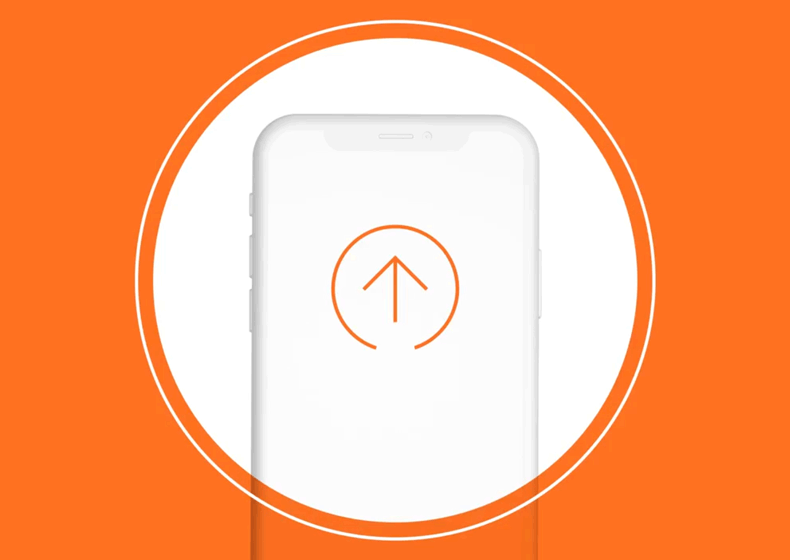
Since micro animations can guide a user’s eye across the page, they can also show the user what steps to take next. Even if the page design is as simple as can be, movement clarifies what the user needs to do in order to use the app or website correctly. For instance, when you click this hamburger menu, it transforms into an X.
That way, you instantly know that by clicking the icon again, the menu closes.
Yet perhaps one of the most important ways micro animations improve navigation is by adding context. Take a look at this menu.
The page clearly changed, but the transition is sudden, unexpected, and clunky. Now, look at the same menu with micro animations.
The expanding motion links the clicking action to the result. The change is given context, and the interface makes sense. Simple animations like these make any user interface significantly easier to navigate.
Deliver Feedback
Movement conveys important information to users. The most obvious example is a loading icon or a progress bar. It indicates that the page is loading, not frozen.
However, micro animations can deliver more subtle feedback as well. For instance, when a user drags their cursor over a button, a change in size and color indicates that something will happen when you click it.
This feedback is less obvious than a loading icon, but it is incredibly important. Look at the same button without any micro animations.
That’s because animated feedback indicates causality, which is critical for good UI/UX design. At all times, the user should understand what happens as a result of their actions, and micro animations are the key.
What Makes Good Micro Animations?
Not all micro animations are created equal. However, by keeping a few key factors in mind at all times, you can easily turn good animations into great ones.
Simplicity
Micro animations are supposed to add clarity, but if you get carried away, they will only make your interface confusing. In fact, overly-complicated animations are more distracting and annoying than helpful. Keep your animations subtle and tasteful. As a rule of thumb, an animation that is longer than half a second is probably too complex. However, there are always exceptions. Be wary of over-complicated micro animations.
Functionality
Never add animations just for the sake of adding animations. Each tiny bit of movement within a single animation should serve a functional purpose or convey some form of information. Don’t make a button twirl in circles when your cursor hovers over it; that serves no purpose. Here’s a tip: ask yourself “Is my interface clearer with without this movement?” before you finalize any animations. If the interface is clearer without that extra motion, it doesn’t serve a clear enough function.
User-Focus
UX always starts with the user and ends with an experience. Designers that fail to focus on the user also fail to create compelling animations and designs. Above all else, prioritize the opinions and preferences of your target audience when designing micro animations for UI/UX.
Creativity
An interface with boring animations is almost as bad as one without animation at all. Try to make your animations fun without going overboard.
Micro animations will make or break your interface. While well-designed animations will give your website or application a special flare, poorly-designed or absent micro animations will make your project look confusing and unprofessional. The key to designing good animations is understanding that intricate balance between too much and too little animation. If you want to get your project moving, contact our design team or call us at 888.221.6509.