Eric Daily
Note: This article has been updated to reflect the most accurate information and is up to date as of December 2023
Dark themes have been a hit for years, but they have grown especially popular ever since Google debuted its fancy new dark theme for Google Search in September 2021. While Google’s feedback has been mostly positive, not all companies can pull off a dark color scheme. In fact, the very factors that make a dark theme so appealing in some cases make it completely unattractive in others. So when should a dark theme be used and when should it be avoided? We asked our Fyresite designers to share their thoughts.
Psst: curious about other dos and don’ts of design elements? Read our blog about good versus bad content.
Do Use a Dark Theme to…
Emphasize Visual Content
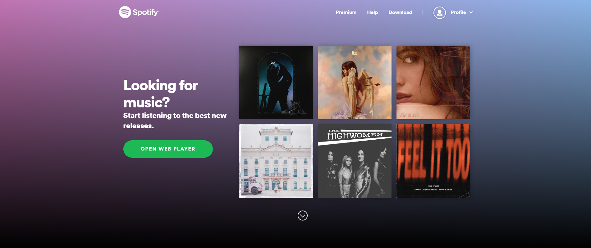
A dark theme is ideal for making visual applications and websites stand out. The deep, heavy backgrounds provide a perfect high-contrast backdrop for images, graphics, videos, and visuals of any shape and color. Since the lighter visual content stands out against the background, the application or website gains a strong visual hierarchy. This is especially true for large, high-contrast images like the product shots on the Furrion eRove landing page, the album covers on Spotify, and the show covers on Netflix. If your application or website strongly favors images over the copy, consider a dark color palette.
Enhance Emotional Branding
A dark theme needs more empty space to avoid looking cluttered. As a result, dark websites and applications tend to evoke stronger emotions than light ones. Color psychology also impacts the emotional appeal. Black and other dark colors are strongly associated with power, mystery, drama, and elegance. Thus, when a dark background is paired with a few large, high-contrast images, the final result looks stunning.
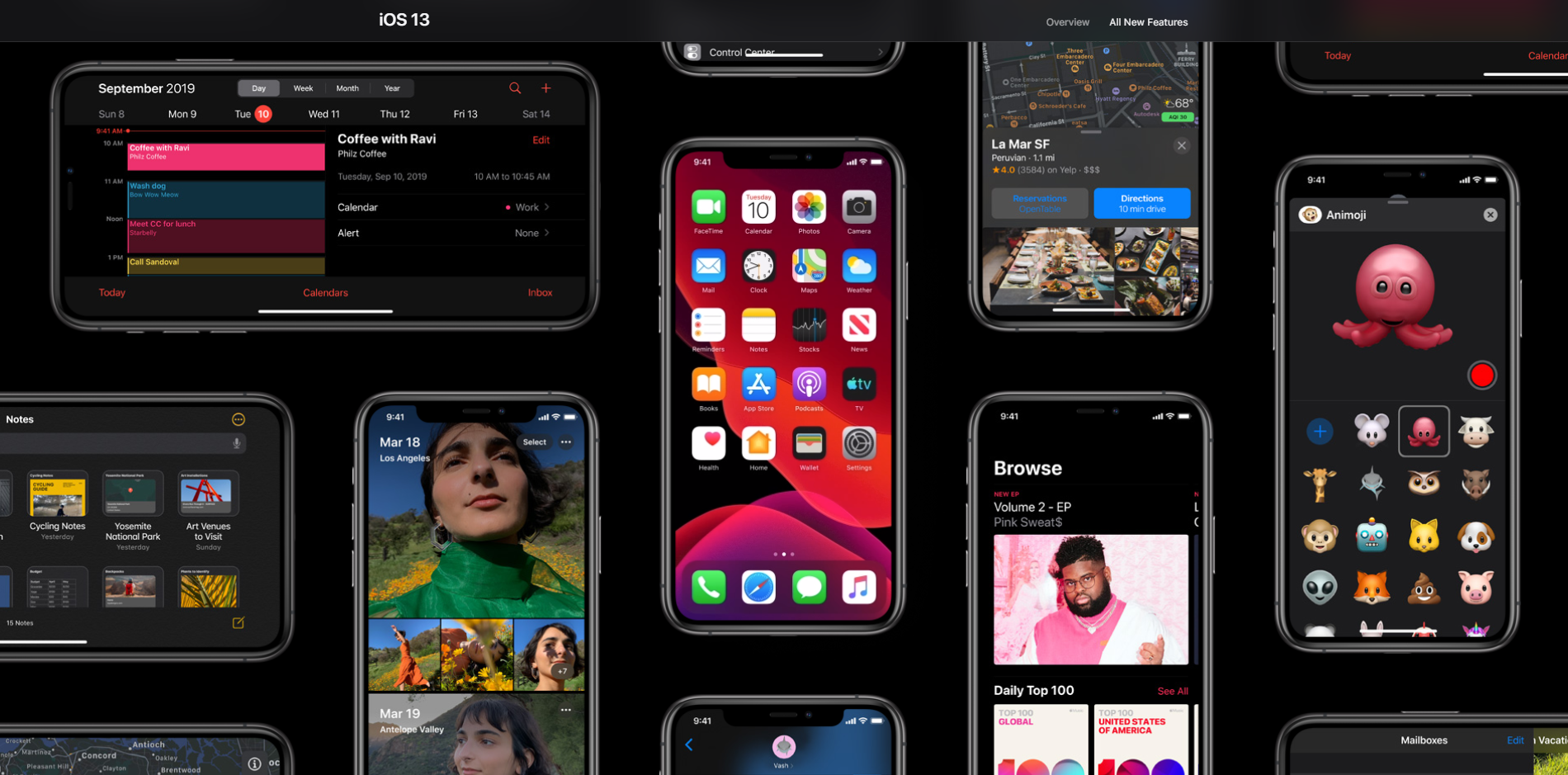
This mood-setting strategy works beautifully and appears frequently on product pages and entertainment applications. Apple’s iOS 13 page uses a dark color scheme to make their product seem more sophisticated and elegant. Similarly, the Halo App’s dark theme makes it look more dramatic. However, a lightly-colored website or app can be just as impactful. Choosing the right color scheme depends entirely upon what emotions you want your brand to evoke. You wouldn’t get the same reaction to your site if it was done in pastel pink and yellow, would you? Consider the emotions you’re evoking before picking your color scheme.
Improve Usability
Sometimes, your app has to be dark in order to be user-friendly. For instance, apps designed for heavy nighttime use will employ a dark color scheme to avoid straining the user’s eyes. The trend is especially noticeable in entertainment apps like Netflix and Prime Video, but other applications offer a dark mode, too. X lets users toggle between light and dark in the settings, and Google Maps automatically darkens at night. Facebook and Instagram also allow the user to enable dark mode.
However, the time of day isn’t the only usability factor to consider. If your application is intended to be used for hours without rest, a dark theme may minimize eye strain. That’s why dark themes are popular in code editors and financial apps.
Don’t Use a Dark Theme When
Lots of Text
Easily one of the biggest drawbacks of a dark color scheme is that it is bad for displaying text. That’s because light text on a dark background is hard to read. Here’s a great example from UX Movement:
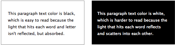
The image demonstrates that dark themes are not ideal for interfaces with lots of copy. Not only do people have to spend more time reading the text, but they also understand the material less accurately. On the other hand, dark text on a white background looks crisp, clean, and refined. The copy is easy to read. The difference is so noticeable that almost all blogs and news websites have light backgrounds instead of a dark one. Your website should not have a dark theme if it contains lots of written content.
Lots of Elements
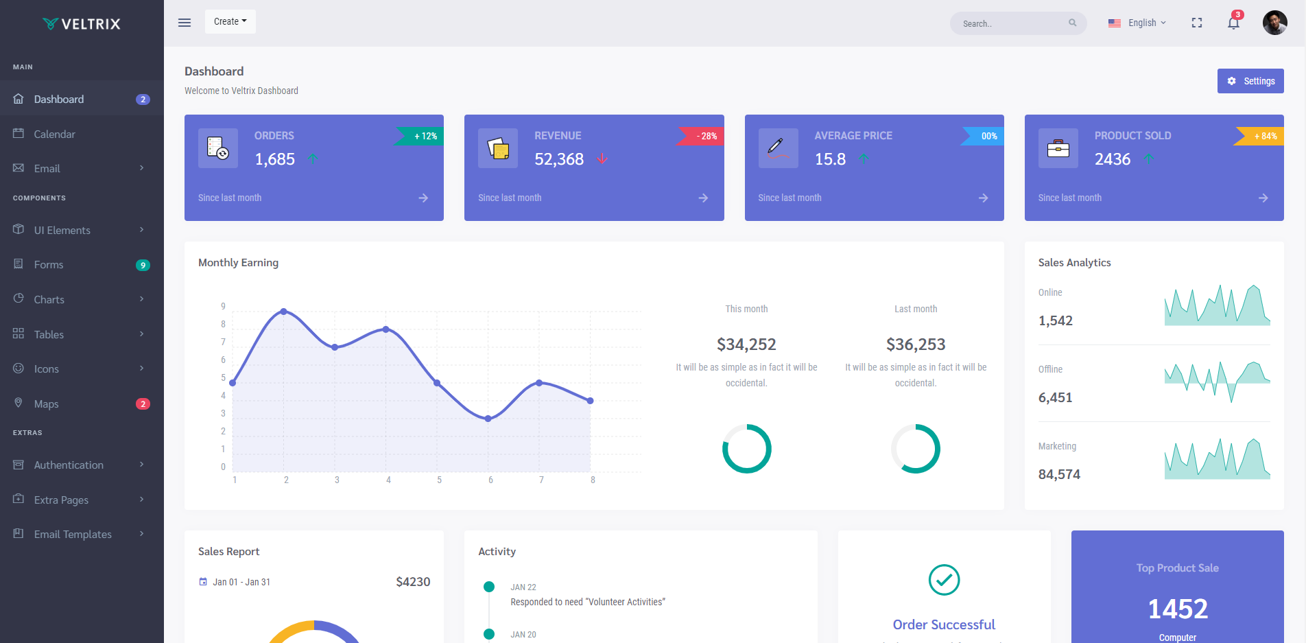
Finally, a dark theme can be a poor choice for apps and websites with lots of icons, buttons, and small images. That’s because the dark background de-accentuate empty space. While de-emphasized empty space makes large images and minimalist pages elegant and dramatic, it makes small icons and dense pages look cluttered, unorganized, and unprofessional. Admin backend panels are a great example. Of Colorlib’s 31 favorites, only three use a mostly-dark theme. The difference is even more obvious when you compare a light panel with a dark one. Since Veltrix offers both a light and dark theme, let’s compare the otherwise identical dashboards side-by-side.
Here is the light version of the interface.
Here is the dark version of the interface.
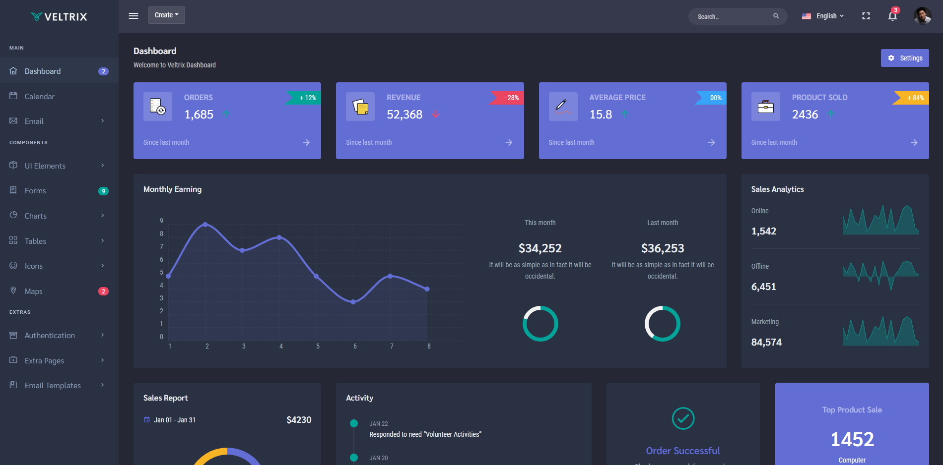
There is no technical issue with the dark theme, but it does look denser. In some instances, that’s not a problem. However, the clutter problems don’t end here, because, with a dark color scheme, it’s hard to make each element stand out. Since a dark color scheme limits your color selection, it’s harder for a designer to maintain good contrast. This does not pose a problem if a page has a few key elements, but if a page contains several buttons, icons, menus, and banners, the overall design will look much less cluttered on a light background.
Bright Colors
Dark themes also limit color options. Too many bright colors can clash against the dark background and give your entire website a harsh and unfriendly appearance. While the occasional splash of color can add brilliant emphasis, most of your elements should be muted neutral colors. Take, for instance, Windows 10. Here’s what a page looks like in “file explorer” in light mode.
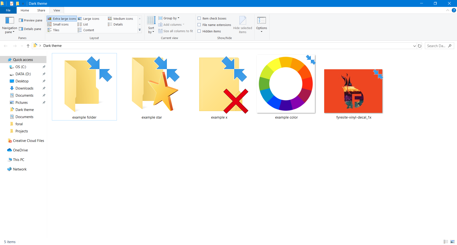
None of the icons or colors clash too heavily with the background. Whether or not you like the overall look of Windows 10, the colors look fine. However, that’s not true for the dark theme.
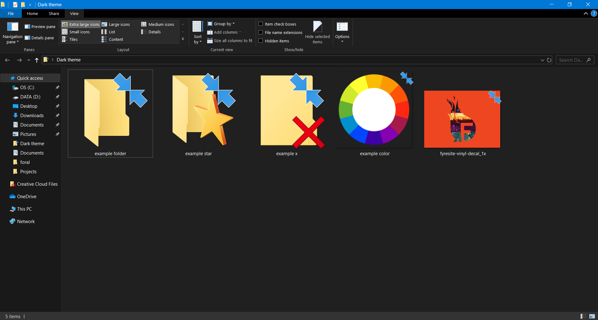
Suddenly, the interface looks much worse. Windows 10, in particular, is an extreme example that has received a lot of criticism. MacOS Mojave, for instance, gets the dark theme right.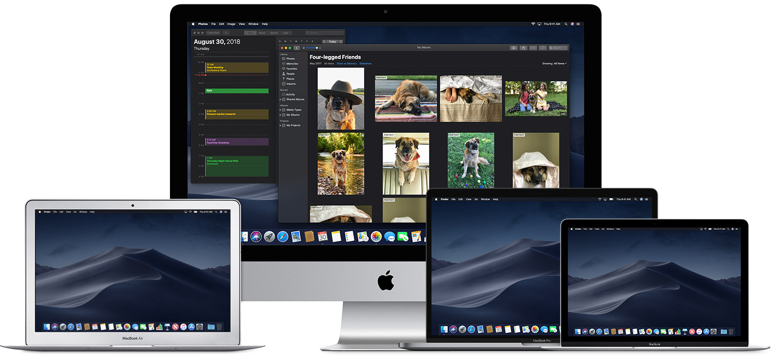
Dark Mojave looks great while dark Windows 10 looks horrible because of color. While Apple changed the color of elements to match the theme, Windows did not. In order for a dark theme to look good, designers need to select color very carefully.
On the other hand, light themes are much more forgiving of vibrant colors. If your brand is characterized by bright and vibrant colors, a light background will make your website stand out.
Final Thoughts
The beauty of design is that there are no hard and fast rules. After all, each project relies upon a unique set of requirements and specifications. Sometimes, users prefer an interface that goes against the rules, so balancing their preferences with modern design trends requires skill and years of experience. Enter Fyresite. Fyresite conducts thorough research on your target audience during the UI/UX Design phase. To find out how we can make your UI stand out, contact us online or fill out the form below.
"*" indicates required fields