 Dylan Opet
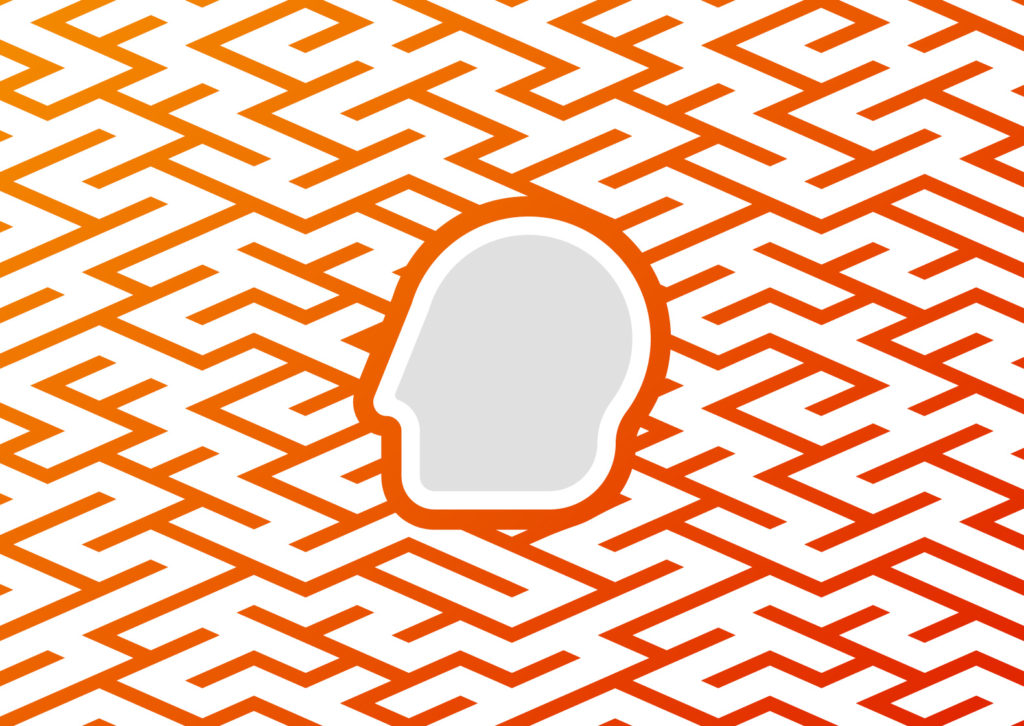
Your UX has to be one in a million–at least if you want people to remember it. But if you design with a sneaky psychological phenomenon called the Von Restorff effect, your UX will be completely unforgettable.
This post is part of a 9-part series on UX psychology. Read our next article on the Mere Exposure Effect.
What Is the Von Restorff Effect?
The name may be a mouthful, but the rule itself is very simple: things that stand out are the most memorable.
For instance, what part of the featured image was the most memorable? Was it one of the oranges, or the large, red apple?
Let’s look at that image again.
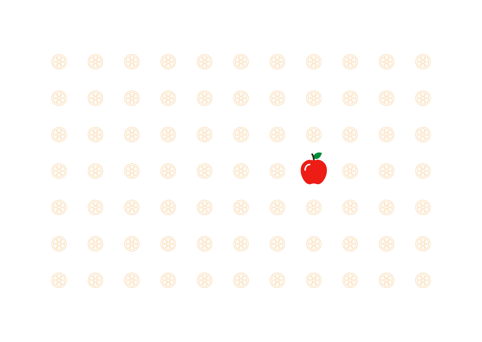
Clearly, the apple is the most memorable item because it stands out the most. No other item stands a chance — it’s like comparing apples to oranges.
So What?
The psychology seems really obvious, but you can apply it in all sorts of different ways. Here are a few of the countless creative applications of the Von Restorff effect.
Big, Beautiful Buttons
There’s no such thing as being too clear.
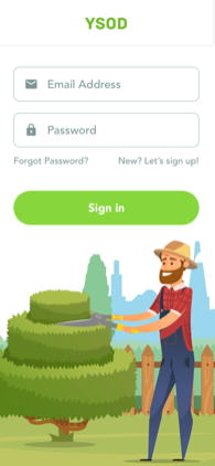
Does the user need to click the “sign-in” button to sign in? Make that button big, bright, and visible. The user will instantly know what button to press without even thinking about it.
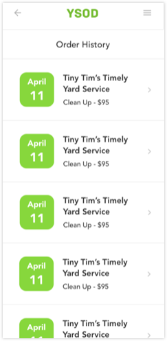
That advice may seem obvious, but it really makes a huge difference in the world of buttons. Here’s a login screen we did for YSOD.
Now, here’s the same login screen without any stand-out buttons.

It’s not hard to tell that the first option is much simpler to navigate. In fact, Von Restorff is so engrained into our brains that it seems self-evident.
As a result, it’s great for incentivizing certain options.
Time for an Upgrade
Do you really want users to choose a certain choice? Make it stand out from the crowd.
UX designers use Von Restorff to push certain options all the time. If a service has multiple pricing plans, you’re guaranteed to see it in action. We’re building it into apps right now.
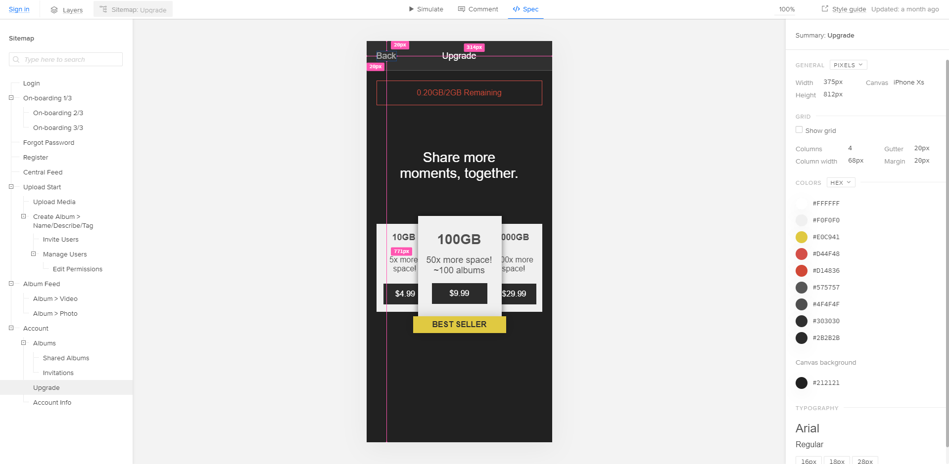
Even if the user doesn’t decide to upgrade, the design still did its job. Von Restorff dictates that the option will be more memorable, so the user will be more likely to think about the benefits of the 100GB option and return later.
But we aren’t the only ones that use Von Restorff to encourage certain choices; everyone does.
Spotify is a bit subtler with its premium pricing. Instead of making the premium option a different color or shape, they bold the text.

This solution works well because the users will walk away remembering the extra benefits of premium instead of the icon alone.
But remember: the Von Restorff effect says things that stand out are more memorable. That rule doesn’t just apply to UI elements. It applies to your entire app.
Take it Home
A user may have downloaded your app, but the battle’s only just begun. They may have your app installed, but it’s important that they use it.
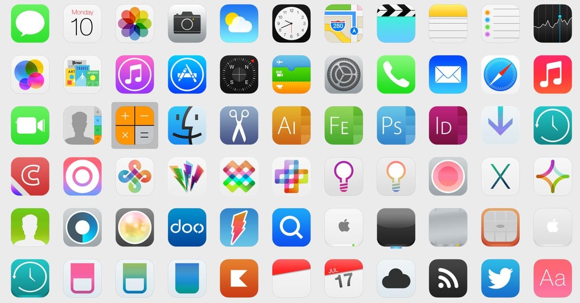
This is where the Von Restorff effect really comes in handy: if your app stands out on the home screen, users will remember it and use it more often. But that can be tricky when every single app is trying to stand out, too. Look at all those options!
Sometimes, it may be easier to just compete against other apps in your industry. That’s what Lyft does well. Most of the top rideshare apps are black, yellow, or both (Uber, 99, BOJEK, Yandex, Dida, etc). However, Lyft opts for a bright pinkish-purple icon.
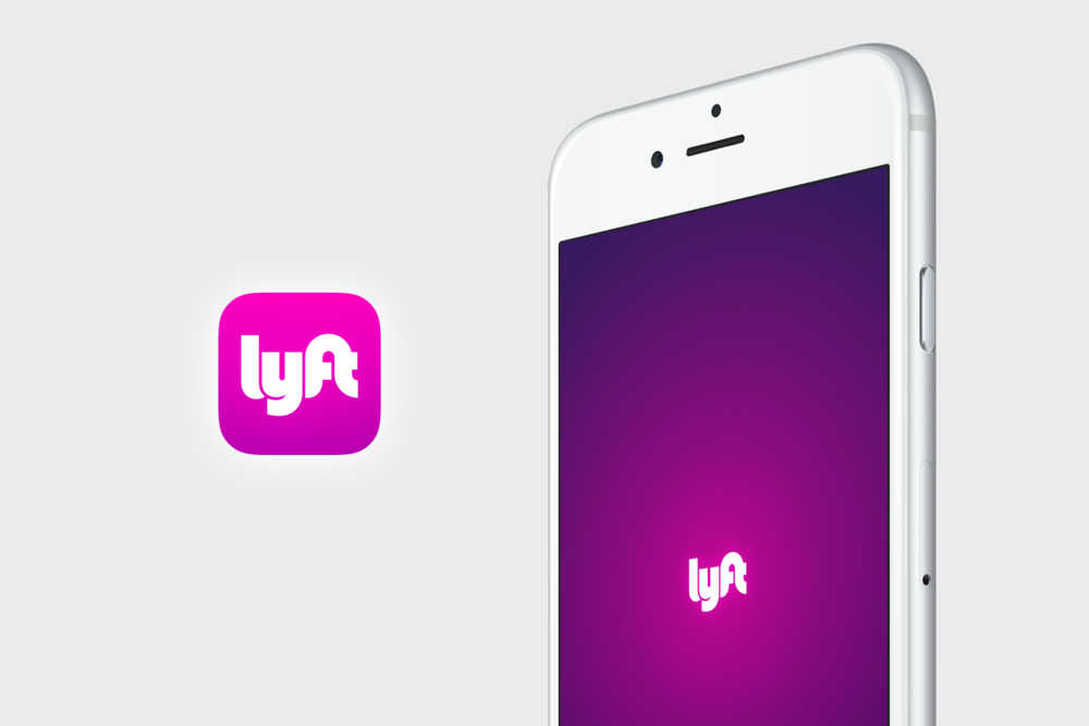
Why is this so great? Because there’s a huge overlap between ridesharing apps–as high as 20% in one survey. Overlapping users don’t see a major difference between ridesharing apps, and often check a couple to compare prices. Lyft’s stand-out coloration makes it a memorable option that people click on more frequently.
If your app has a user base that overlaps with competitors, use the Von Restorff effect to your advantage.
One-of-a-kind UI
If your UI is different, your app is more memorable
For apps like YSOD, that’s great. The illustrations make it pop right off the screen and sink into the recesses of the user’s squishy ol’ brain.

The bright green has the same effect. It makes the app stick out. Plus, green matches your lawn. It stands out while staying on-brand.
However, the Von Restorff effect can work against you if something goes wrong. Apple Music wasn’t great when it first came out. People across the internet attacked it for being messy, hard to use, and bad at its job. While some people report that it’s gotten better, Apple music will always have a bad reputation burned into it.
That’s, again, because of the Von Restorff effect. Apple’s blunder stands out because it’s an isolated incident of bad design amongst a long history of good design.
But that goes for your app, too. If you make big UX mistakes, they will sear into your user’s memory. If you want help designing a beautiful UX that relies on human psychology, contact our design team or call us at 888.221.6509.