 Jason Turnquist
Showcasing your app in the App Store is extremely important and is the first experience the user has with the brand. It is important to showcase the best features of the app, write captions that can communicate to users quickly, and this has to be done in 3 screens to effectively work. We put together 12 App Store Showcase design ideas to help generate inspiration and get the design juices flowing.
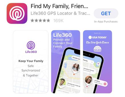
Life360
Keep your family close with this app that lets you know the location of your family members and gives you the ability to stay in touch with them.
What We Like: We love the use of gradients with white text. Notice how Life360 has their logo ghosted in the background and they use familiar references with the “Seen On:”. The offset orientation of the Phone with a pop-up notification “Breaking the Lines” is a detailed touch that sets apart decent design with great design.
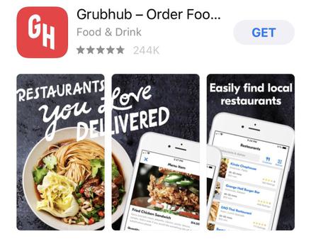
Grubhub
Order food delivery from local and undiscovered restaurants with this app.
What We Like: The caption is a fun font and spans across the first 2 screen showcases. This is different than most app show cases we’ve seen. Also, the use of stock photography instead of just UI showcases make’s it feel more like a lifestyle than a sales pitch to use their app.
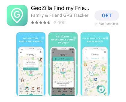
GeoZilla
A family safety platform that keeps family, cars, home, and pets safe with the help of a combination of AI, geolocation technologies, and IoT solutions.
What We Like: The caption on the top of each screen mixed with good UI screenshots from the app really help drive the concept home. Mix that with a different gradient on each screen, a cool pattern and it’s a winner!
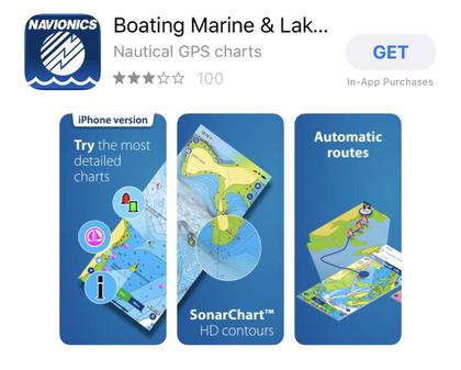
Navionics Boating App
Optimize your cruising, fishing, and sailing with this app that offers tracking, fishing ranges, charts, navigation help and much more.
What We Like: The magnification of important features on an offset mobile screen is very catchy. The 3d layering of the map on the 3rd screen is very informative and helps differentiate from other apps.
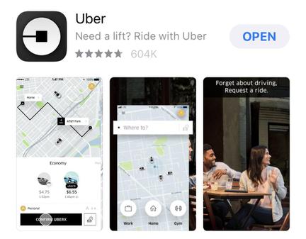
Uber
A rideshare app that allows you to give and get rides from anywhere to anywhere without a hassle.
What We Like: Uber has become synonymous with ride sharing. They let their well-researched UI experience speak to the user with very little verbiage. They also use a lifestyle shot for the 3rd screen which is different than most showcases.
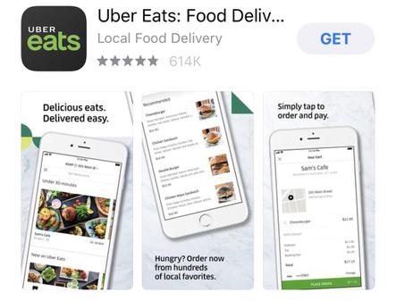
UberEats
Get food delivery from your local favorites right to your door.
What We Like: The use of offset phones screens on top of a marble countertop is very classy. It feels like the user is ordering from their own high-end kitchen.
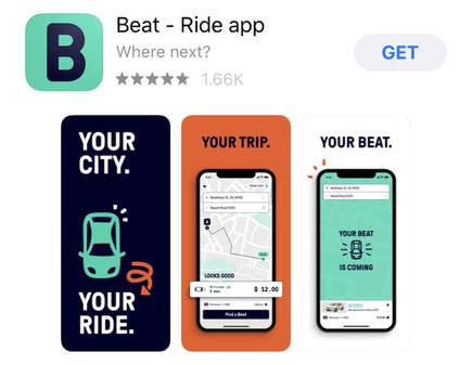
Beat
A different take on ride sharing, this app lets you request rides whenever to wherever and has become a driver opportunity as well.
What We Like: We like the use of flat colors with a different color representing each screen. We also like the use of very large font sizes with specific, applicable words.
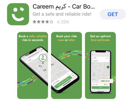
Careem
A rideshare app that lets you ride or drive in over 14 countries, mainly in the Middle East.
What We Like: The color coding of specific words in the caption is memorable and easy to digest. The use of patterns that transmit over multiple screens makes for good flow to the final screen. Highlighting key functionality and breaking the lines is also one of our favorite details.
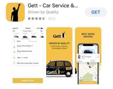
Gett
A rideshare app that’s taking transportation and instant ordering to the next level for consumers and businesses.
What We Like: The use of flat colors with an object that overlaps on to multiple screens. We also like the magnification of items on the screen that “Break the lines”.
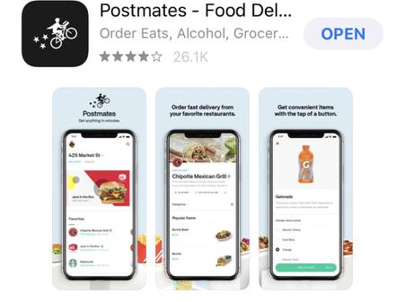
Postmates
Order your restaurant favorites, groceries or alcohol with this delivery app.
What We Like: The use of one single horizontal background that brings each individual screen together. They also use their logo on the first screen to really drive home the brand identity.
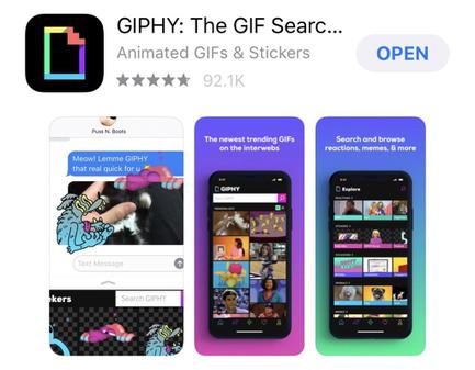
Giphy
Get the best and latest GIFs and animated stickers with this app.
What We Like: We love the gradients used for each screen combined with great UI screenshots. They also use a Video for the first screen which is a superb added touch although you can’t see it in this screenshot.
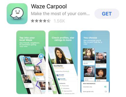
Waze
A community-based traffic and navigation app that lets you get the best routes every time you drive.
What We Like: The multi showcase screen gradient and the 3D offset, layered and multi showcase screenshot make this one the most complex design-wise we’ve seen. It’s sophisticated and well designed.
Looking for help with app design or app development services? The Fyresite team has experience in designing, developing and launching mobile applications.