70% of people turn to the internet for an attorney.
That’s right. More than two-thirds of your clients will come from the internet. Business cards, billboards, and bus ads just don’t cut it anymore
That’s why we’re here to help you out. Fyresite has been designing websites for lawyers and law firms for over a decade. We’ve seen the best and worst legal web design on the planet, and we’ve used massive ammounts of data to hone down what makes good legal web design that sells. Here are our biggest pointers.
What Makes Attorney Web Design Different?
Websites designed for legal professionals need to prioritize a few factors: copy, brand trustworthiness simplicity, and SEO.
Writing copy for an attorney website
Words drive sales, but they’re really tricky in law. On one hand, your website needs all the right disclaimers. But if your website is full of legalese, no one will hire you.
How do you write effective copy for an attorney website?
Check the rules!
The state BAR will set forth several guidelines for what you can and cannot include on your website. California lists all of theirs on a single page, but every state is different.
In general, you will need a disclaimer that your website shouldn’t be used as legal advice. This is an obvious one, but too many websites leave it off. Most likely, you know what your website needs and what it doesn’t, but double check to be safe.
Avoid legalese
Your website isn’t for other lawyers. It’s for people who need a lawyer.
If your clients understood legalese, they wouldn’t be coming to you. Don’t force them to know it.
Instead, save the legalese for disclaimers on the bottom of the page (even those probably don’t need to be hard to read as long as they’re abundantly clear). The body copy throughout your website should be easy to understand and directed at your target audience.
If simple, flowery language isn’t your forte, you can always let a writing team cover the copy, but make sure you go over it and tweak it once it’s done to make sure all the legal checkboxes are ticked.
But wait! Copy is the first of many factors. Arguably more importantly, you need to establish trustworthiness right off the bat.
Brand Trustworthiness on your attorney website
Every company needs to build trust with its customers. After all, no consumer wants to entrust money to an unreliable brand. But if your company provides legal services, brand trustworthiness is exponentially more important. Since legal advice is so expensive, risky, and sensitive, your clients will be extremely cautious. If they don’t trust you entirely, they won’t hire you.
Gaining someone’s trust is relatively easy in person. A warm smile and a firm handshake are usually enough to do the trick. However, when someone visits your website, you only have 50ms to gain their trust. If your law firm website isn’t warm, friendly, and well-designed, no one will hire you.
That’s why most attorneys put a large photo of themselves on the homepage. Friendly faces immediately build trust. For instance, here’s the Grant Woods Law homepage.
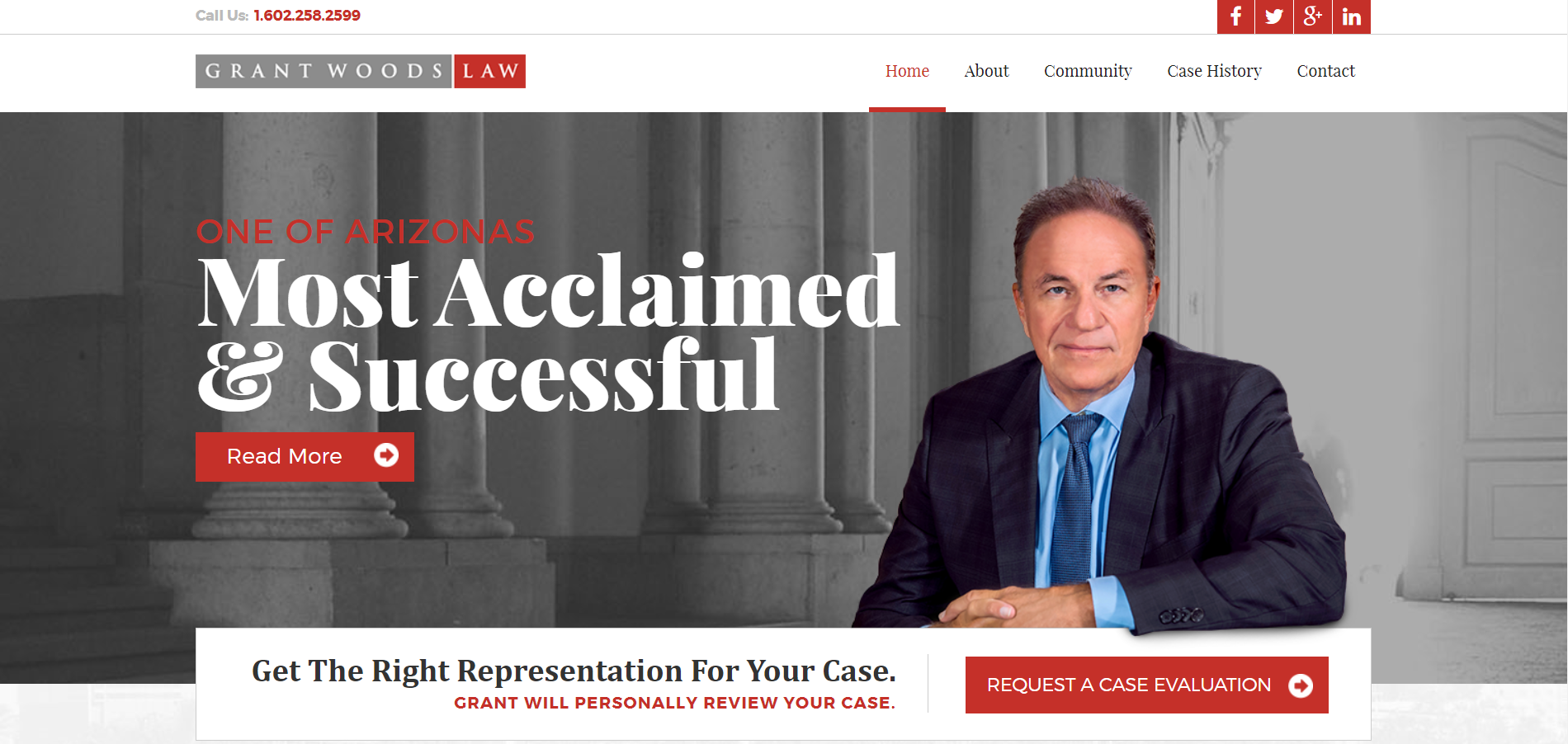
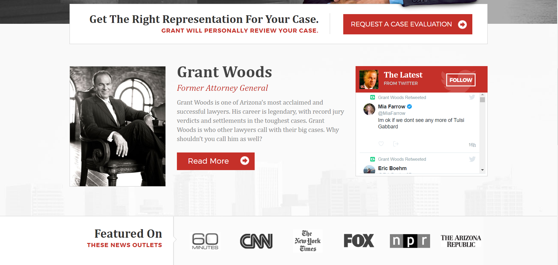
As soon as the web page loads, visitors are greeted by Woods’ prominent, soft smile. His pose is relaxed but formal and sturdy. And right next to his face in large, bold type is “Most Acclaimed & Successful.” Between the text, composition, and image, the entire homepage makes it abundantly clear that Grant Woods is a trustworthy and successful professional. However, that’s just the hook. As the visitor scrolls down, each header, button, and block of content builds upon that early indication of trustworthiness. The “about” page provides background, the “Featured On” section builds his credibility, and the twitter feed lets clients peer into his head.
Then, as soon as the viewer finishes reading the ethos-boosting content, they encounter the call to action: the “Do I Have A Case?” contact form.
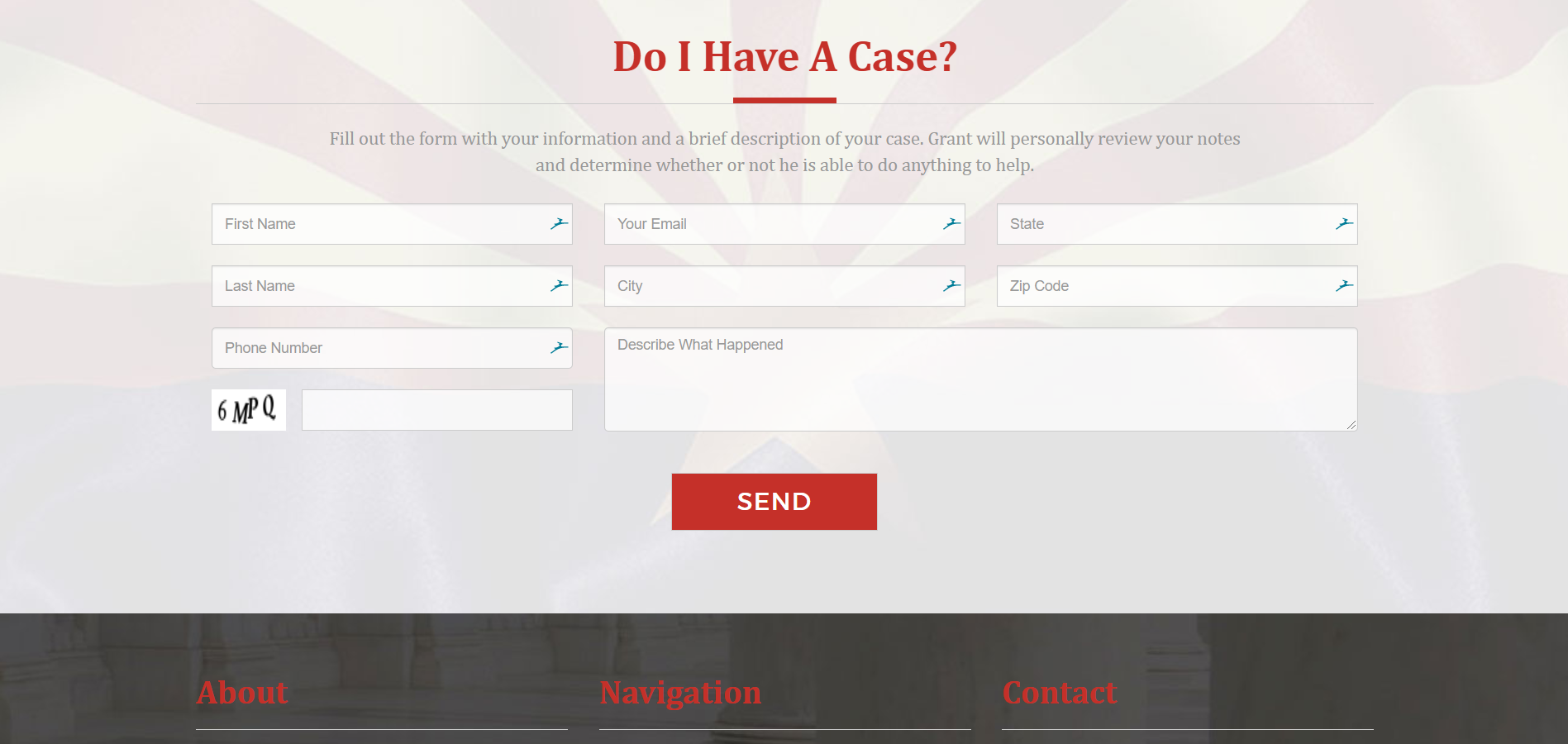
Lots of web designers forget the call to action, but it is the most important part. Without it, how else will you convert visitors into customers? Building trust is difficult–especially for attorneys and law firms–so don’t let that hard work go to waste.
Simplicity for Law Firms
Simplicity is less obvious than credibility but no less important. While many websites–especially ones with vibrant and expressive brands–benefit from flashy and exciting websites, attorneys and law firms should always keep it simple. If your website is full of bombastic micro animations and dozens of extra pages, like the Lerner and Rowe website, potential clients could lose themselves in a sea of superfluous content.
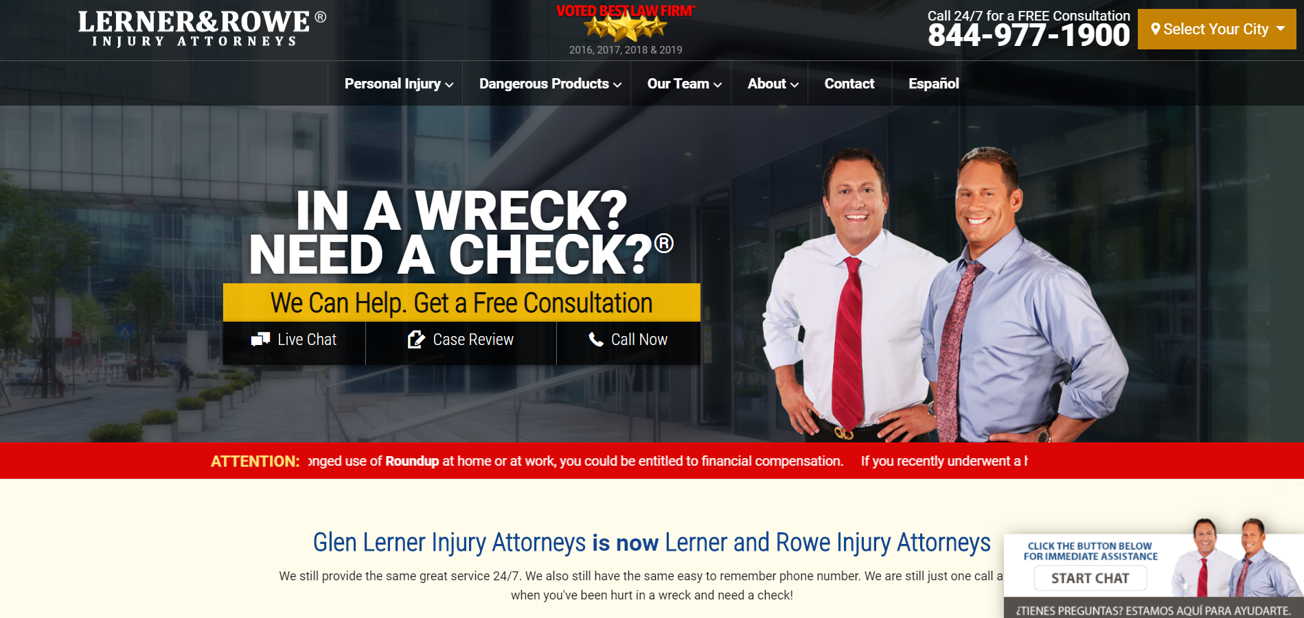
All these scrolling banners, bright colors, and unnecessary animations are reminiscent of a bad Saul Goodman parody. The pop-up windows are even worse.
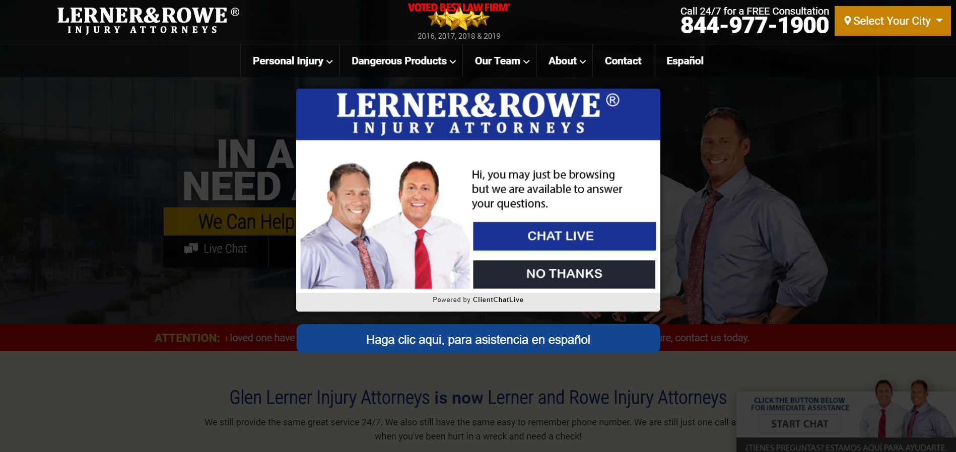
Does your website really need a “Live Chat” popup when it already has two separate”Live Chat” buttons? Redundancy can be good, but that’s overkill. However, the Lerner and Rowe website isn’t all bad, and it’s far from the worst. Brent Buckman’s website is perhaps one of the most abhorrent abominations in entire the legal industry, if not the entire internet.
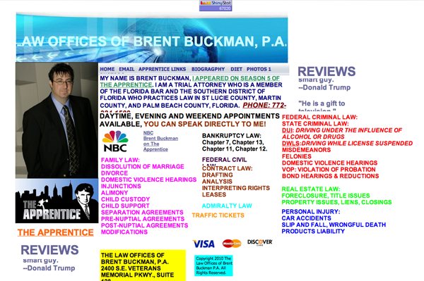
This website is far too complicated. I can’t even begin to express how much I utterly despise every single pixel. For starters, the screen is so crowded and colorful that it physically hurts your eyes. I’d rather stare directly at the sun than ever look at this website again. It may be an extreme example, but it does illustrate that if you add too much information, no one can find what they’re looking for.
However, if you cut off the fat, your website will look much more clean and professional. For instance, the Pope Law website only has the bare bones.
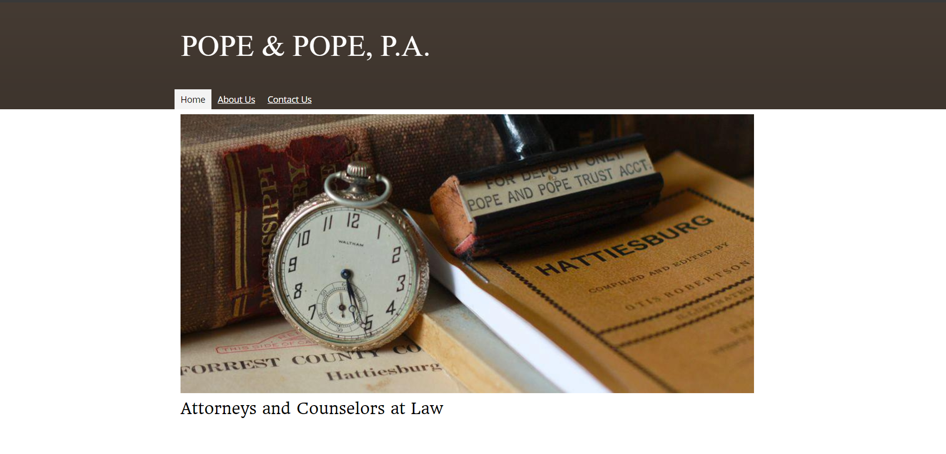
The home page establishes the purpose of the company, the “about” page elaborates on the attorneys’ legal backgrounds, and the “contact us” page provides contact information. That’s it. The website doesn’t need pop-ups and flashy showmanship to make a point. With a minimal amount of effort, it establishes orderliness and professionalism. More importantly, customers don’t have to dig through extra information to find what they need.
SEO for Attorneys
We cannot stress this enough: SEO is more important for a lawyer’s website than for most other industries. In fact, so many people use Google to find legal advice that “Lawyer” is the fourth most expensive keyword on Google Ads. So to optimize your website, you need to get creative. Here’s a tip: instead of optimizing for “lawyer,” find a niche and go all in.
For instance, Sonja Duckstein’s website doesn’t optimize for “lawyer.” Instead, the website optimizes for criminal defense in Arizona. Right away, the home page hits you over the head with striking imagery, engaging questions, and criminal-focused copy. Even the domain name, “criminalattorneyaz,” establishes expertise in that niche. 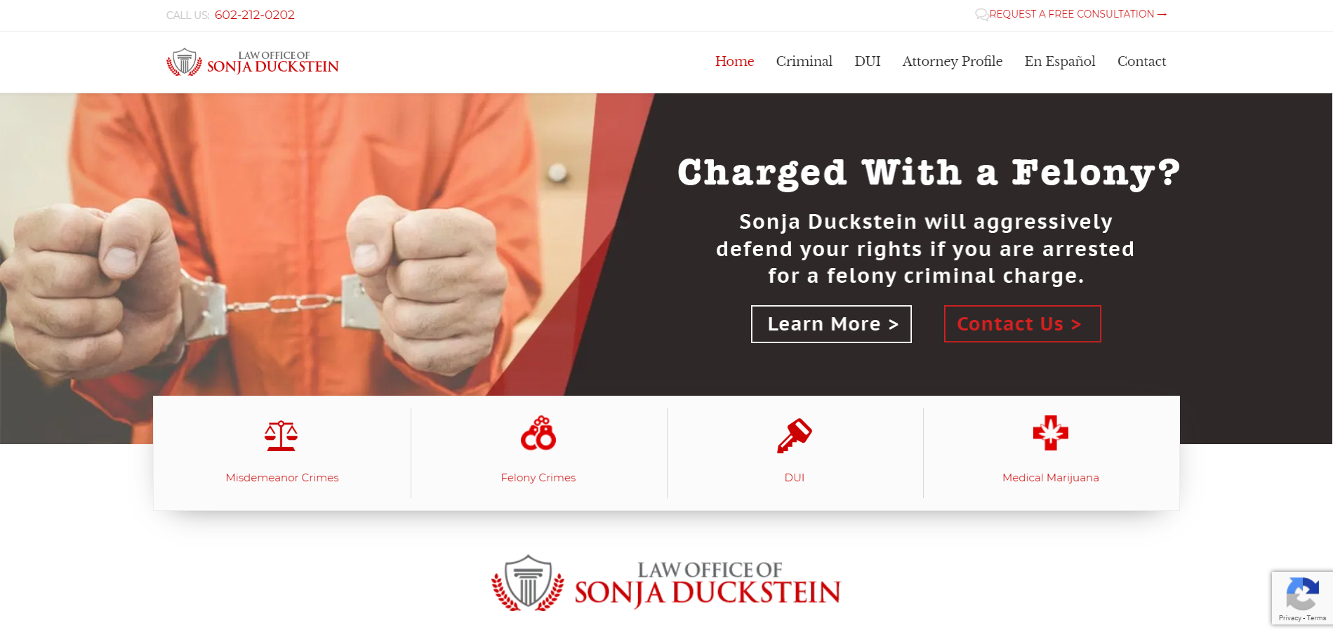
However, simply declaring yourself an expert isn’t enough to rank high on search engines. To optimize for your niche, include high-quality content on your website. That way, if a potential client searches for information on a certain subject, they will find your website first. Duckstein’s website employs that exact strategy with several posts about misdemeanors, DUIs, marijuana, and felonies. This high-quality content keeps customers informed and boosts her SEO. If all those benefits aren’t enough, high-quality content will improve your credibility. To stand out as a legal professional, don’t optimize for “Lawyer.” Find what makes you unique and go all in.
Getting Started on Attorney Web Design
Merely understanding what makes an attorney or law firm website stand out isn’t enough. You need to use that information to start building a stunning website. Whether you hire a freelance developer, partner with an agency, or do it yourself, your team should set some goals and standards before getting started. Here are some important questions to ask your team.
What’s the Best Domain?
After all, a long domain from 2009 simply won’t make the cut in 2019. Instead of cramming in your full name, your specialty, your state, and your mother’s maiden name pick a simple, memorable domain that gets the point across quickly. Lerner and Rowe’s domain is lernerandrowe, not lernerandrowepersonalinjuryattorneys. Grant Woods’ domain is grantwoodslaw, not grantwoodsformerattorneygeneral. Sonja Duckstein’s domain doesn’t even include her name, and Latham & Watkins’ domain is only two letters. Long, bloated URLs don’t help your SEO, so choose something memorable that will look nice on a business card.
Finally, remember to renew your domain. Set a timer. Use an automated service. Nothing is more embarrassing than not owning your own domain.
What’s Our Budget?
No two budgets look the same, regardless of size, industry, and brand. So why would you rely on a quick shoddy estimate without a thorough analysis? Meet with your team and your developers to discuss each bit of functionality and how it will impact the cost of your website. Most attorneys and law firms keep websites cheap and simple–even Latham & Watkins, one of the biggest law firms in the US, has a minimalist website.
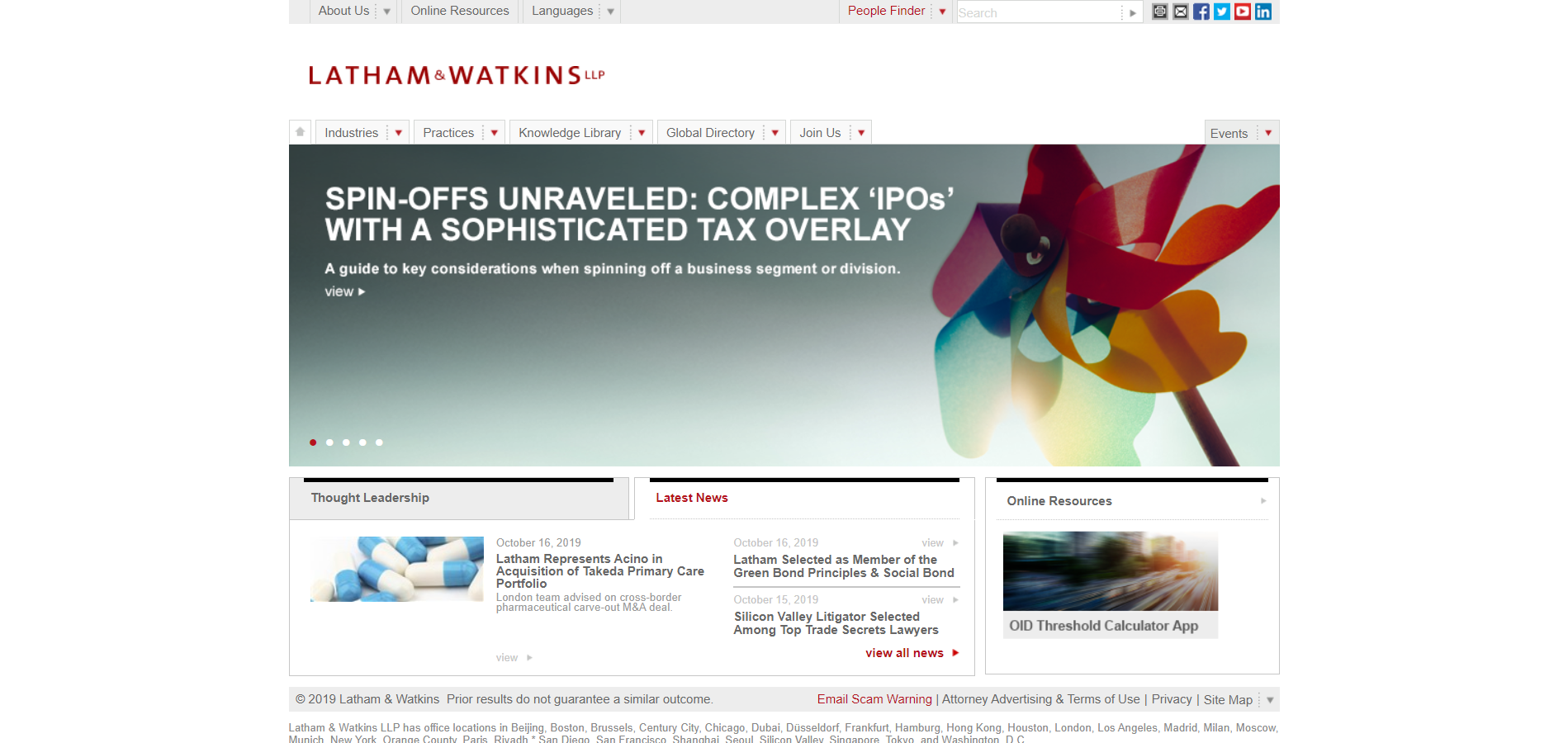
Since your website will likely be straightforward, a semi-custom solution will probably be wise. Besides, once you add your own content and images, the results can be stunning. However, your website could need lots of custom solutions. Talk about your budget with your developers and finance team to find the best solution.
Who Is Our Audience?
Never build a product that no one wants. Before you make a website, learn everything you can about your audience and prioritize their needs and desires. If your customers prefer more casual legal services, provide them, and if your customers prefer a flashy and confusing website, appeal to their needs. However, don’t chase an audience that doesn’t exist. Research your target audience with your team.
What Makes Us Unique?
No two companies should have exactly the same target audience–even if they are both parts of the same industry. It’s no different for attorneys and law firms. Even if another firm specializes in the same thing, you should stress your distinctions. For instance, both Sonja Duckstein and Dwane Cates specialize in criminal defense. However, Duckstein focuses on leadership and protecting people’s rights while Dwayne Cates focuses on skills and experience. Both websites use different strategies to target different groups of people. Your website should do the same: use it to illustrate what sets you apart. Find your unique points and turn them into selling points.
Building a new website is a huge step in the growth of your company, so make sure you do it the right way. Take some time to evaluate your needs and look for the development partner that best reflects those requirements. To get started building a stunning human-focused website, contact us online or call us at 888.221.6509.