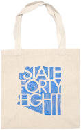
How State Forty Eight Scaled B2B and Retail with a Shopify Plus Migration


Conversion Rate Boost
Increase in Online Revenue
Years of Partnership
This Arizona-loving brand migrated from WooCommerce to Shopify Plus to scale their business.
Industry
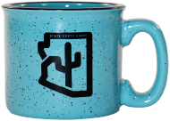
- Apparel
- Fashion & Apparel
Services
- B2B
- E-Commerce Migrations
- Shopify
- Shopify Plus
- Shopify POS
- WooCommerce to Shopify Plus Migration

The Problem
State Forty Eight, an apparel brand dedicated to celebrating Arizona, needed a more stable eCommerce platform to support their growth. While their loyal customer base thrived, their WooCommerce store lacked the reliability and scalability required to elevate their business.
To take the next step, they sought a solution that would provide enhanced platform stability, improved performance, and a seamless shopping experience, ensuring they could continue sharing their passion for Arizona with an even larger audience. Naturally, they wanted a partner who worked from and loved the forty-eight state as much as they do.


The Solution
Having been partners for over 6 years, State Forty Eight came to Fyresite when they needed a new eCommerce platform. We provided a full suite of solutions.
We migrated them to Shopify Plus, setting up Shopify B2B for selling to other businesses and POS to sell at their brick and mortar locations. We also designed a custom theme, executed a ShipStation integration and a reward points migration. Add in our site speed, SEO optimization, and extensive UI/UX testing, and State Forty Eight now had a website that was stable and optimized conversions.


Got a tech problem?
Let's solve it together