Lauren Lively
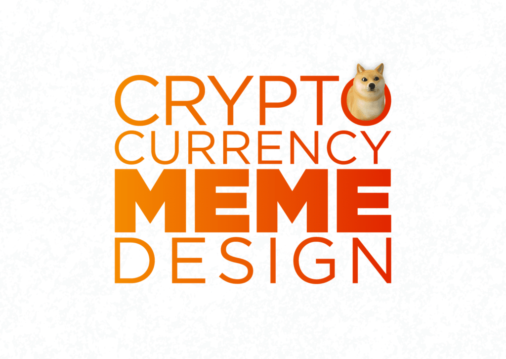
Memes have been taking over the internet for many years. As of recently, they are starting to take over financial markets as well.
What once seemed like an intimidating field, is now being filled with casual investors trying to find the next big cryptocurrency (possibly one with a very good boy on the front).
Image by MarketWash
Although memes were meant to invoke emotion, they have consequently revolutionized how website design is built and marketed.
While memes are a great way to connect with people and a great way to get people interested in your cryptocurrency, it takes more than just putting an image on a brand. Design is such a crucial element and staying ahead of trends will keep your cryptocurrency relevant.
Here are some of the most successful crypto meme website design and token trends emerging in 2021:
Futurism
Because most people within the industry believe that cryptocurrency is the technology of the future, it is no surprise that people are looking for modern, futuristic designs.
Futuristic designs may resemble:
- Wire circuits, machinery, and other general tech wonders
- Glow-in-the-dark or high-contrast neon
- Out-of-this-world space themes
- Ultramodern Sci-fi themes
Safe Mars uses futuristic elements within their design to convey their crypto-brand in a fun way. Using an astronaut flailing his way through space is a unique way of making their way into meme culture.
With all the current buzz on Elon Musk and SpaceX, Safe Mars is using meme knowledge to promote their brand through their website design.
Banano also uses futuristic elements in their banana-themed meme design.
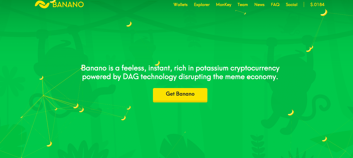
Although monkeys are quite the opposite of futuristic, adding the connecting circuits that change depending on the location of your cursor adds a modern touch to the modern market.
Futurism is common in all crypto website design, but it has become especially prevalent in meme web design.
Minimalism
Simple, clean designs are a great way to draw focus when everything else looks busy and complex. MonaCoin (MONA) uses minimalism to accentuate their main logo, the Mona kitty.
Minimalism symbolizes clarity and is a wonderful design element in such a complex industry. To achieve minimalism, use a monochromatic color pallet and leave the design as simple as possible.
While Monacoin’s website may be a little over-simplistic, Monacoin gives you everything you need in the most uncomplicated way. Minimalism is great for intuitive design and that leads to trust within users.
Garlicoin (GRLC) also uses a minimalist token to provoke simplicity within their brand.
Because they wanted to make their website as intuitive as possible, Garlicoin uses basic, clickable elements and simple navigational tools to maneuver their website.
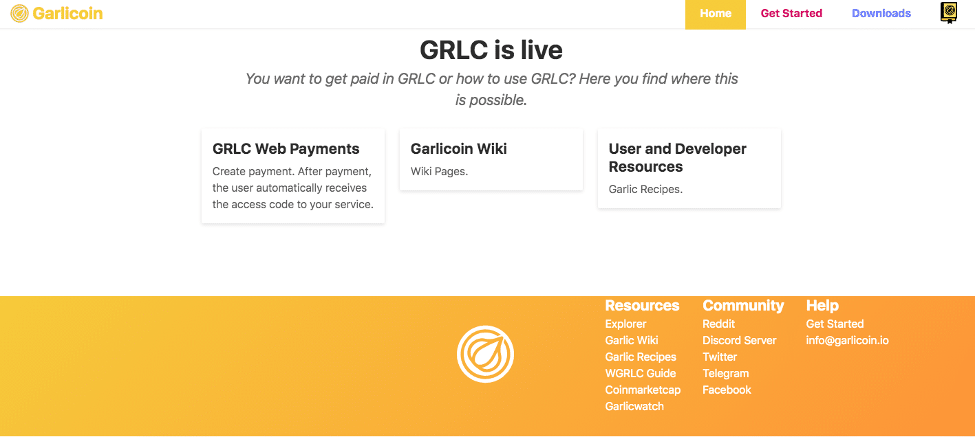
Making your website design a meme doesn’t always have to be extravagant. Just make sure you add some elements that will give your audience a chuckle.
Interactive Elements
Clickable elements are another great way to add some excitement to your crypto website design. Since there has been such a big rise in technological personalization, people love to leave their own mark and have elements they can control.
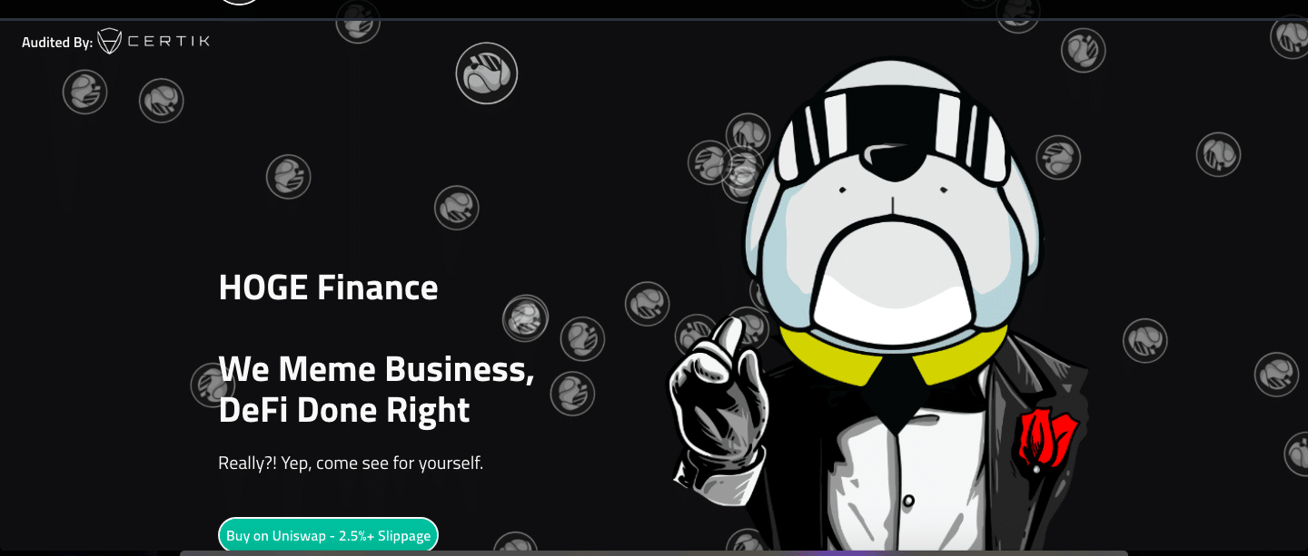
Hoge Finance has tokens that bounce around behind the Hoge dog and multiply when you click on them. Stackable elements that multiply with user interaction perfectly captures the essence of meme-culture in cryptocurrency.
While there are other things that this website does well, this homepage is so much fun to be on and is the most memorable on their entire website. Well executed mixed media is a great way to make designs stand out.
Typography
Cryptocurrency website design typically falls within two trends:
- Streamlined professional fonts
- Overly ironic fonts that stand out
If you decide to go for the more professional typography, great! It is wonderful because it is simple and inspires trust and inspiration.
Keeping it professional implies that you are too, so there is nothing wrong with choosing a nice Sans Serif font over something less traditional.

LabraCoin (LABRA) uses minimalistic typography to create a beautiful meme token. This laid-back font conveys comfort and ease.
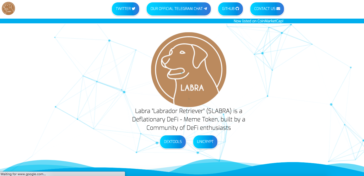
LabraCoin has such an awesome typography for meme cryptocurrency. This font is just serious enough to be taken seriously, while also having a little fun and converting that within the brand.
And by consistently using this within all aspects of their website design, they have found a notable element that people will always think of when looking at LabraCoin.
Because they have mixed futuristic elements with fun typography and cool color tones, this crypto-brand hits all the marks for a successful crypto website.
Tiger King (TKING) has the best of both worlds when it comes to fonts.
While their meme token uses a simplistic font, they make sure that the rest of the token stands out with a bold tiger design and diamonds encrusting the border. Their website follows a similar pattern.
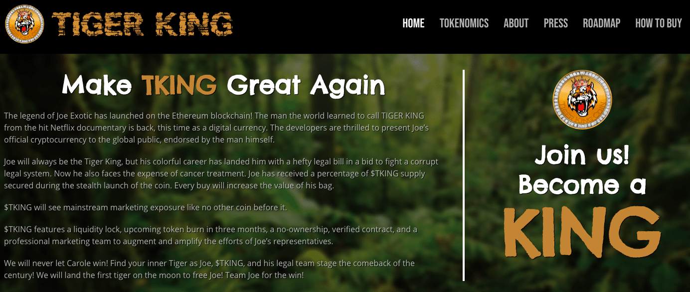
Using a mix of serious and stand-out fonts, Tiger King Coin has completely captured what it means to make meme designs for crypto websites.
While there is enough balance to read everything in a non-confusing manner, TKING uses fonts to highlight all the essential information.
Cool Color Tones
If you know anything about color psychology, blue is used to convey trust, security, and confidence. Mixing this in with greys and other darker colors evokes a feeling of innovation and maturity.
The most popular cryptocurrencies like Bitcoin and Ethereum use a cool color scale because they know it is such a powerful design tool.
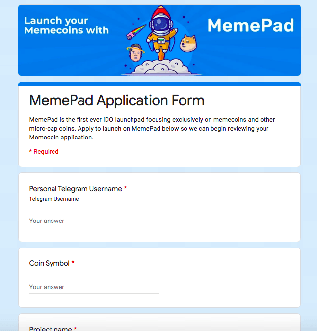
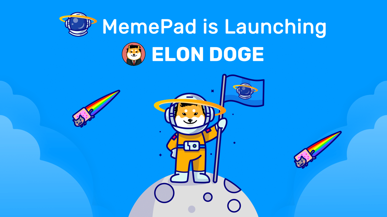
MemePad knows this and uses the color blue in every single one of their designs.
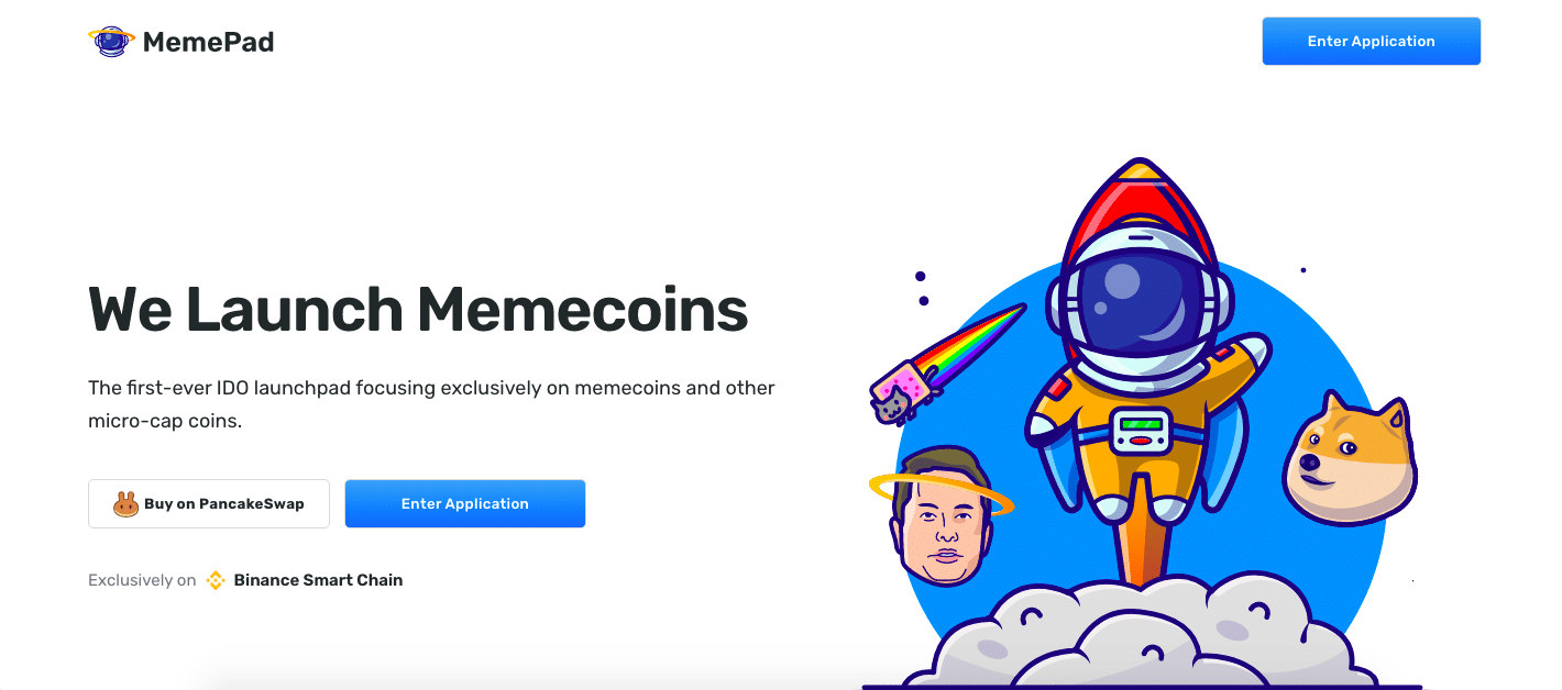
You cannot escape cool color tones with MemePad.
Because they committed to their shade of blue, they have used it in every form possible. From their tokens, website design, even application forums are uniformly blue.
Consistency is essential in building design. This increases recognition, creates stability within the brand, and is an easy way to gain the trust of users.
While MemePad is a great example of using color to convey meaning, they aren’t the only brand utilizing this tool.
Sad Cat Token (SCAT) uses blue to completely outline their token. This simplicity (along with general goofiness) makes this meme token one of the most memorable.
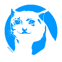
Although the website is lacking some pizazz, Sad Cat Token falls heavily into the cool-color design trend and uses it for natural flow within the website.
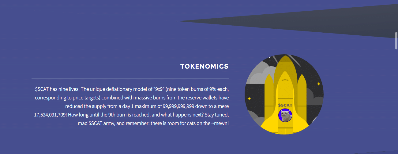
Using cool color tones as a background is a simple way to incorporate this into design.
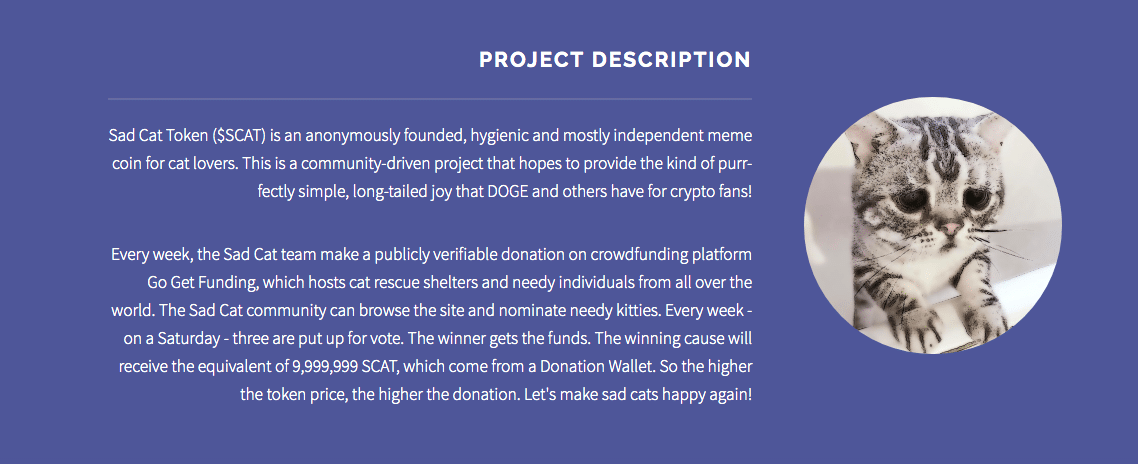
While the design of Sad Cat Token is basic, you are still getting all the information you need in a clean, clear way.
Although Sad cat could add more creative elements to make their website more of a meme, they play off as really professional and aren’t lacking any crucial information.
From Memes to Money
With the cryptocurrency market being over $2 trillion dollars, companies are trying to find their way in. Here are great examples of brands that use meme design trends to promote their cryptocurrency.
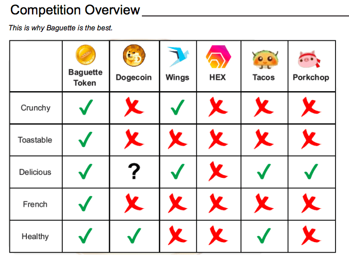
1. Baguette Token

Meme score: 6/10
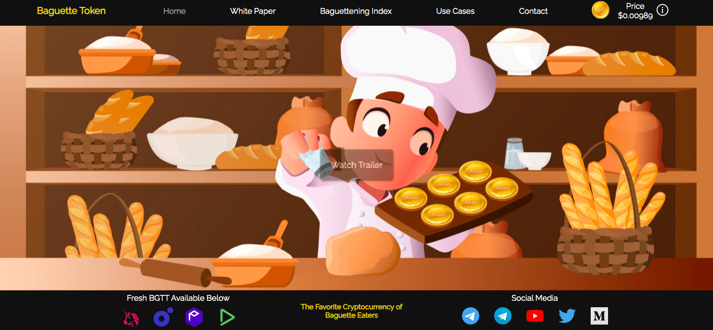
Baguette Token has the spirit of memes but falls short in most ways. With an unsecure website that quite frankly, is a little boring, Baguette token seems to hit a lot of the marks people look for while also falling short in similar categories.
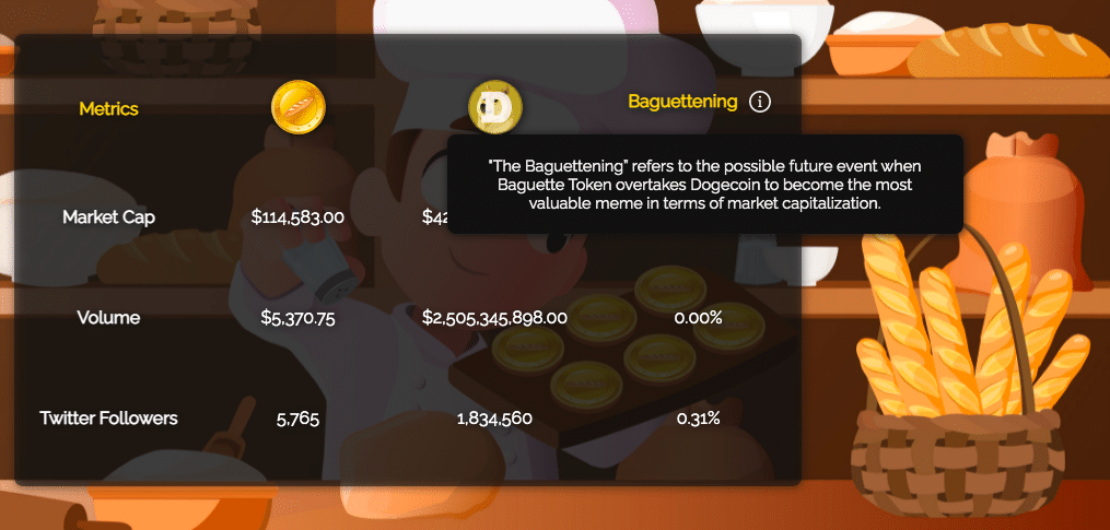
One element that is awesome is that memes are incorporated into their white paper. While something like this is typically taken more seriously, they have added fun elements to add to their meme driven design.
2. Blowfish Token
Meme score: 9.5/10
Blowfish Token really has a website that has it all.
Not only does their brand and token reflect great textures and fun personality, their branding is also cute and appealing to a wide audience.
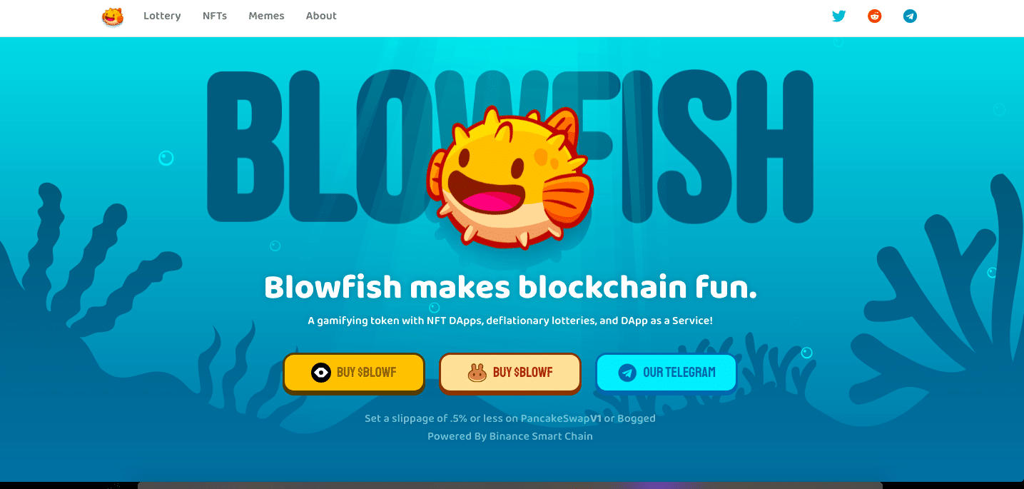
Their website follows cool color tones and has chosen fonts that really follow the brand’s aesthetic. Because of all this, their brand is cohesive, easy to follow, and fun to navigate. All these are essential when designing crypto websites.
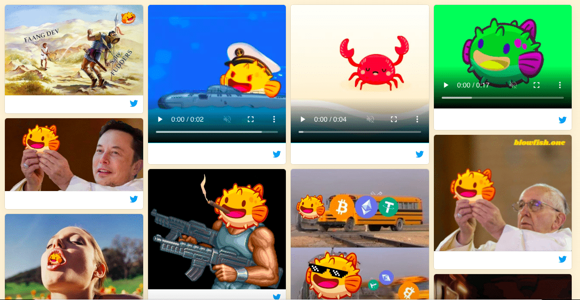
They also have a meme page where they’ve turned their brand into a meme themselves.
The only reason this cryptocurrency website isn’t scoring higher is because of the lack of awareness of the brand. They have all the right elements, but blowfish hasn’t really made themselves fully a part of meme culture.
3. Norris Coin
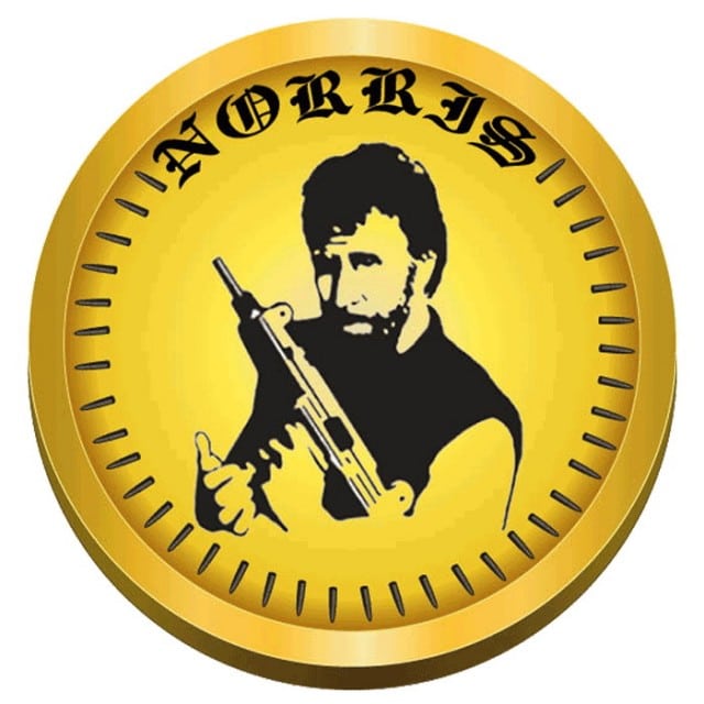
Meme Score: 2/10
Norris coin (CHUCK) is the perfect example of using typography to generate the perfect meme token. Typography mixed with the design around his image is *chefs kiss* exquisite!
This meme score is going to have to be a 2 because of how low of an impact this made on the market.
With this cryptocurrency no longer in existence, this design is just a memory that will soon be lost along with its website design.
4. Crazy Ape
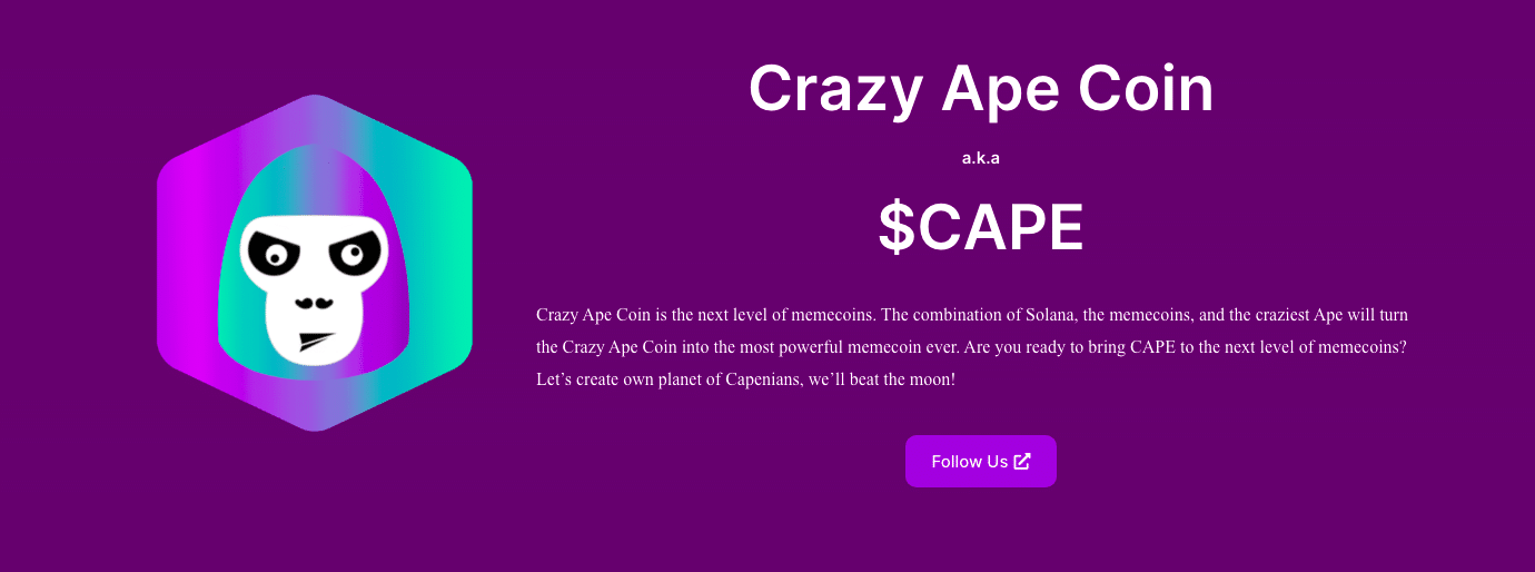
Meme Score: 4/10
Crazy Ape has such a fun logo and color pallet. And after Harambe becoming such a big internet meme, they pretty much already have a built-in fanbase. Although these are essentials when it comes to good design, you have to make sure that you don’t stop there.
This website lacks elements that would normally make it stand out.
This ape is one of the few elements on their website that is actually fun to look at. Simplicity and minimalism in design are great for easy navigation, but if the design isn’t thorough enough, it can feel like the website is missing out.
5. DogeCoin
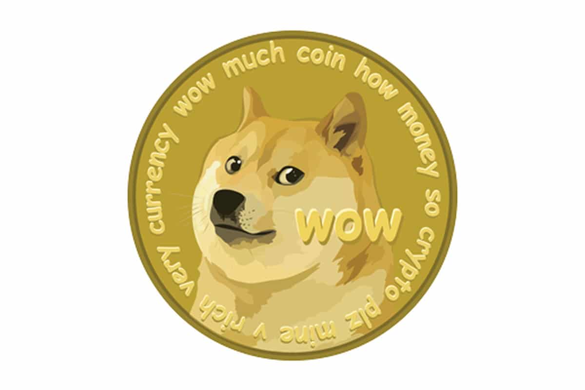
Meme Score: 2039482309482/10
The DogeCoin website is super successful for a lot of reasons. Starting right off the bat, you can tell the website developers knew what they were doing and 1000% understand the essentials in meme-centric website design.
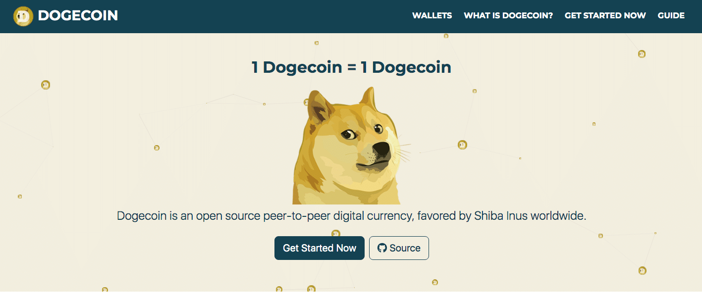
DogeCoin’s homepage starts you off with a meme, has simplistic moving elements, and uses a consistent color palette.
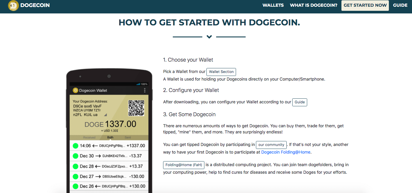
This website is super intuitive, easy to navigate, and minimalistic in the best possible way. There is absolutely no wonder why this cryptocurrency is as popular as it is.
6. SuperDoge
Meme Score: 2039482309492/10
While DogeCoin is one of the best examples of website design for cryptocurrency, SuperDoge is scoring 10 points higher because of how eccentric they’ve made their website.
It is a meme in every possible way.
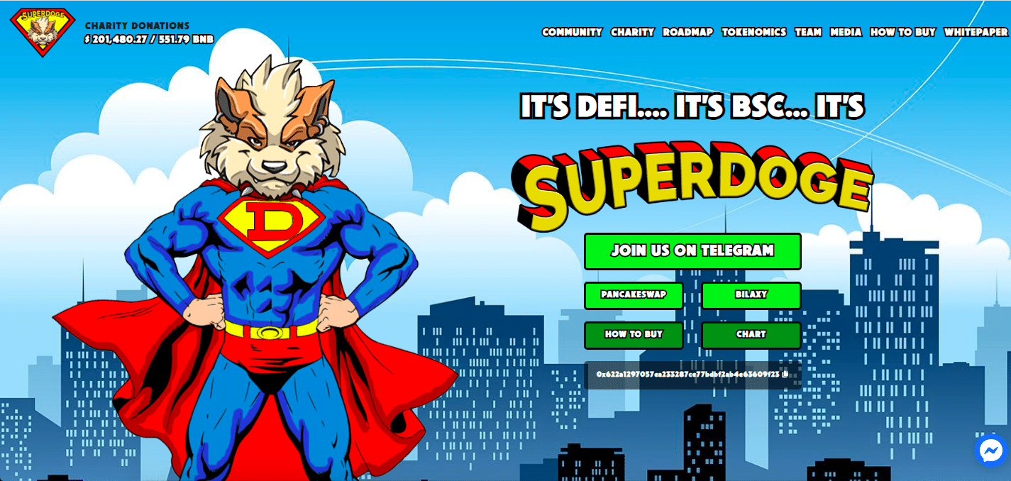
Does this image really need any commentary? From the use of color, to all the themes and how intuitive the design is, there is really no room for poor design.
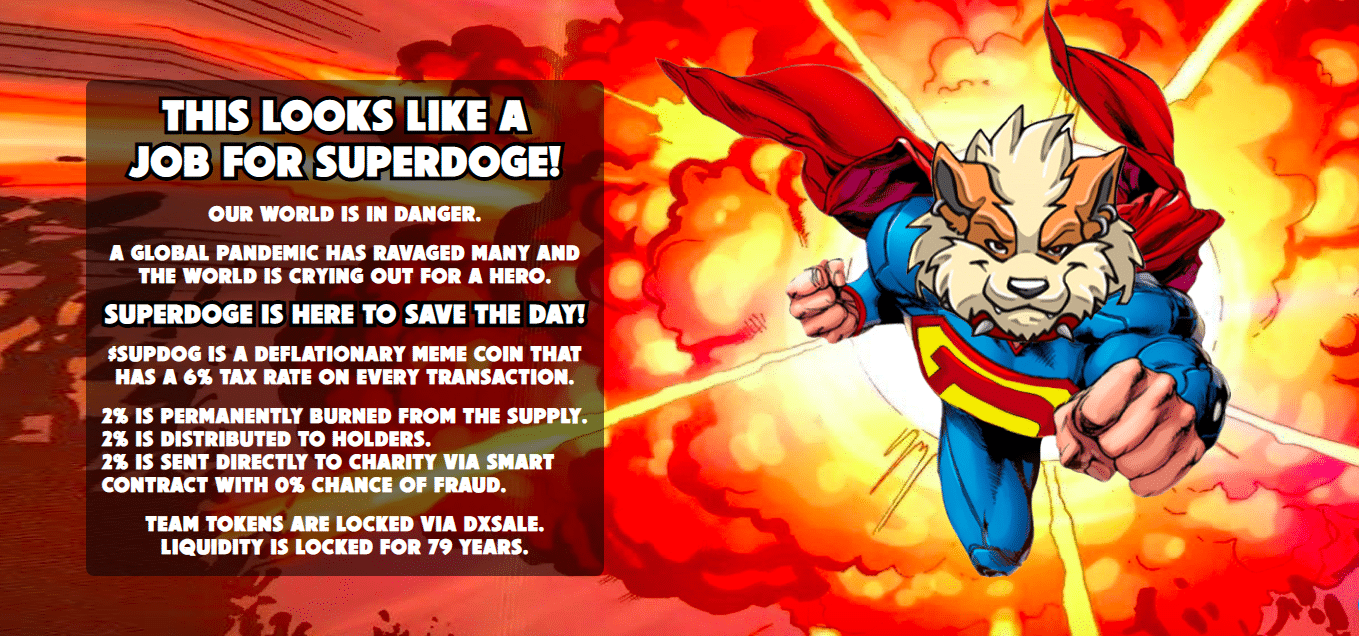
On every page there are elements that are made to make you laugh. And with how consistent the design is, you’re always expecting to be wowed on every page you scroll to.
Everything is created in such a creative, entertaining way. And even though there are tons of cryptocurrencies, even focused on dogs, this website finds a way to stand out in every single way.
Creating your own Crypto Website
Creating your own website can be a long and trying process.
Contact the professionals at Fyresite today to see how we can help create a cryptocurrency website you can be proud of.
Footer - Contact
"*" indicates required fields