 Taylor Simmons
You only get one chance to make a great impression. For a website, this first impression is its landing page. That’s why Fyresite has made this guide to help you make a lasting impression that keeps them coming back for more. Here’s everything you need to make high-converting landing pages.
Top Navigation
Navigation is an important part of site engagement. Your top navigation needs to be uncluttered while still telling the user what they need to know. Your logo, for instance, should be located here. If you choose to include any links, they should only be your main links. A call to action button is also important to keep here.
For maximum benefits, make sure that you’re using a fixed or ‘sticky’ navigation. This makes it so the top navigation bar stays in place as the user scrolls.

Heading
A heading should be concise and encourage a user to read more. The heading is often the first (and sometimes the only) thing that a user reads. Because of this, you need to get your main point across clearly and quickly in your heading.
Subheading
A subheading, like a heading, should be concise, but gives the user an opportunity to read more and helps transition the reader from your header to your next point.
Call To Action
Any call to action that is present on your landing page should be concise and engaging. Ideally, your landing page should only have one or two calls to action. Landing pages are focused on one offering, so using too many CTAs can be confusing.
While most landing pages only need one CTA, you can use two if you’re targeting two different parts of the customer journey. However, the same call to action can be used multiple times on the same page.
Introduction
You want to tell users who you are, what service you’re offering, or what is special about you and your landing page. This can be done in a multitude of ways, but one of the most impactful ways is to do a short video.
If you choose to do a video, it should be high-quality, short, and concise. Viewers prefer shorter videos, with the sweet spot falling somewhere in between 30 and 90 seconds. When creating a video, you should follow the inverted pyramid of information. This means putting the most important, high level information at the beginning, where viewers are most likely to see it.
Wondering what this looks like? Check out our introduction video!
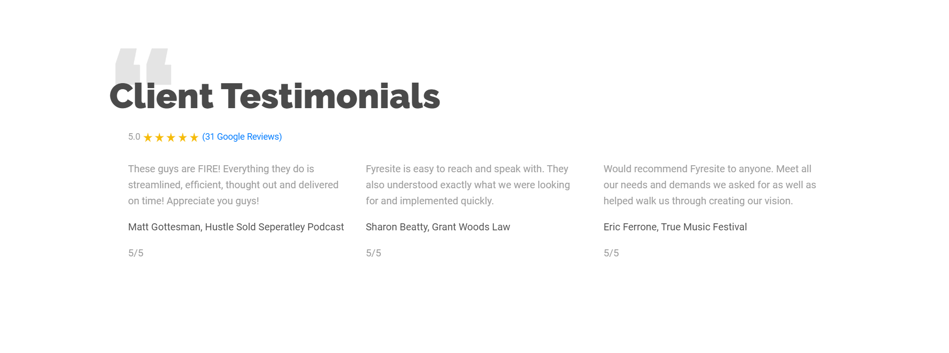
Social Proof
A savvy user isn’t going to take your word that you’re the right choice. Social proof tells users that you’ve been trusted and improves your legitimacy. There are generally multiple types of social proof on a landing page.
Logos and testimonials are the two most common ways to showcase social on your landing page.
Logos are commonly high on the landing page, often below the introduction. They’re a quick visual and allows a user to quickly glance at the brands you’ve worked with. This is a good place to put your most recognizable clients.
Testimonials often appear lower on a landing page, but they are incredibly important. 72% of users trust a brand more after reading a positive testimony when shopping B2C. B2B buyers ate 92.4% more likely to make a purchase after reading a positive review of it.
Why Before What
If you want someone to care about what you’re offering, explain why it helps them before explaining what it is.
When creating a landing page, it’s important to make sure to highlight the benefits, or why your service/product is needed, before explaining what it is. Typically, people are more interested in why and how they benefit – what do they gain? If you bury the benefits too far down, they won’t care.
Footer
Footers are the last thing that appears on a page, so many people assume that they are unimportant. If you’re not using your footer, you’re not taking full advantage of your landing page.
Your footer should include your logo, copyright information, privacy policy, social media widgets, and contact information.
Connect With Fyresite
Looking to create a high converting eCommerce store? Contact Fyresite to keep your customers coming back for more.