Eric Daily
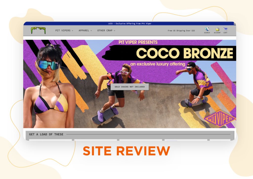
In recent years, most websites have been trending toward classy, refined minimalism.
Pit Viper throws this trend in the trash.

Every corner of this website is tacky, abrasive, and unapologetically acidic. Each pixel stings your eyes like a spritz of spitting cobra venom.
But is that a bad thing? In this case, probably not.
Pit Viper isn’t without its flaws (especially in usability), but its unparalleled creativity and one-of-a-kind branding make each page pop.
Tl;DR
- The website looks so bad it’s good
- Content is fun, strange, and entertaining
- Accessibility needs lots of work
Overall score: 4/5
It’s so hot it’s smokin’

![]()
First impression
The first impression is the most important part of the website. After all, users make their first judgement in only 5 milliseconds.
Thus, an eCommerce website must make a good impression right away.
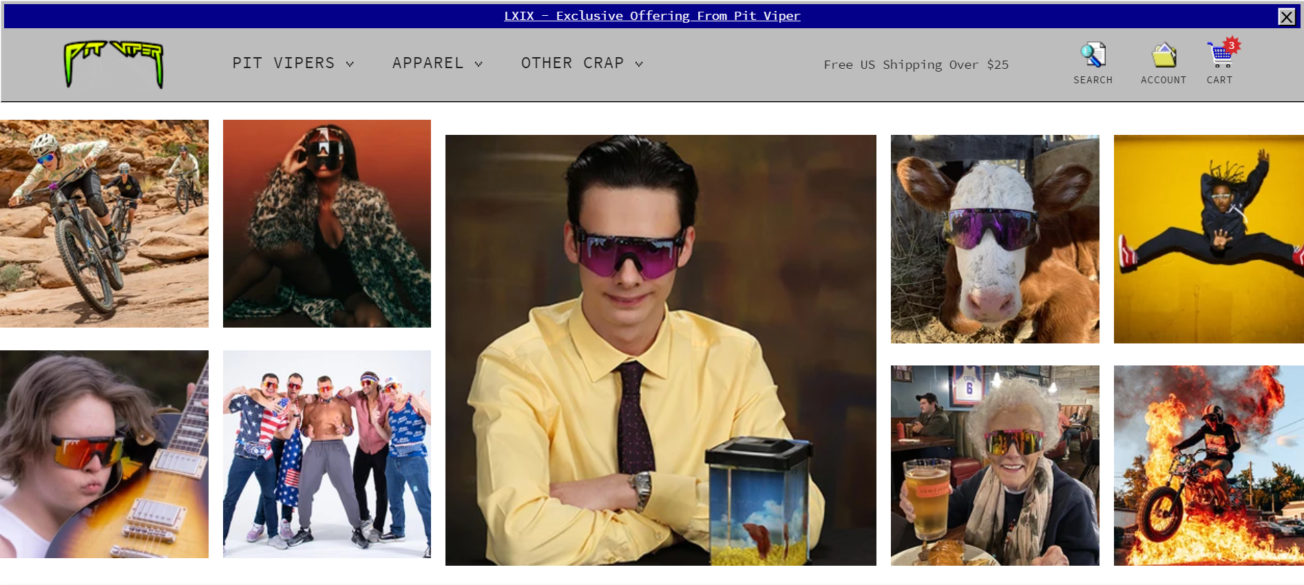
Pit Viper certainly . . . makes an impression.
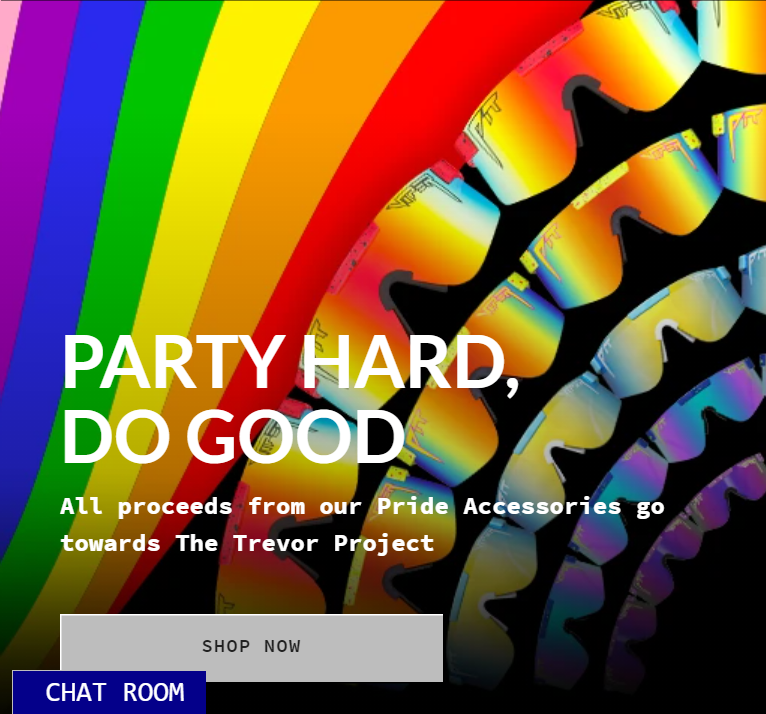
The page loads fairly quickly and immediately hits the viewer with a bold, clashy header image, featuring skateboarders and scantily-clad women in Pit Viper sunglasses.
It’s certainly a bold statement.
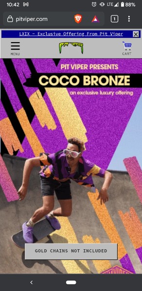
The experience is very similar on mobile: users are greeted with a bold, clashy image.
Although many average customers may be turned away, such is not the case with Pit Viper. Pit Viper markets toward athletes and partygoers, so a little boldness can actually be a good thing.
The average customer will be uninterested, but the average customer isn’t who Pit Viper wants buying their stuff.
An elderly hedge fund manager may not like this website, but the audience certainly does. The landing page catches your attention and makes a solid first impression.
First impression score: 5/5
blazin’
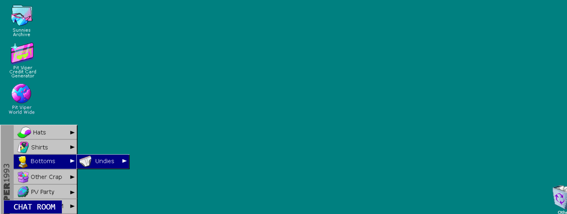
Design
This section is tricky. In some ways, the website design is genius. But in other ways, it makes your pupils puke.
The entire website is designed like Windows 95, with ugly colors, tacky icons, and lots of outdated design elements.
But because the content is so ludicrous, it kind of works. The wild images and frequent cursing make each piece intentional.
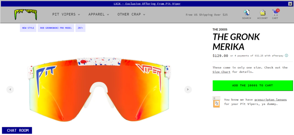
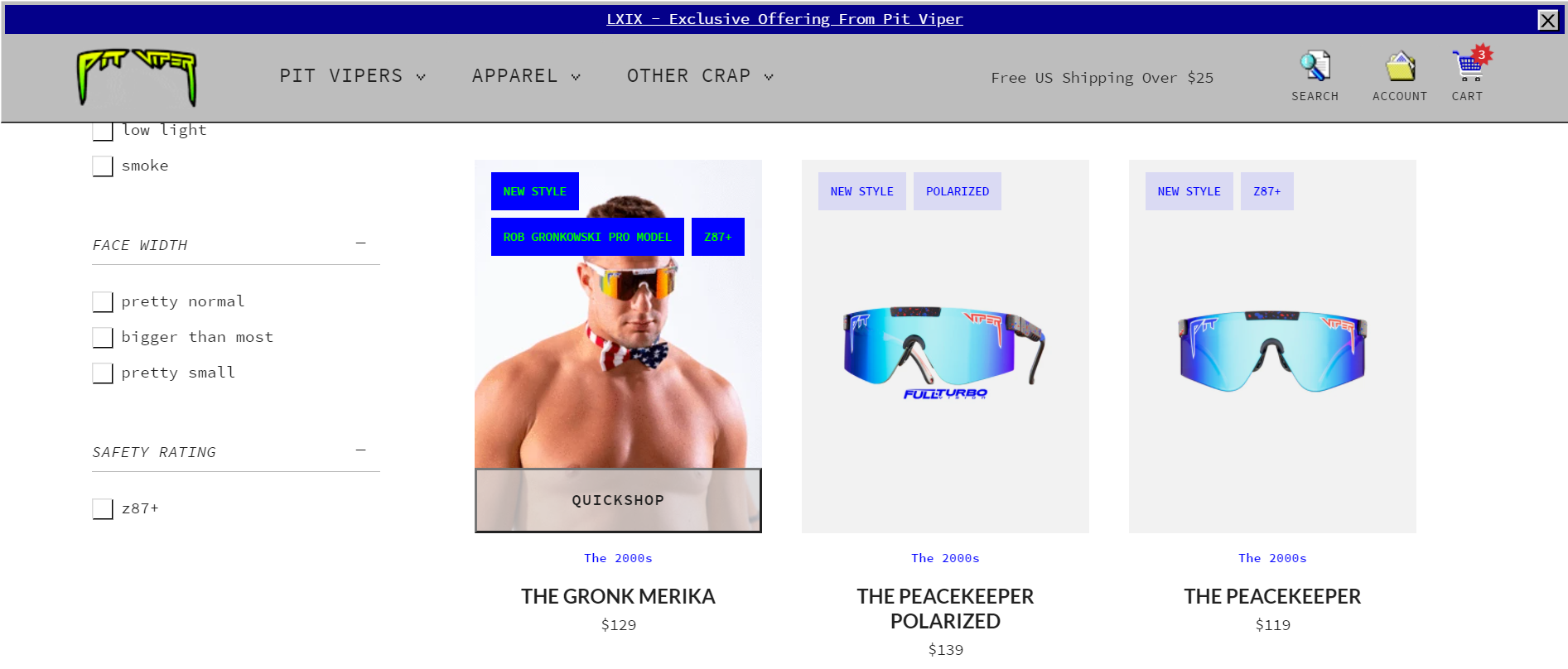
The actual shopping interface is a lot more standard, with a product picture, description, and checkout button.
The best way to describe the design is like a movie that’s so bad you can’t stop watching it. Users find themselves exploring strange corners of the website until, soon enough, there’s an item in their cart.
The design is bad, but in this case, that’s good.
Yet how does the so-bad-it’s-good design fare for usability?
Design score: 3.5/5
burnin’


![]()
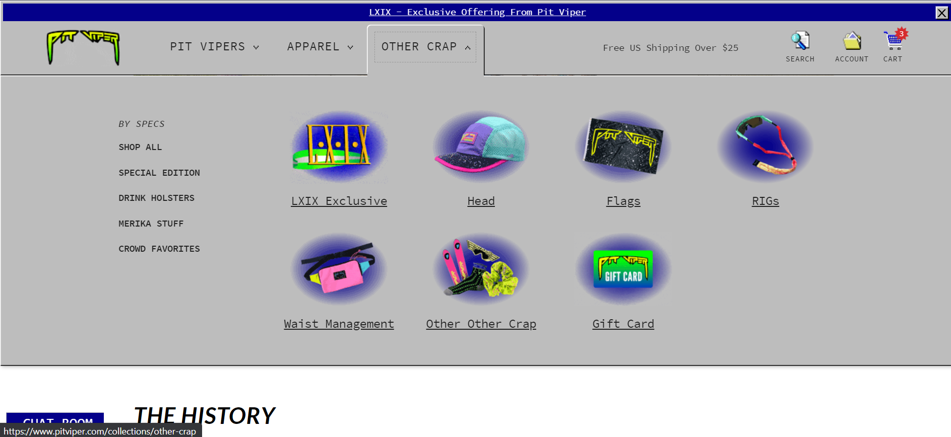
Usability
Usability is another major fallback of the Pit Viper website. It’s hard to use, and that’s not great for search engines or for humans.
Immediately upon opening the website, a viewer will notice the header text is baked into the image (alongside unhelpful buttons)
It looks fine now, but what if this happens?
If the image breaks, nobody can read the header.
More importantly, computers can’t read the header text, either. That means headers won’t be taken into account on search engines — ouch.
But it gets much worse. Plugging the website into an SEO tool like WAVE reveals several problems, including contrast errors, oddly-made buttons, and more.
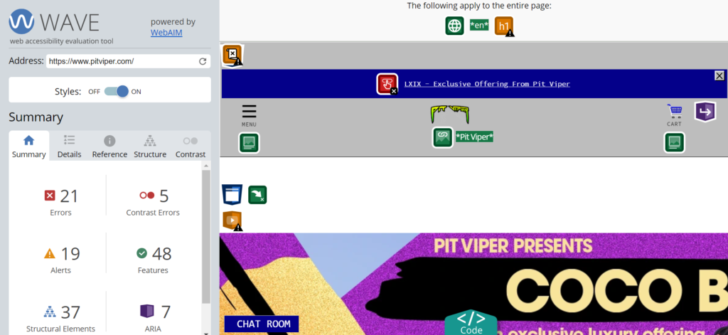
Contrast is one of the most glaring issues. On the rare occasion that the heading text isn’t baked into an image, the contrast is often too low to be of any use.
The worst part? It’s a simple fix. Change a couple of colors or add a darker filter and the text is much more readable.
Even beyond these accessibility points, the website isn’t very useable.
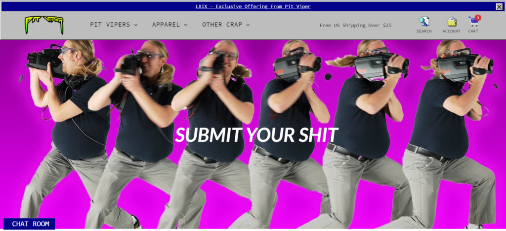
Jokes at what expense?
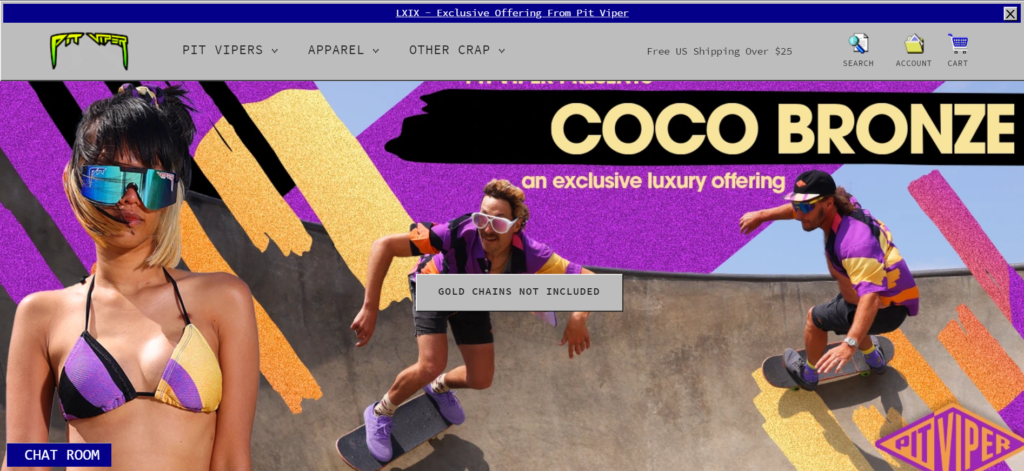
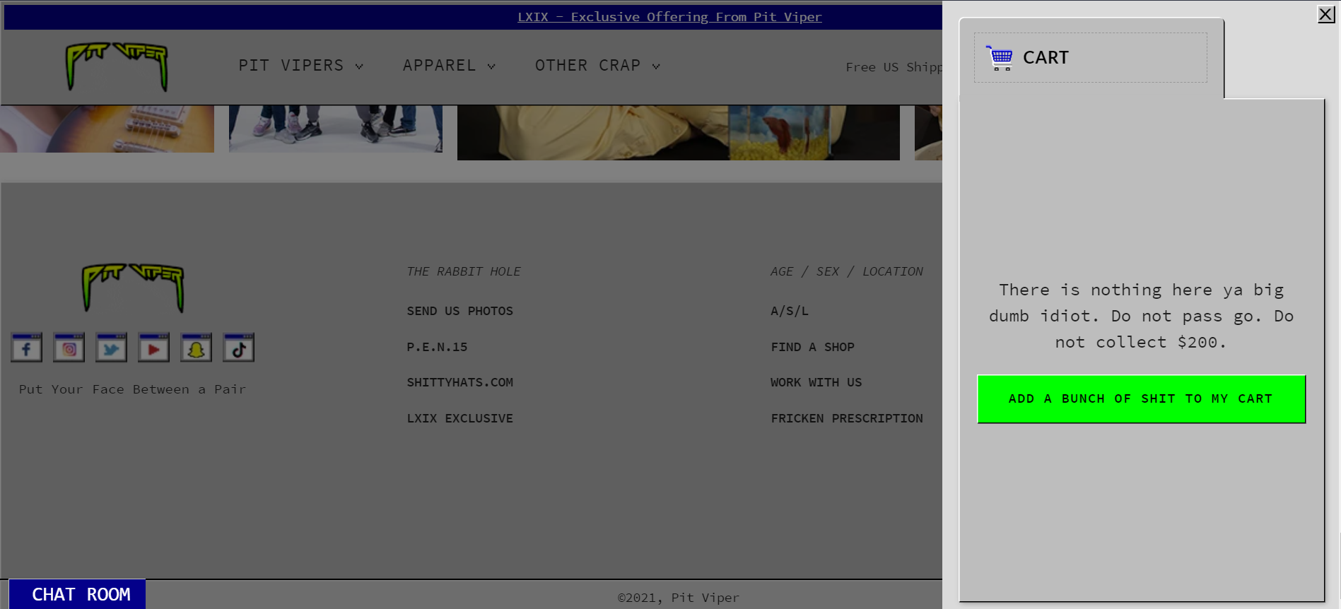
At many points on the website, the design is made significantly more confusing for the sake of a joke or silly feature. For instance, the contact box looks like a popup window on the desktop of a computer. Pretty cool, right?
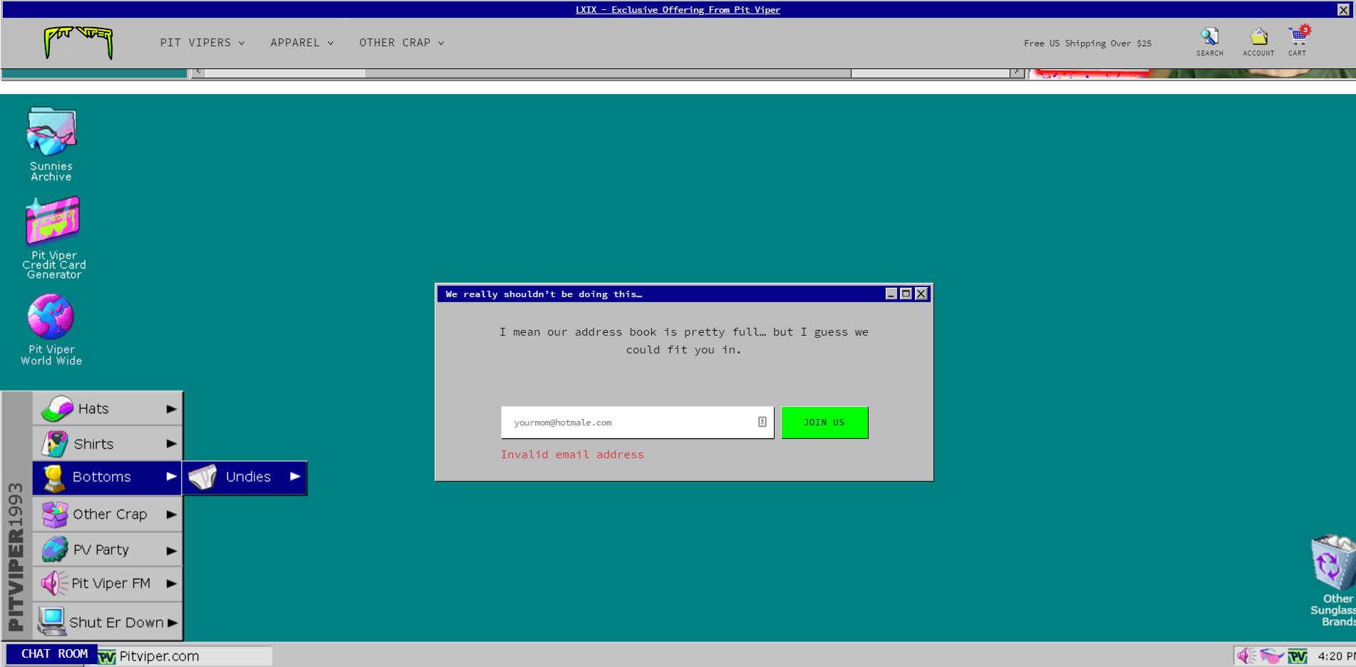
But for some reason, the “X” button works (even though it’s an element on the page, not a true popup). If you click it, the window remains empty and blue for a bit.
The entire website is littered with these strange design choices. It’s full of counteractive buttons, oddly-placed scroll wheels, and other poorly responsive junk that takes up space.
These useless features aren’t bad in small quantities (especially if they’re used strategically to make things look better) but too many make the website significantly harder to use than it needs to be.
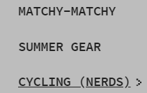
For instance, the navigation is too ugly and messy to be of intuitive use.
And even if you figure out the menu, many links aren’t very helpful. For instance, they use “A/S/L” for their “about” page.
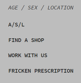
The joke is funny, but it’s kind of confusing if you’re trying to quickly navigate the website.
Of course, the usability isn’t all bad. The website works pretty well on mobile. Even the little whacky features work (glasses move from a hotdog to a man as you scroll).
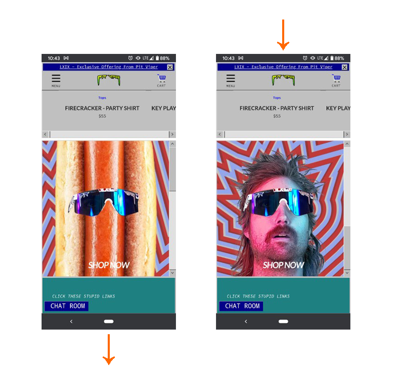
Frankly, the way they captured the messy branding in a mobile format is impressive. However, it doesn’t outweigh the easily-fixable setbacks.
Usability score: 2.5/5
fadin’ out
![]()
![]()
Content
The content can be a tad confusing, but it’s fun and extremely creative as a whole.
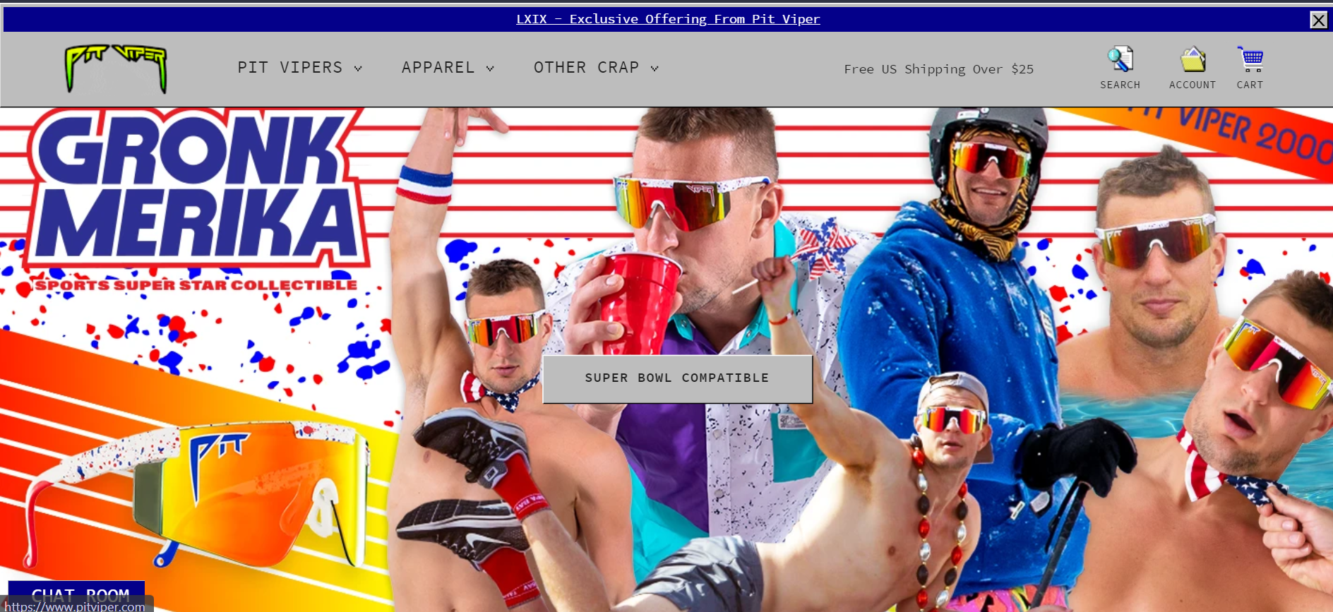
Each piece of microcopy is especially engaging. The buttons, messages, and little chunks of text all crack immature jokes.
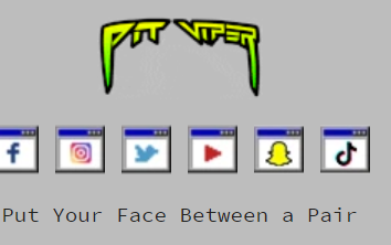
Most of these jokes are inuendos of some sort, catering to the party-going audience and breaking the tension surrounding buying expensive sunglasses. For instance, Pit Viper asks the visitor to “put your face between a pair,” clearly making an innuendo.
Even the prices have a punchline. Many products cost $xx.69 (another sexual innuendo).
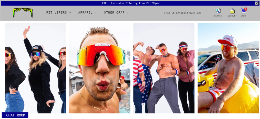
The copy pairs brilliantly with the images, featuring celebrities and models dressed up to party.
Everything about the content is unapologetically rude and fun. This casualness breaks the tension and encourages a purchase, all while building a brand. It’s brilliant.
Content score: 4/5
smokin’
![]()
Creativity
None can deny the sheer creativity of the pit viper website. At every turn, there’s some sort of unique, fun feature worth exploring, such as the “add a bunch of shit to my cart” button, which adds random items to your cart.
This creativity gives Pit Viper a huge edge. It’s particularly memorable in comparison to its competition, which opts for plain white interfaces.
This makes Pit Viper unique not only within its industry, but on the internet as a whole. It’s a weird website, but not easy to forget (in a good way).
Creativity score: 5/5
blazin’
The Results
- First impression: The tacky, dated design grabs your attention immediately.
- Design: It looks ugly on purpose, yet somehow works
- Usability: The navigation is jumbled, confusing, and unorganized.
- Content: The microcopy is fun, engaging, and well branded.
- Creativity: The website takes outstanding creative risks that set it apart.
Score: (4 fyreballs) smokin’
Who’s Next?
Seen a website worth reviewing? Or do you want to see your own website put to the test? Email us at [email protected].