The internet doesn’t need another flimsy blog post explaining that “voice assistants are the future.” We get the point. Alexa is really cool. What most of those posts don’t explain, however, is that voice assistants are changing how we build user interfaces. With the rise of the voice app, UI will never be the same.
So instead of ranting about how amazing voice technology is, we’re gonna cut straight to the point and explain how voice app UIs work. Because contrary to popular belief, voice app UI is very different than your run-of-the-mill visual mobile app.
But First…What’s a Voice App?
Remember Colossal Cave Adventure from the 70’s? It’s a text-based video game. The computer describes a scenario and you tell it what your character does in response.

Voice apps are pretty similar. They’re the same as visual apps, but they use speech to communicate. and they’re much more advanced than text-based video games from the 70’s.
Voice apps work the same way as traditional apps on the back end, but they use a voice UI instead of a visual one. Think about Amazon Alexa. You speak to it and it does things. Every time you ask it to run a skill, Alexa is running a voice app.
It’s an invisible, speech-driven UI.
No Visuals? Does that really count as UI?
Of course! The UI is just the user interface; it’s a tool for connecting a user to the app’s backend. Must that interface be visual?
Voice UIs don’t get as much credit as their visual cousins because they don’t feel like traditional UIs. Visual items–like screens and home screen icons–give traditional apps their “app-iness.” That’s why a non-visual UI doesn’t feel UI-ish.
In fact, most users don’t even think of voice apps as real apps. To the user, it’s just a neat add-on to their voice assistant. It doesn’t helpt that Amazon calls them “skills” and Google calls them “actions”–people just don’t think of voice apps as “real apps.
But don’t be fooled. Alexa skills and Google Home actions are very much full-fledged apps with unique, voice-driven UIs.
How do you even build a voice UI?
Building a voice app UI can be a unique, yet exciting challenge. Since voice UI doesn’t require any visual mockups, designers and engineers double down on the flow. Let’s break down each part of a voice app UI.
Step 1: Set the Setting
All great apps start with the audience, but voice apps take it a step further. Don’t just consider who is going to use your app. Consider where they’ll use it.
Are you building a navigational assistant? People will probably use it in their cars. Are you building a sleep timer? People will probably use it on smart home devices in their bedrooms. Are you building a fitness app? Some users will want to run it on their phone, but others may want to run it on their smartwatch.
Your audience, their setting, and their device are all equally important factors to consider when you start your next voice app.
Sometimes, the setting may not warrant a voice app. If you’re building a workplace app, no one will want to use voice. Similarly, few users will want to talk into their phones in public just to use an app. Voice apps are best for private settings with unreachable devices. Voice assistant? That’s great for driving! Alexa timers? Those are great for cooking!
But a voice app for grocery shopping? Maybe rethink the design so people don’t have to yell into their phones in the produce aisle.
However, the voice app’s setting is only a starting place. The next step is to build the UI piece by piece, starting with the trigger.
Step 2: Build the Triggers
Voice apps can’t process every single thing you say. Instead, voice apps only start processing your speech when triggered.
But how do you trigger your app?
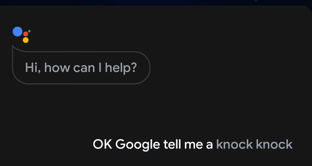
If your voice app runs on a smart home device, it probably starts listening after a voice trigger. It will listen for a certain word or phrase, like “Alexa,” or “OK Google” before it starts processing what you have to say.
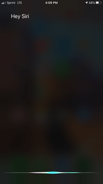
Many smartphones will use voice triggers, too. Siri will trigger when it hears, “hey, Siri:” and Android devices will trigger when they hear “OK Google.” But don’t forget that, unlike Alexa and Google Home, smartphones have other triggers, too. Google pixels trigger the voice assistant whenever the user squeezes the bottom half of the device. Apple iPhones can trigger Siri from the home/slide button.
So don’t expect every user to trigger the app in the same way. While one user may trigger it with “OK Google,” another may have that setting disabled to save battery life.
Still other triggers exist on still more devices. Maybe your voice app runs on a smart security system and triggers when the user walks past a security camera. Or maybe it’s triggered by an external event, such as a phone call. Consider the events that trigger the voice app to start running.
Step 3: Create Cues
Okay, the device has been triggered. But do the users know it’s listening?
Feedback is critical for any visual UI, but it is even more important for voice UIs–especially ones without visual components. For a voice UI to function properly, it needs lots of cues.
Entrance Cues
Alexa’s cues are mostly built-in. It lights up when it’s listening and makes a “boop-Boop” noise when it starts recording. Those cues instantly tell the user what’s going on.
But cues aren’t limited to smart home devices. Voice assistants have cues, too. Google voice assistant uses these small colorful lines not only to cue the user, but also to seem more friendly and personal.

Smartphones and smartwatches take it a step further. Often, they will briefly vibrate to tell the user that they’re listening.
If you can’t use visual interface elements to prompt a user, you need to use other strategies. That’s why non-visual entrance cues are so important.
But they’re important for more than the initial step. You may also want some cues while the user is speaking.
Feedback Cues
Should the user know what the device is picking up? Maybe it didn’t hear the words correctly. Feedback cues help.
Not every voice UI will have feedback cues. Amazon Alexa doesn’t have any. However, they can be a game-changer for smartphone voice apps.
When you talk to Siri or Google, it displays the words as it picks them up.
That feature is especially useful when you need to input information. If you’re asking for the device to pull up an address, you want to make sure that it picks up the name of the location correctly.
In other cases, audio feedback may be nice. For instance, your automated answering machine may ask for a customer’s name, then playback the sound file.
No matter the case, some sort of feedback cue may be useful.
Exit Cues
If you needed a cue to tell the user when the recording started, you probably also need a cue to tell them when it’s over.
Again, Alexa does a great job sending this cue. It makes a second “boop-Boop” noise and puts on a “pending” light show as it processes the voice.
Similarly, Siri will stop moving that flashy wavy banner on the bottom of the screen to indicate that it’s done.
Before sending any response, the voice UI needs to make sure the user knows that it’s processing.
Any cue–whether entrance, feedback, or exit–is critical for helping users grasp what’s going on. But cues are mostly determined by the devices. The heart of the app is the speech itself.
Step 4: Plan Commands
Here comes the hard part: commands!
Listening is hard enough for humans. How can you teach a computer to listen?
Even then, how can a computer extract that meaning and act accordingly?
That’s the hard part of any voice app UI. The computer has to understand the speech, pull out the important information, and make a decision.
So to understand commands better, developers break any voice command into a few pieces . . . using an example
Example: Ordering a Pizza 🍕
Let’s say you want to order a pizza on your smartphone.
“OK Google, order me a cheese pizza from Don’s Tasty Pizza.“
Seems informative, right? But how will a computer deal with it?
Intent 💭
The intent of a command is the vague goal that the user is trying to get across. Sometimes, intent can be a bit tricky to figure out. Let’s say someone asks about pizza instead of ordering it.
“OK Google, tell me about Don’s Tasty Pizza.”
The intent is a bit tricky. Does the user want the Don’s Tasty Pizza menu? Or does the user what to know if they do delivery? Maybe they want to learn about the rich history of the restaurant. It’s hard to tell. The app may need to ask for some more information.
But lucky for us, we’re working with an easier command.
“OK Google, order me a cheese pizza from Don’s Tasty Pizza.“
This intent is a lot easier to find. The user wants to launch the Don’s Tasty Pizza voice app to order a pizza. This is easy for humans to figure out, but a bit harder for computers. After all, these commands all have the same intent, but they each have different phrasing.
“Order me a cheese pizza from Don’s Tasty Pizza.“
“Gimme a pizza.”
“Launch Don’s Tasty Pizza.“
The app must be able to find the intent, no matter how the sentence is uttered.
Utterance 💬
As you may have guessed, utterance is how the command is phrased.
Some commands only have a few utterances. Most people ask a device to play music in the same way:
“Alexa, play Despacito.”
Of course, you can ask it to play music in different ways, too.
“Alexa, pull up Despacito on Spotify.”
However, most commands will stick to the transitive verb most associated with their intent (“play” the music, or “order” the pizza).
But that doesn’t mean you’re in the clear. A command still has lots of different phrasings. We’ve already discussed three possibilities that you need to prepare for.
“Order me a cheese pizza from Don’s Tasty Pizza.“
“Gimme a pizza.”
“Launch Don’s Tasty Pizza.“
Each of these commands has a different verb, so the app needs to be ready for a few different possible commands. Each variation needs to be built into the app. Otherwise, the UI won’t be very usable.
“OK Google, buy a cheese pizza from Don’s Tasty Pizza.“
“I’m sorry, Dave, I’m afraid I can’t do that”
“Uggh! OK Google, ORDER me a cheese pizza from Don’s Tasty Pizza.“
That would be very annoying. It’s just bad UX.
But even if the utterance is almost exactly the same, you can run into a few problems–especially if your app needs users to fill out voice forms.
Variables/Slots 🗃
Let’s assume that everyone orders pizzas with the same verb:
“OK Google, order...“
Even with a single verb the grammar can get crazy. That’s just how language is.
Let’s start with our primary example:
“OK Google, order me a cheese pizza from Don’s Tasty Pizza.“
In this example, the verb is ditransitive and the sentence ends with a prepositional phrase. That means has a direct object (the pizza), an indirect object (me) and a prepositional object (from Don’s Tasty Pizza).
Each object is a “slot” on a form, and your app needs to be careful with them.
When your voice assistant hears the phrase, “OK Google, order...“, it will want to put all the order information into a form. Here’s a very rudimentary demonstration of how the app would save that information:
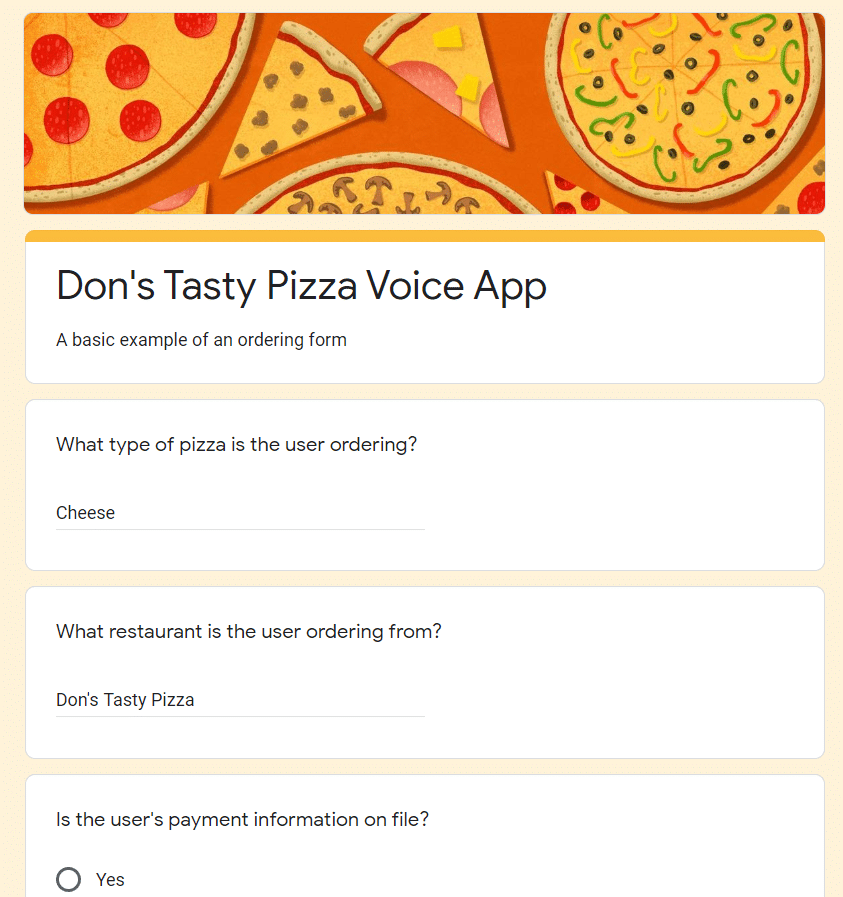
The app extracted the important details and plopped them into this form. So far, so good.
But what if a user is less detailed?
“OK Google, order from Don’s Tasty Pizza.“
The form won’t be complete!
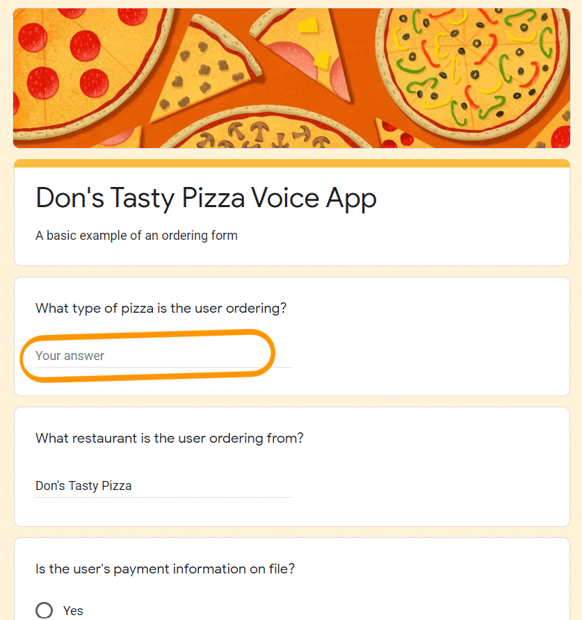
To finish the order, the app needs to prompt the user for more information. Problem solved!
But depending on which slots are full or empty, you’ll need one hell of a dialogue flow.
Step 5: Write a Dialogue Flow
Visual UIs flow from one screen to another. Input is limited to what you allow.
But voice app UIs are messy. That’s because all input is language, and language is always messy.
Disagree? Let’s look at the flowchart. Your standard flowchart will look something like this one we made for ZINKN:
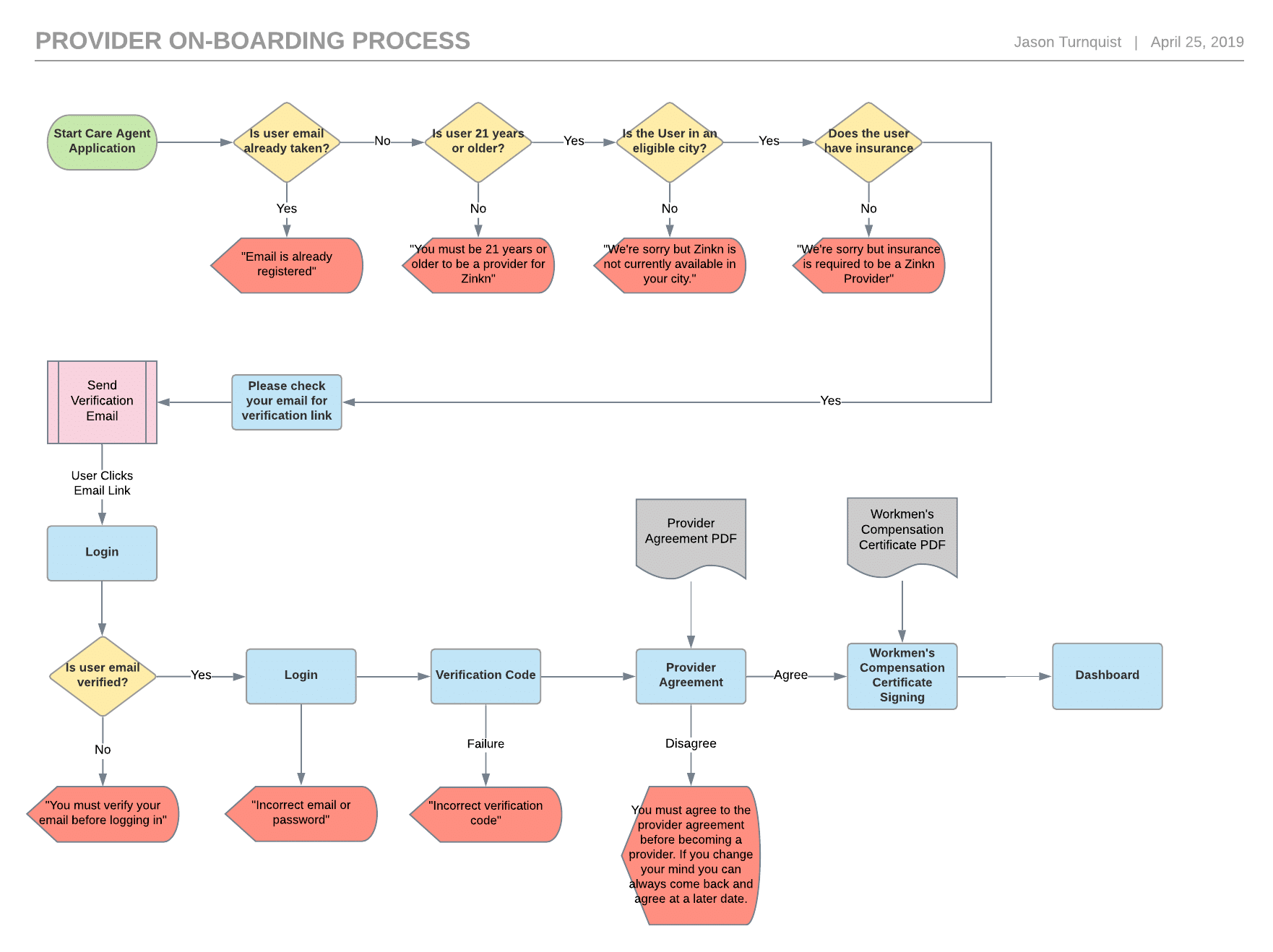
Those red arrows send you back, those yellow diamonds ask a question, and those blue boxes require some sort of input–you can learn more about the spec sheet and wireframe process in our blog post.
Notice how much the order impacts the flow?
Imagine how much more complicated things are when users weave information into syntactically-complex sentences.
Every user will speak a command differently. Each one will use different verbs and different function words in different orders, so decoding that language with code is a mess.
How Dialogue Changes the Flow
Let’s look at our pizza example again.
“OK Google, order me a cheese pizza from Don’s Tasty Pizza.“
Which slots get filled out on the form?
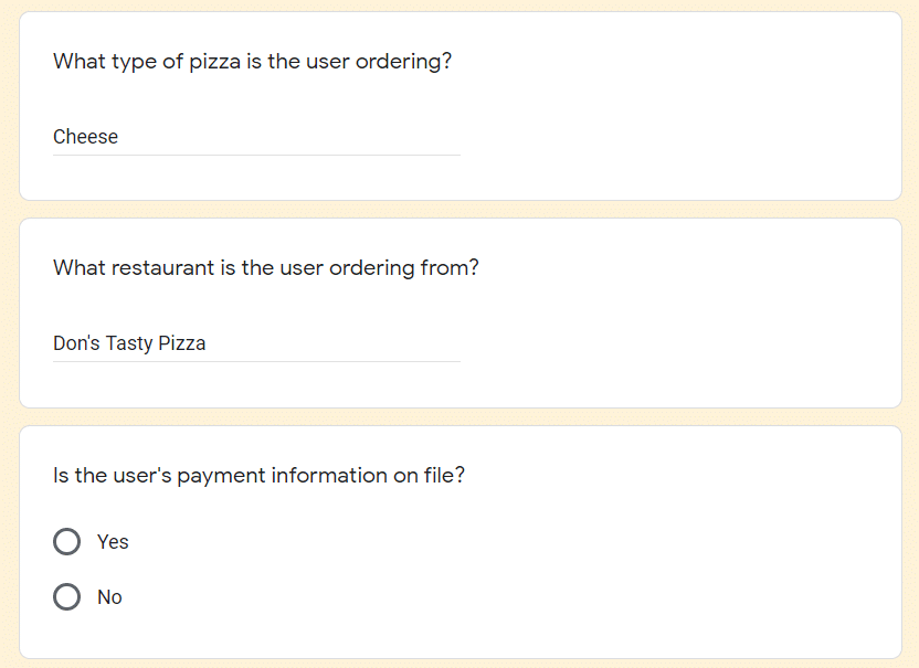
Great! The app knows the order, but it still needs the payment information, so the next step on the flow should be to request more information.
“Sure! I’ll prepare your order. How would you like to pay for your order?”
Of course, asking a user to read their credit card number to a machine is terrible UX. You’d probably want them to input their payment info during setup so the app doesn’t even need new info.
However, this is just a demonstration of an important point: users leave out info when they speak, so your app needs to prompt them for the missing information.
They also leave out different information in a different order. What if the user leaves out the first slot on the form?
“OK Google, order me a pizza from Don’s Tasty Pizza.“
The order isn’t complete! The customer still needs to input their pizza preferences.
That means that the dialogue flow will look a little different. After all, the app needs to prompt for different information each time it’s left out.
In the end, voice apps have much longer flowcharts. Here is a brief example from Topal of what a single dialogue flow may look like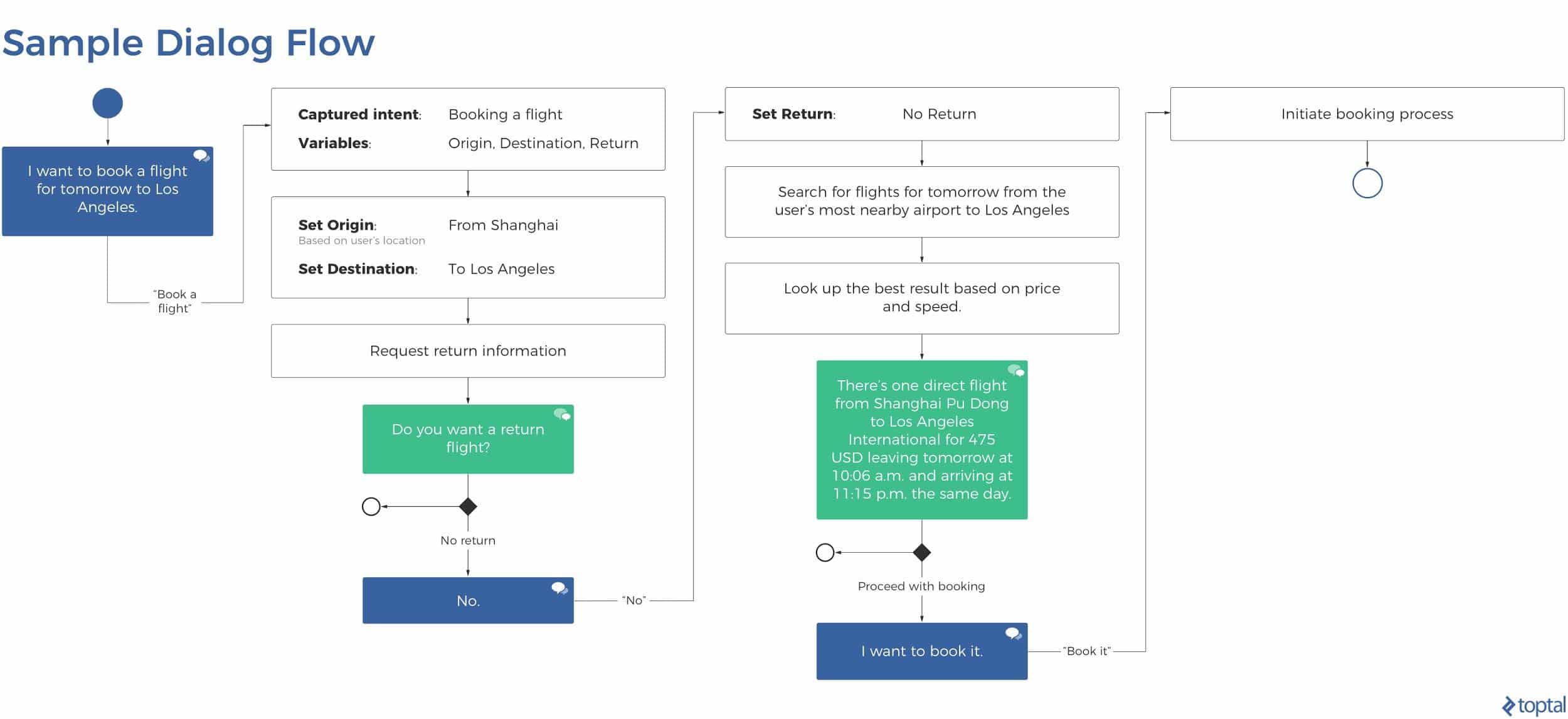
This diagram is less complicated, but remember: it only shows one possibility. If a user includes or leaves out certain slots, the results will differ.
Once you have the dialogue flows down, you need to make your responses less robotic. The machine should sound human. Here’s how:
Step 6: Refine Your Responses
Once the commands are in and the cues have been given, the last step of the voice app UI is to respond.
Responses are some of the most important, yet most overlooked pieces of voice app UI. Developers tend to focus so much on getting the input right that they don’t realize how out of place their responses feel.
To keep your responses useful and human, follow the four Gricean Maxims of effective communication. To demonstrate each maxim in action, let’s use an example:
You want to launch Don’s Tasty Pizza, so you say,
“Alexa, launch Don’s Tasty Pizza.“
Alexa responds,
“Okay! Launching skill…”
But nothing happens. What do we do? And how can we give the user feedback through the voice UI to make this scenario less scary?
Maxim of Quality 🦾
where one tries to be truthful, and does not give information that is false or that is not supported by evidence
Start by making sure the feedback being given is correct. Let’s see what Alexa said…
“Okay! Launching skill…”
But nothing happened. Did an error occur? Why didn’t Alexa say anything?
Alexa violated the Maxim of Quality. It had trouble launching the app but said that it launched the app, anyway. That’s bad design.
So you turn to your programming team and ask for a new bit of feedback that explains what went wrong. You get this in return:
“Your Amazon Alexa cannot reach the skill’s endpoint in which you have requested because your SSL settings prevent it from connecting to non-Lambda functions.”
Okay, so the users know that something went wrong–that’s good. The Maxim of Quality has been satisfied because all the information is true. But this feedback is still pretty horrible. To make it better, we’ll need to move to Step 2.
Maxim of Quantity 📚
where one tries to be as informative as one possibly can, and gives as much information as is needed, and no more
For step 2, include exactly as much information as you need. Let’s revisit the example.
“Your Amazon Alexa cannot reach the skill’s endpoint in which you have requested because your SSL settings prevent it from connecting to non-Lambda functions.”
This error has too much information. Let’s cut some out.
“Error”
Oops! We cut out too much information! Remember: the Maxim of Quantity says that you need to add the right amount of information. Be careful not to cut out too much!
“Your Amazon Alexa cannot reach the skill’s endpoint in which you have requested because of your SSL settings.”
That’s better! However, it’s still pretty impersonal. Let’s go to Step 3 for more improvements.
Maxim of Relation 🤝
where one tries to be relevant, and says things that are pertinent to the discussion
Keep things relevant. Again, this point seems really obvious, but poor voice UI will noticeably lack it.
Relation is especially important for longer exchanges. If there’s lots of back and forth, make sure each point is related to the previous one so the user can follow along easily
This point is hardest to achieve without a solid understanding of the user’s intent. Don’t respond only to keywords, and if the intent can’t be drawn from the sentence, ask them to try again.
Let’s look at our example again:
“Your Amazon Alexa cannot reach the skill’s endpoint in which you have requested because of your SSL settings.”
How much of this is relevant to the user? Would your grandmother care about endpoints or SSL? Tone it down a little.
“Your Amazon Alexa cannot reach the skill in which you have requested.”
That’s better, but it’s not great.
Maxim of Manner 🗯
when one tries to be as clear, as brief, and as orderly as one can in what one says, and where one avoids obscurity and ambiguity
The feedback your app gives isn’t as important as how it gives it. Make sure every single sliver of feedback is completely clear to the user.
Here’s where we left off:
“Your Amazon Alexa cannot reach the skill in which you have requested.”
That’s pretty clear, but it can be clearer.
Remember: voice apps need to be personal. If the manner of your feedback isn’t personal, how can your app be?
Let’s try something more conversational:
“I’m unable to reach the requested skill.”
That’s much better, and it does everything it needs to in a concise package. That’s where Amazon stops, but it helps to go a bit further.
“Sorry, I can’t reach the skill you requested. Want me to try again?”
This final edit does a few important things: it…
- takes ownership of the mistake.
- makes the manner clearer and more conversational.
- offers a natural next step on the dialogue flow.
Don’t leave your user stranded. Guide them through the app with voice.
The Rule of Thumb 👍
Treat every bit of feedback like a page on a mobile app. If you plop a user onto a page that says “error” without a back button or any sort of interface, they won’t be very happy. The same goes for voice UI. Make it usable.