 Reed Steiner
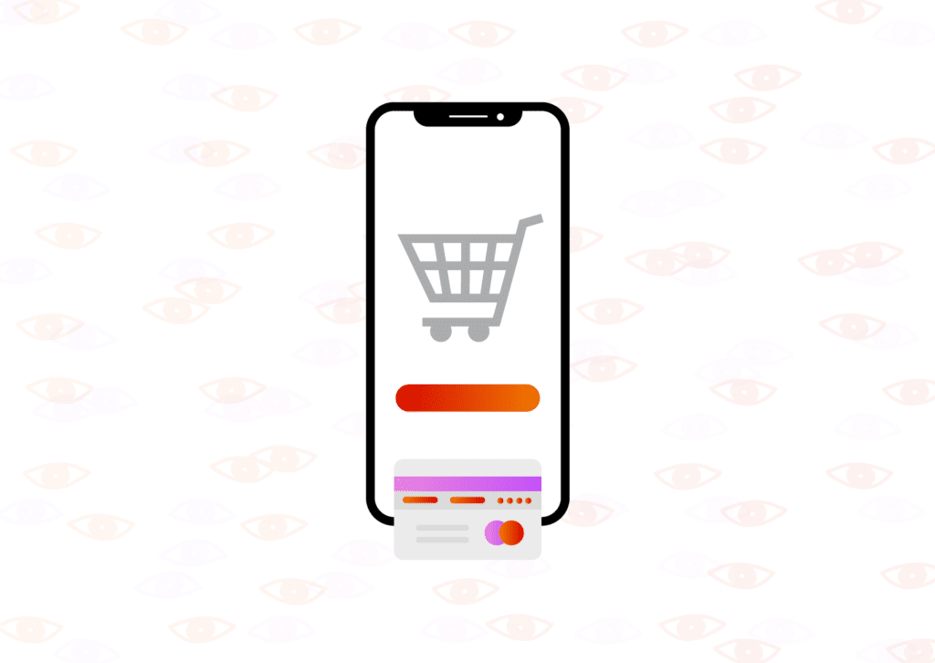
Traffic isn’t everything. Countless users could be perusing a website, but if they leave immediately, sales will stay the same. How does a skilled merchant keep people on their eCommerce website longer?
It’s a tricky task, but with the right strategy, any merchant can keep customers on their site longer. But first, they need to know why it’s so important to make sessions as long as possible.
Why It Matters
Does it matter how long people stay if they keep on buying anyway? So what?
Actually, session length has a significant impact on eCommerce sales. Not only will visitors buy more if they stay longer, but they’ll also come back for seconds! Here are just a few of the reasons you have to keep people on your eCommerce website longer.
Sales
Every extra second a user engages with your content makes them much more likely to buy. This makes sense: people who stay longer have more chances to work their way down a conversion funnel.
But it isn’t just conjecture; the trend is visible in the data. Look at the Google Merch store’s analytics. Excluding function pages like “check out” and “review order,” the pages that make the most money usually have longer sessions.
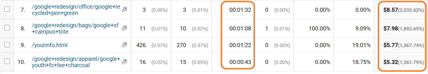
There are a few exceptions that have short sessions and high value (such as “Google keychain 19”), but they also have lots of entrances. That means people entered the website already knowing they wanted that merchandise. When new customers explore the website, they were much more likely to buy when their sessions were longer.
The longer they stay, the more likely they are to buy. But sales isn’t the only metric that improves with longer sessions. Websites rank higher, too.
Ranking
If people stay on a website longer, it ranks higher on Google searches.
That’s right! There’s a metric called “Avg. Time on Page” (known colloquially as dwell time) that measures how long people stay on a page (not to be confused with bounce rate). It’s even featured prominently on Google Analytics.
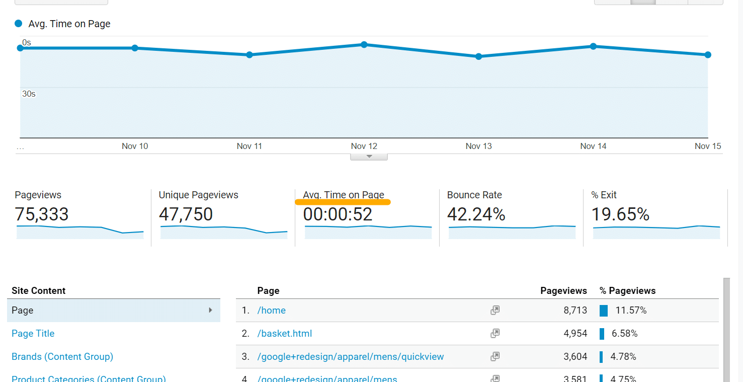
When people stay on a page longer, the website will creep closer to the top of the google search, which means more sales for the business.
Return
One-time purchases aren’t enough. For a business to thrive, customers should come back over and over again.
Longer sessions can help. If people spend more time on a website, they’ll become more loyal and return frequently to buy more goods. Of course, correlation is not causation: long sessions probably don’t make people return. However, if people are engaged, they will come back, and session length is a great indicator of engagement.
And what does engagement do for a site? It builds more sales over time. Shopify illustrates this with a graph: just a little bit of retention builds a ton over a long period of time.
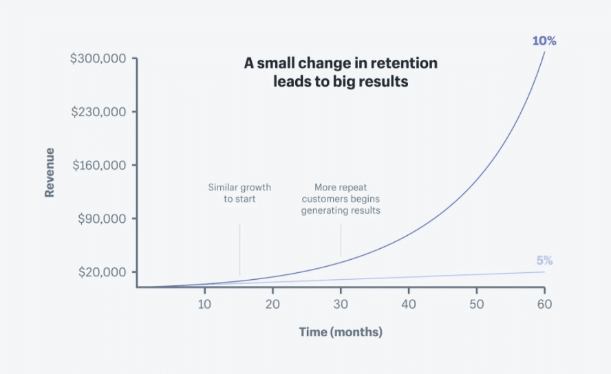
See? Retention is killer, and longer sessions can indicate customer loyalty.
Whether a business needs more sales, better rankings, or more loyal customers, engaging people longer is the solution. Here are a few ways to do it.
How to keep people on an eCommerce site longer
- Fix it above the fold
- Add some discount popups
- Retarget
- Redo your navigation
- Call them to action
1. Fix it above the fold
Want to keep people on the website longer? Start with the first thing they see.
Web designers call it the fold. It’s that part of the website that customers see before scrolling down. A lot of the time, the fold isn’t engaging. It’s ambiguous, clunky, or just plain ugly. Merchants should consider making the fold cleaner, more engaging, and prettier.
However, business leaders can’t just jump into it. No one wants to spend time and money fixing the fold if it ain’t broken. Instead, use this detailed website redesign guide that we wrote on The Manifest. It details how to use analytics and data to make your website more engaging, not just prettier. For instance, our website originally looked like this above the fold.
It’s not bad. The website has a good header, a clear call to action, and a hefty chunk’a text. This original landing page wouldn’t work for everyone, but based on demographics and analytics, it was pretty solid.
However, the Fyresite team wanted to make it more engaging. Here’s what it looks like now.
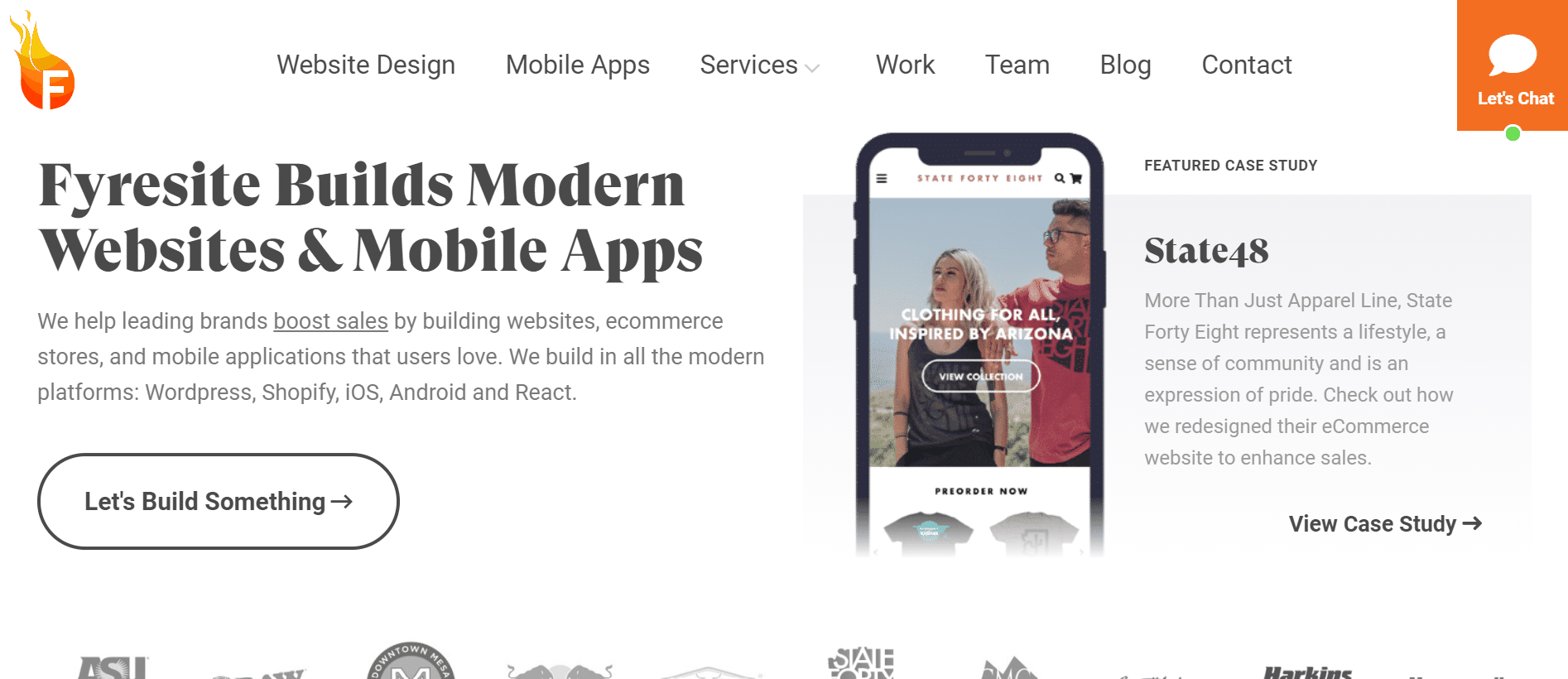
Yes, it’s clearly a different design, but there’s a lot more engagement strategy than meets the eye. There’s still a hero message with summary text and a call to action, but the navigation is clearer, the call to action has more personality, and the logos encourage scrolling. Plus, the chat bubble and featured case study each offer multiple user journeys to engage different types of users.
To keep people on a website, the most engaging content should go above the fold.
This works especially well for eCommerce. For instance, take the Partake Foods website.
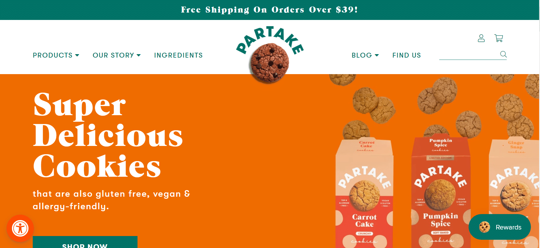
They, too have lots of engaging content above the fold. They have engaging product and packaging shots with a clear call to action, great navigation, and a great discount to encourage shopping. This landing page makes you want to stay longer.
Simply making a landing page more engaging keeps people on a site longer, which yields all the tasty, juicy benefits. But sometimes, the landing page isn’t a problem. If that’s the case, try some deals instead.
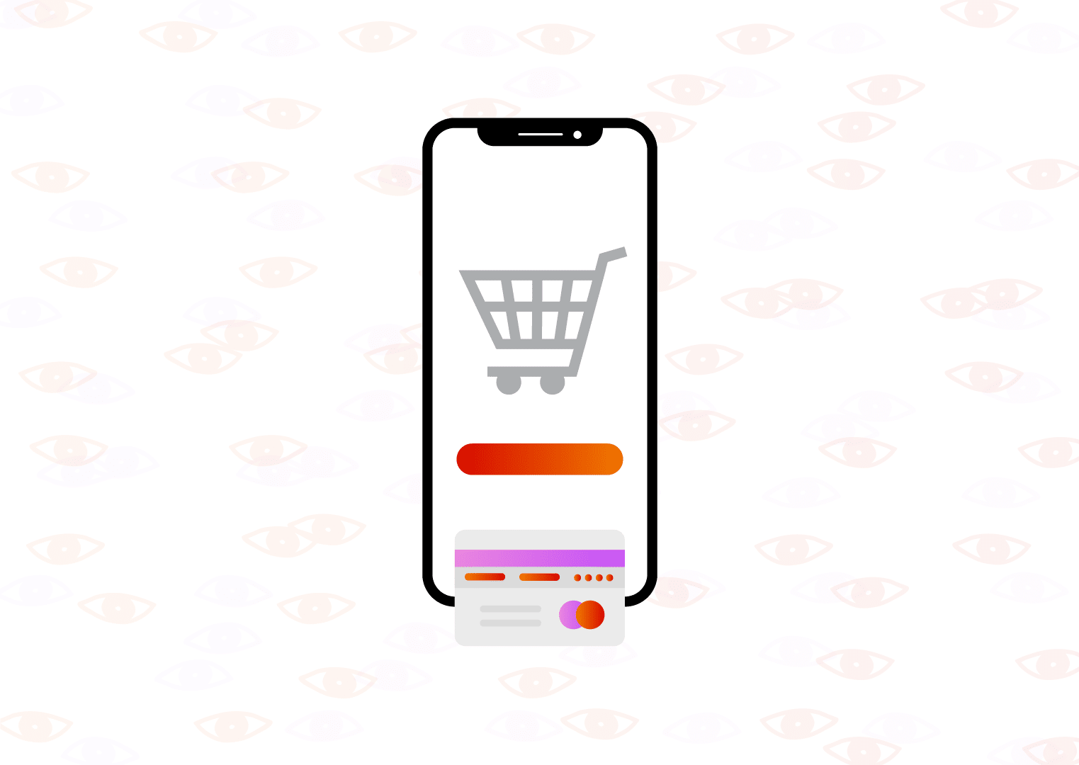
2. Add some discount popups
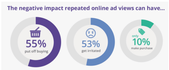
Popups keep people on your website longer? How does that make sense?
Well, if they’re annoying popups, no one is going to stick around. Instead, focus on popups that get visitors excited and keep them engaged.
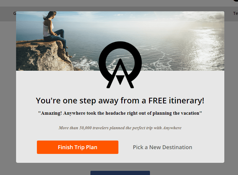
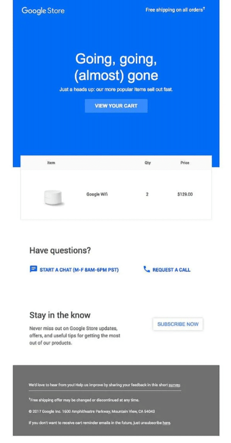
For instance, this popup nudges users to continue their transaction if their cursor gets too close to the exit button.
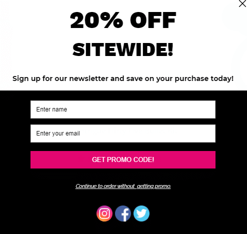
An even better option may be the coupon popup. These popups incentivize people to shop around a bit more, which gets them to linger and boosts sales. Here’s one Fyresite built.
Or alternatively, you could do something a little more branded and unique
The biggest advantage? Analytics. When people use the coupon, merchants know exactly where they came from, which gives the seller a really good idea of how well changes are working. Plus, users give their contact information, so even if they leave, sellers can stay in touch. These efforts significantly increase not just the time on the website, but also the value of each second.
But what if people leave the website anyway? Don’t worry! Try retargeting.
3. Retarget
Retargeting gets the people who left too early back onto a website. It’s one of the most effective ways to keep people around.
Retargeting is aiming ads at people who’ve had some sort of experience with the brand before. Maybe they put an item in the cart, but left. Or maybe they interacted with an ad, but left the site. No matter the story, retargeting works.
Skeptical? Makes sense. Bad retargeting is often pretty annoying, and most users get frustrated.
However, it’s important to remember that there’s a lot of variabilities. When sellers retarget enough to get a customer’s attention, but not enough to annoy them, the customer has a pretty solid chance of coming back. In fact, retargeted ads yield 10x higher conversion rates! Since when has it been wise to turn down such high yields?
This includes cart abandonment strategies. If someone leaves a website with an item in the cart, a simple email may be the push they need to come back, linger, and buy.
While these strategies don’t technically increase the length of a single session, they do increase the total time users spend on a website, and they may be the push a seller needs to make some extra money.
4. Redo your navigation
Have a high bounce? Navigation may be the issue.
Even web designers mess up navigation. Many rely on the three-click rule: any part of a website should be accessible in three clicks.
This isn’t true.
Look at this NYC website. All pages are accessible in three clicks, but the final page is a list of links.
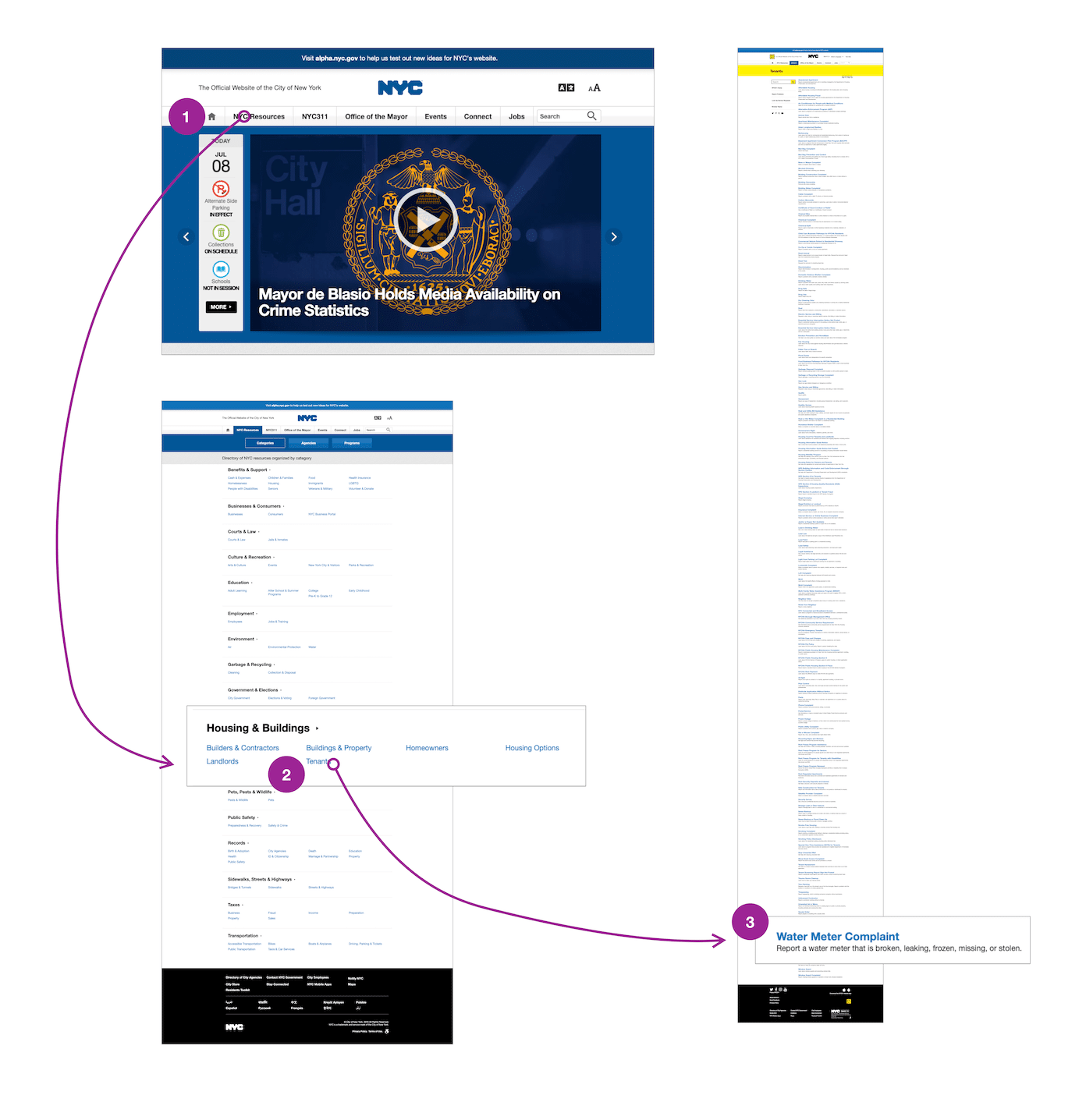
The user interface is horrible, and people will leave the website. It follows all the rules, but it’s not good design. A four-click path breaks the rule, but significantly reduces the number of people that leave the site.
But how can a businessperson know what to do? Read our website redesign guide for a data-driven strategy.
5. Call them to action
Time on site is nothing without action. Instead of merely increasing the time on site, focus on ways to convert.
Conversion is one of the most talked-about topics in all of SEO and tech. Here’s the jist: each page should have at least one call to action. When people are done reading a chunk of text, the seller should have convinced them to take the next step.
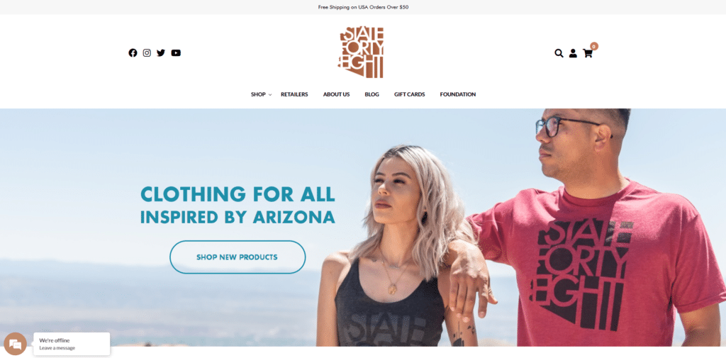
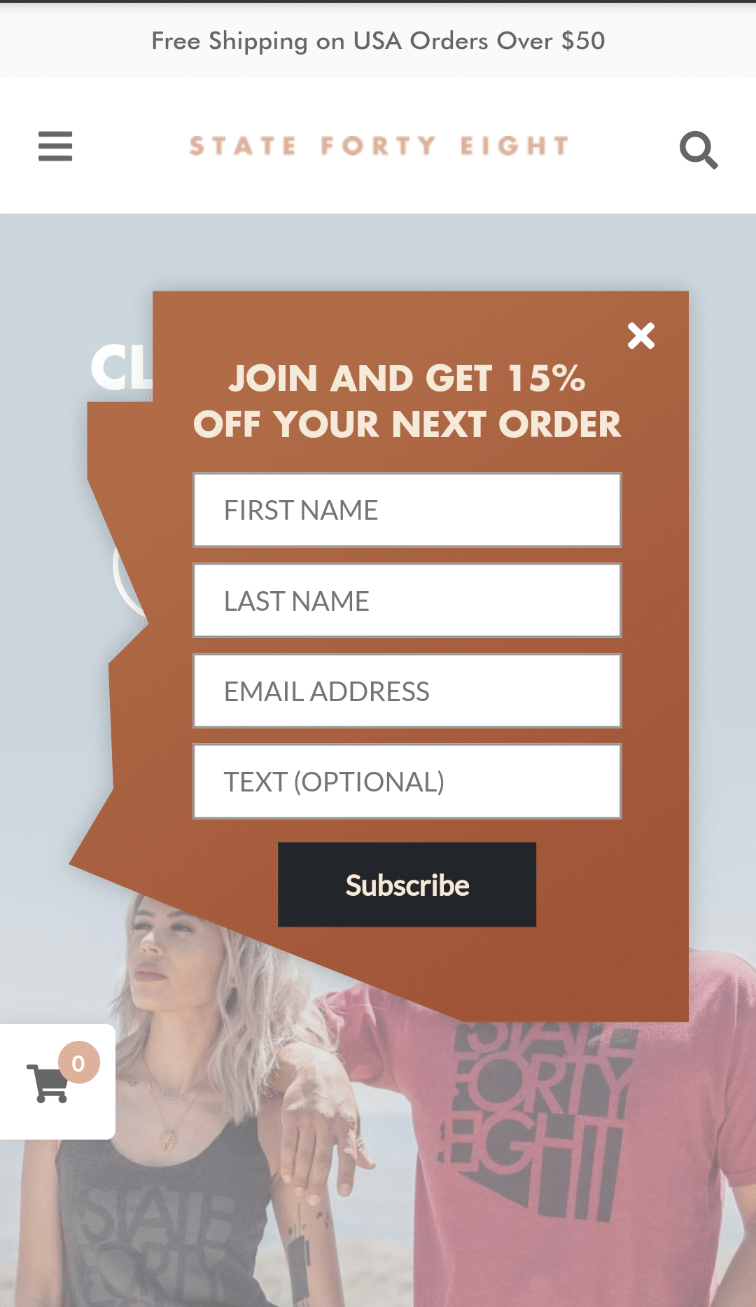
In eCommerce, that call to action is a product page, at least for most eCommerce sites. State Forty Eight, for instance, has a large “shop new products” button on the landing page.

These buttons make a huge impact on sales. Often, people want to learn more about a product or service. Adding a button just means they don’t need to dig for it. If you want to redo your eCommerce website for better c2a’s, learn about our eCommerce services and give us a holler.
What’s next?
These strategies are extremely effective, but only if sellers use them right. Bad popups are annoying and scare people away. Bad retargeting is a waste of money. If a merchant makes one mistaike, all the effort will go to waste.
To get the most bang for your buck, find a team that’ll keep your customers coming back for more. We’ve been building the best eCommerce sites for ages, and we’re thrilled to make visitors stick to your website like glue. Reach out today to see what we can do for you.