Apps don’t come with an instruction manual, and they don’t need to. Before users even install the app, they know how it should work. But does your app fit their mental model?
This post is part of a 9-part series on UX psychology. Read the next post on Hick’s Law.
What is a Mental Model?
Too many articles and blog posts use lengthy and hard-to-follow definitions, so let’s keep things simple. A mental model is an idea about how something is supposed to work. Think of it as a subconscious instruction manual. Every time you use an app or website, you rely on your mental model to guide you.
For instance, whenever you load a new website, you rely on your mental model to figure out how to use it. Let’s say you load up our website. What do you do?

Did you click the “View Work” button? That’ll take you to this page.

Or did you decide to scroll down? That choice will take you to this content.
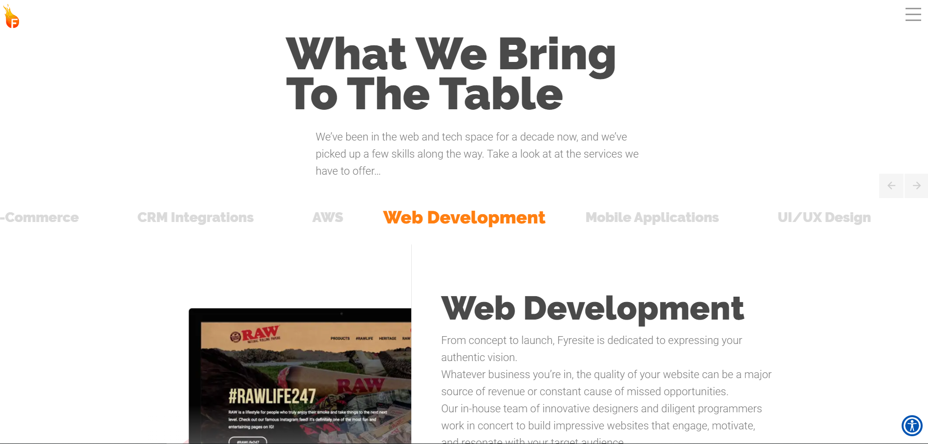
Or maybe you decided to click the hamburger menu icon. That decision will take you to this menu.
Here’s the takeaway: your past experience with websites gives you a rough idea of how they work. So whether you chose to scroll down or click a button, you were sure that it was the right choice.
More importantly, you knew that mashing the “L” key wouldn’t do anything. Why? Because you have a mental model of how websites are supposed to work.
So What?
Here’s the big takeaway: mental models exist, so don’t fight them. If the only way to navigate your website is by repeatedly clicking the “L” key, no one will use it. Even if L-based navigation is super useful, users will hate it because they are not used to it. Make your UX reflect what users know. Here’s how to get started:
Research, Research, Research!
UX design without research is just UX guessing. Always start by researching users to figure out their mental models. We like to map user behavior in a workflow. Here’s what our ZINKN App workflow looked like.
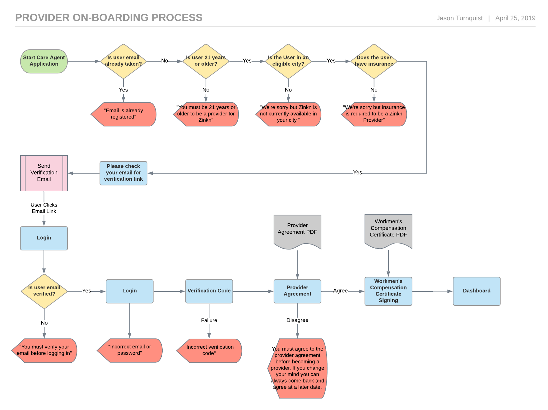
This step is crucial for designing human-centered UX because it captures their mental model in a visual format. That way, we can build the app from the ground-up around a behavioral skeleton. The results speak for themselves; ZINKN is intuitive and fits the user’s mental model perfectly.
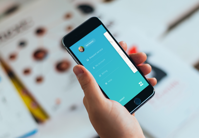
It’s even more obvious when a UX designer doesn’t do their homework. Users never agree on how to use anything, so if users universally decide that a feature is inconvenient, the designers probably didn’t do good research. After all, mapping out mental models just a bit would prevent those problems from rising in the first place.
Check out this awesome UX Planet post on UX research.
Go With the Flow
UX should be unique, but not too unique.
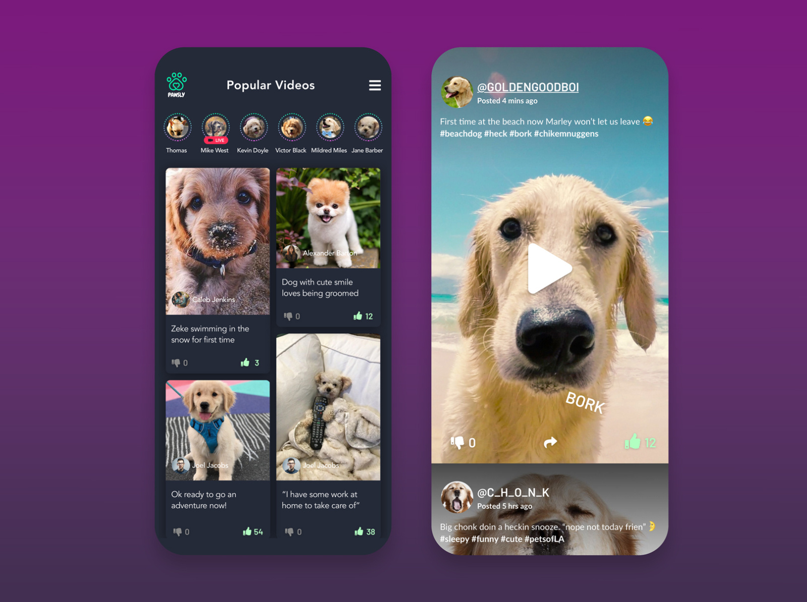
Mental models are usually based on the user’s experience with other apps, so don’t go too far from the standard model. If you’re building a social media app for pets, structure it like a social media app.
If you do deviate from the normal mental model, tell the user. That’s what Growth.Design does. Their case studies are supposed to be navigated with arrow keys. Most users expect to scroll down–that’s what their mental model tells them to do. To prevent the user from becoming confused, Growth.Design includes a large, friendly graphic of a finger hovering over an arrow key.
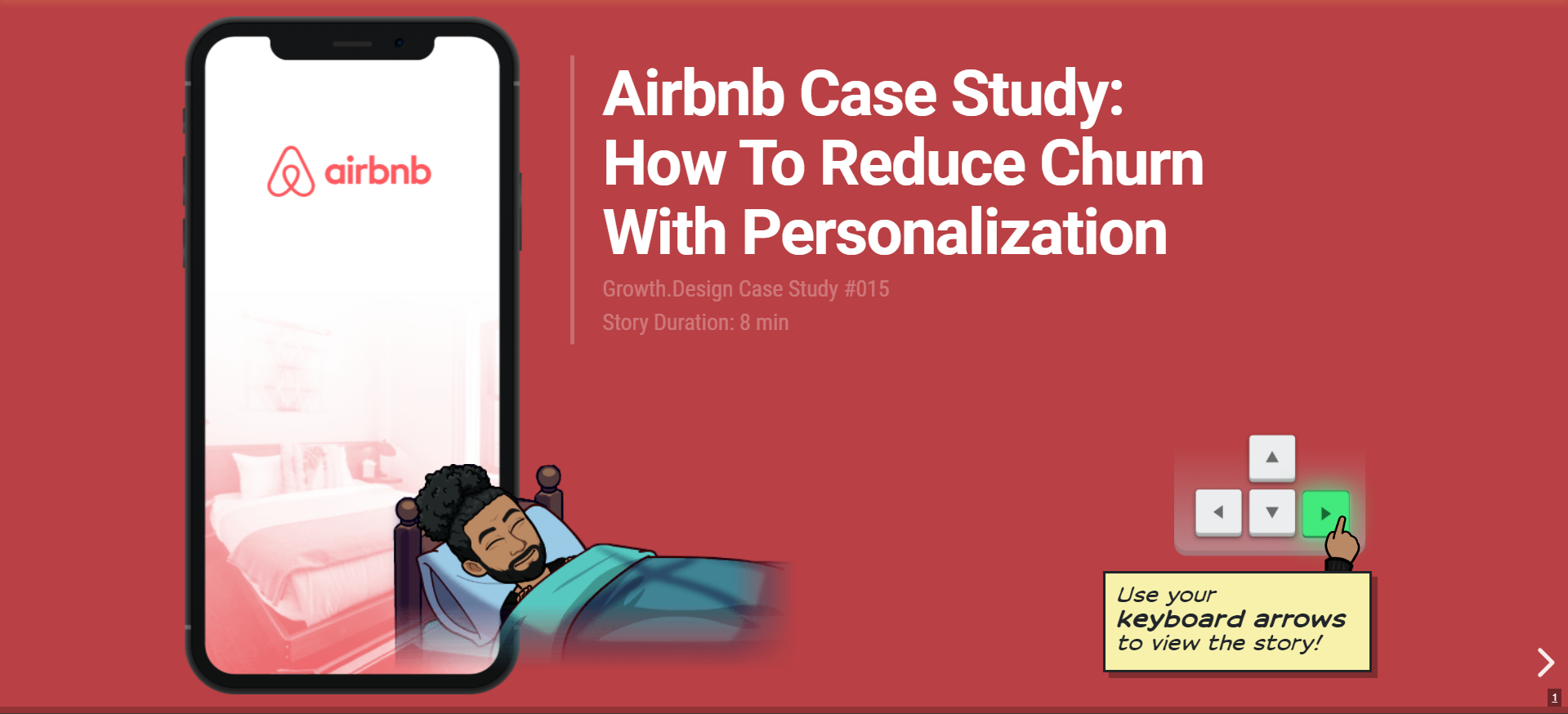
This bit of information is super important. Without it, users will be stuck on the first page. Never assume users can figure out how to navigate an app if you don’t tell them–especially if your navigation isn’t effortless.
Look for Inspiration
Things get a little bit trickier if the app you’re making is so one-of-a-kind that nothing like it exists. Your users will still have pre-existing mental models of your app, but they will all be wildly different. One person may expect an uber-like interface, while another may expect a netflix-like one. To prevent them from doing two separate things with your app, guide them through it with good design.
Another useful to consider strategy is skeuomorphism: a fancy word for “making apps work like real objects.” The calculator app, for instance, is skeuomorphic. It looks like and functions like a real calculator.
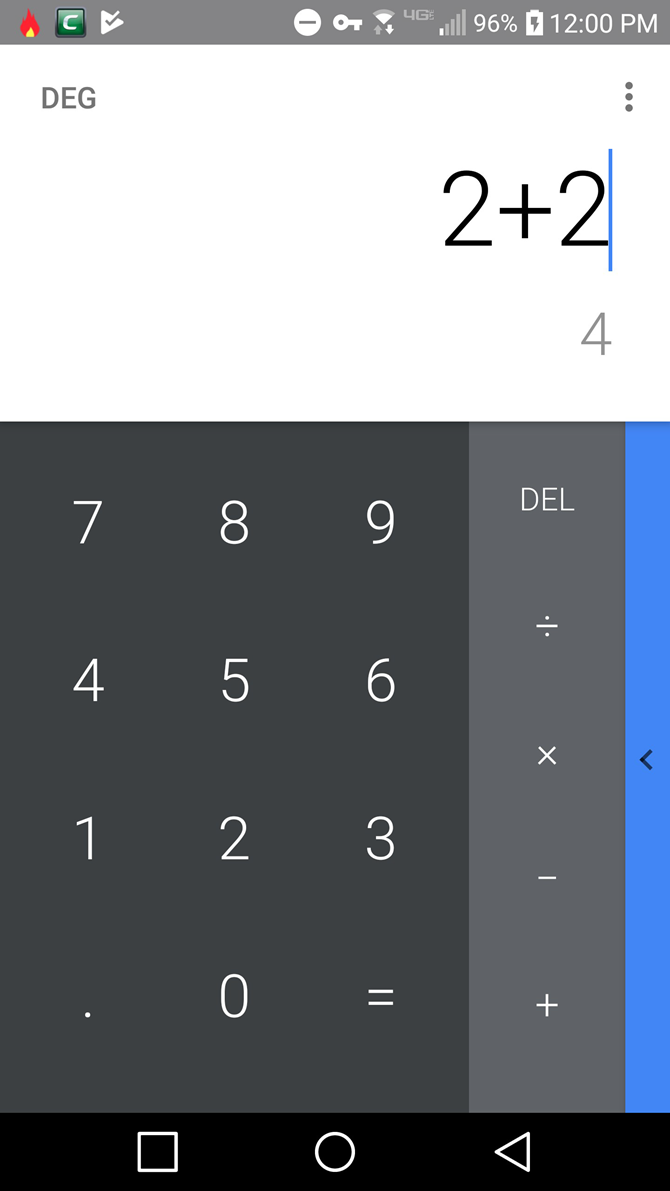
But skeuomorphism doesn’t work in most cases. Apple’s Bookshelf app, for instance, doesn’t look very good.

Instead, try making new apps function similar to real-world objects. A computer desktop, for example, functions in a similar way to a real desk. It isn’t identical, but it’s familiar enough that people can guess how to use it.
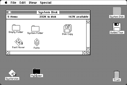
The point is simple: make your app familiar. Otherwise, their mental model won’t line up with your UX, and that’s your problem.
Don’t Be Evil
Mental models are best for teaching people how to use an app. However, they have a much more sinister side.
In fact, these models are so powerful that users can be tricked to do things they don’t want to. This trickery, of course, is unethical, but nefarious designers do it all the time, anyway.
Microsoft is notorious for abusing mental models. In 2016, they switched the “cancel” and “upgrade” buttons. Even worse, they made the “X” button function as an agree button.

A user’s mental model tells them that “X” means close and that the small text means “cancel.” However, Microsoft abused this model to trick people into upgrading.
Once you realize that users have strong, built-in instructions for using apps, it becomes much easier to design around them. Just do your research to learn more about these mental models and you should be fine. Want to learn more about designing apps around mental models? Reach out to one of our designers and let them know what you think.
 Eric Daily