 Reed Steiner
As with criminal defense attorney websites, injury attorney websites aren’t easy to pull off. Lawyers and law firms need to appeal to clients of many backgrounds. They must generate leads, but not be too forceful with popups. Like the law itself, injury attorney websites are a careful balance, but some websites pull it off beautifully. Check out these top injury attorney websites to inspire your next project.
Know what really makes an attorney website good? Check out Fyresite’s guide to building profitable attorney and law firm websites.
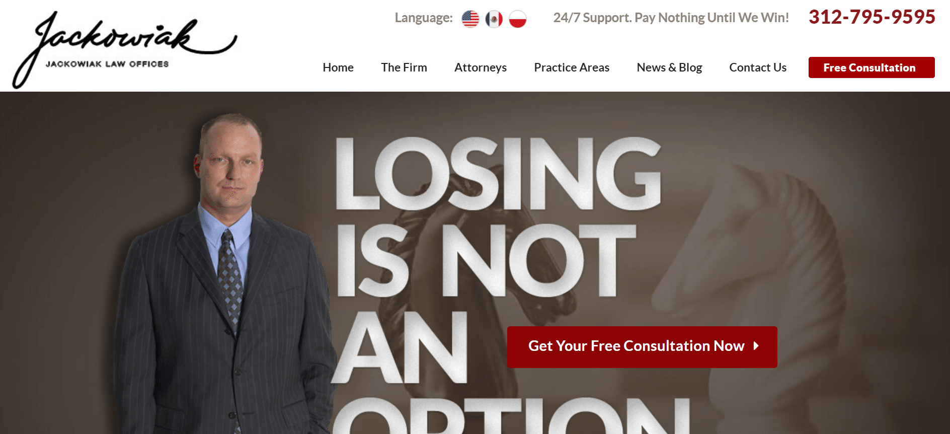
1) Jackowiak Law Offices
The Jackowiak law offices website should be the model for injury attorney websites. It has bold branding, a personal face photo, memorable copy, and multiple calls to action that lead to segmented service pages. Every pixel serves a purpose. Injury attorneys should follow in their footsteps.
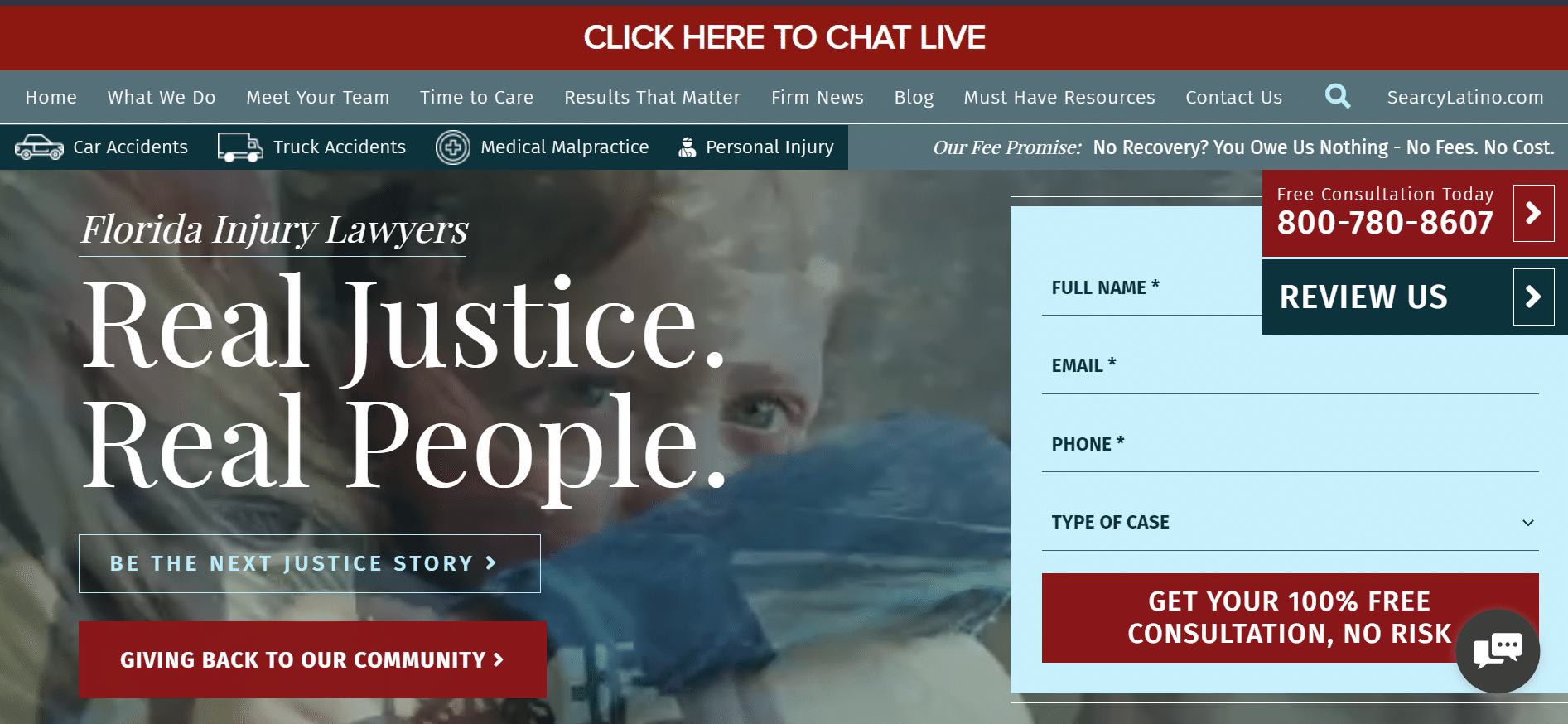
2) Searcy Law
This website isn’t perfect (it has too many popups that overlap), but the core website is especially strong. It has a strong, people-focused brand propped up by videos, several calls to action, and segmented services. The featured video is especially strong and abstract. With a few tweaks to popups, it could be perfect.
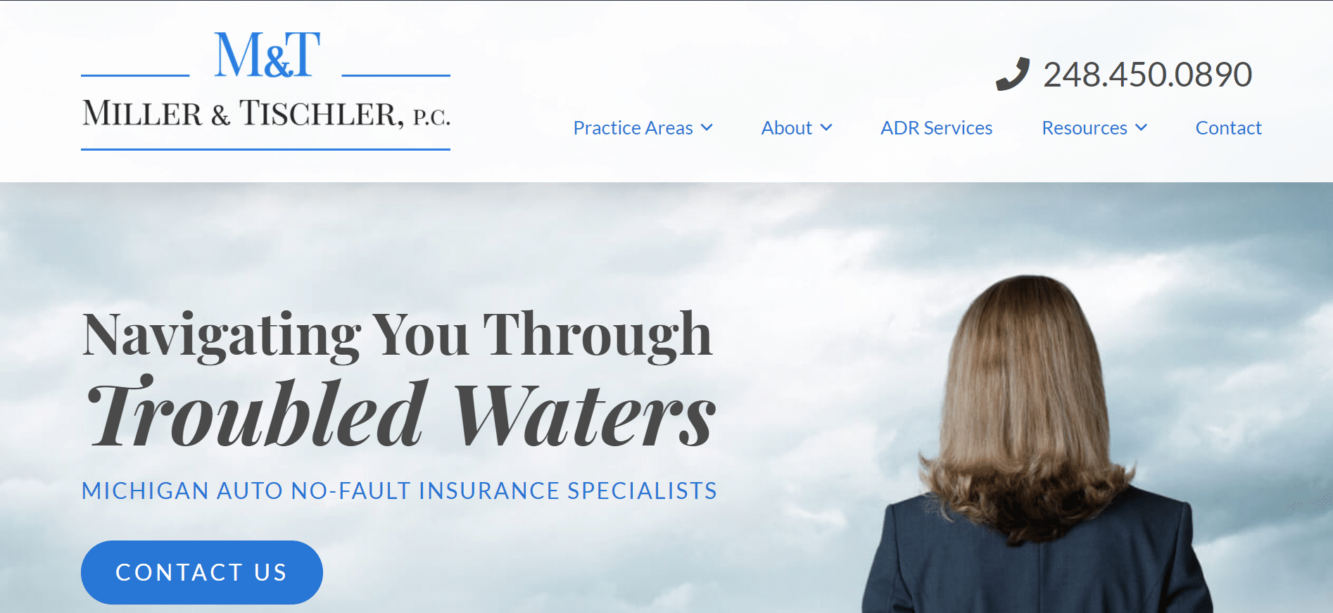
3) Miller & Tischler, P.C.
This injury attorney website stuns with its classy simplicity. It uses strong shark branding, a neutral blue color scheme, and strong navigation to make the site memorable and help users find their way around.
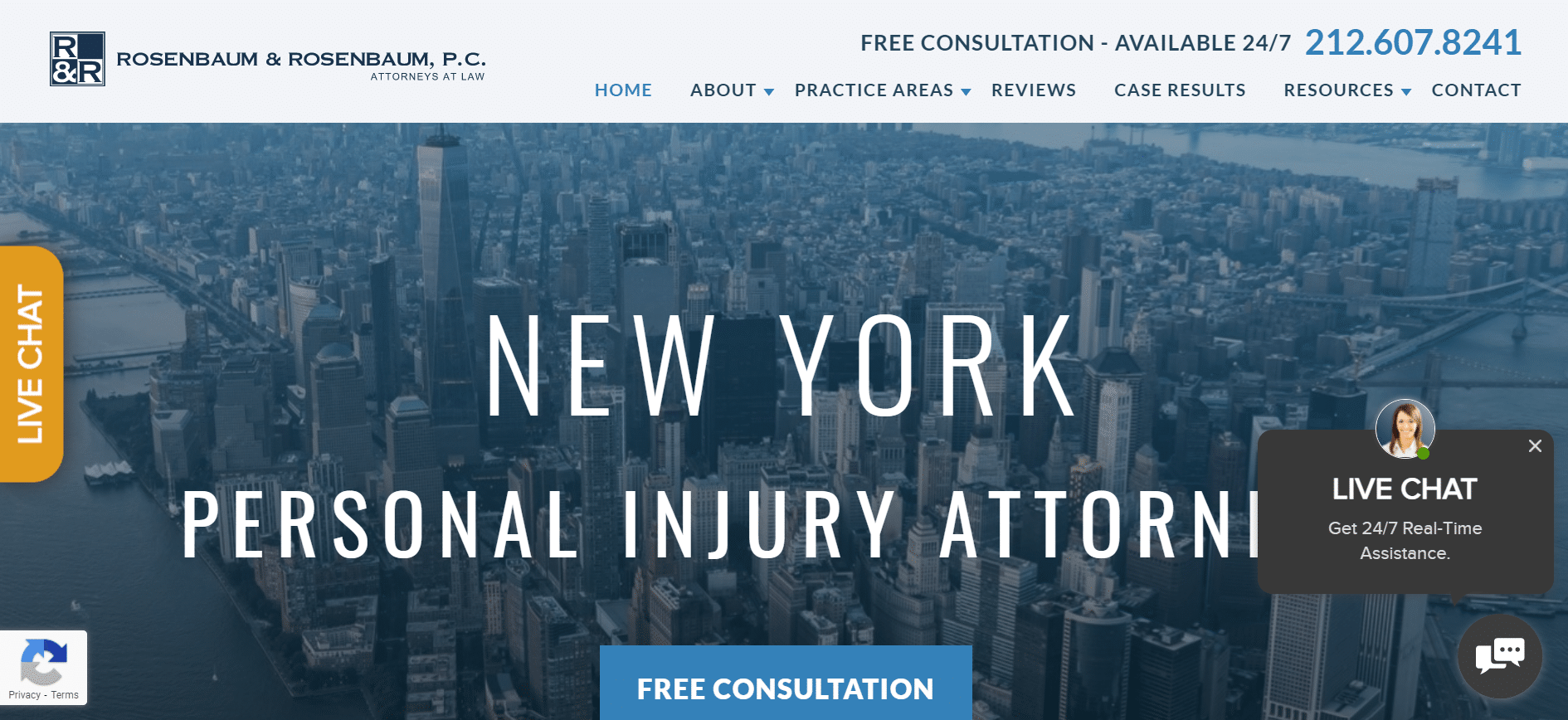
4) Rosenbaum & Rosenbaum, P.C.
Talk about social proof! Rosenbaum & Rosenbaum lists million dollar award values and the cases they’re attached to. With an overall solid design, it’s a great website for a great personal injury firm website.
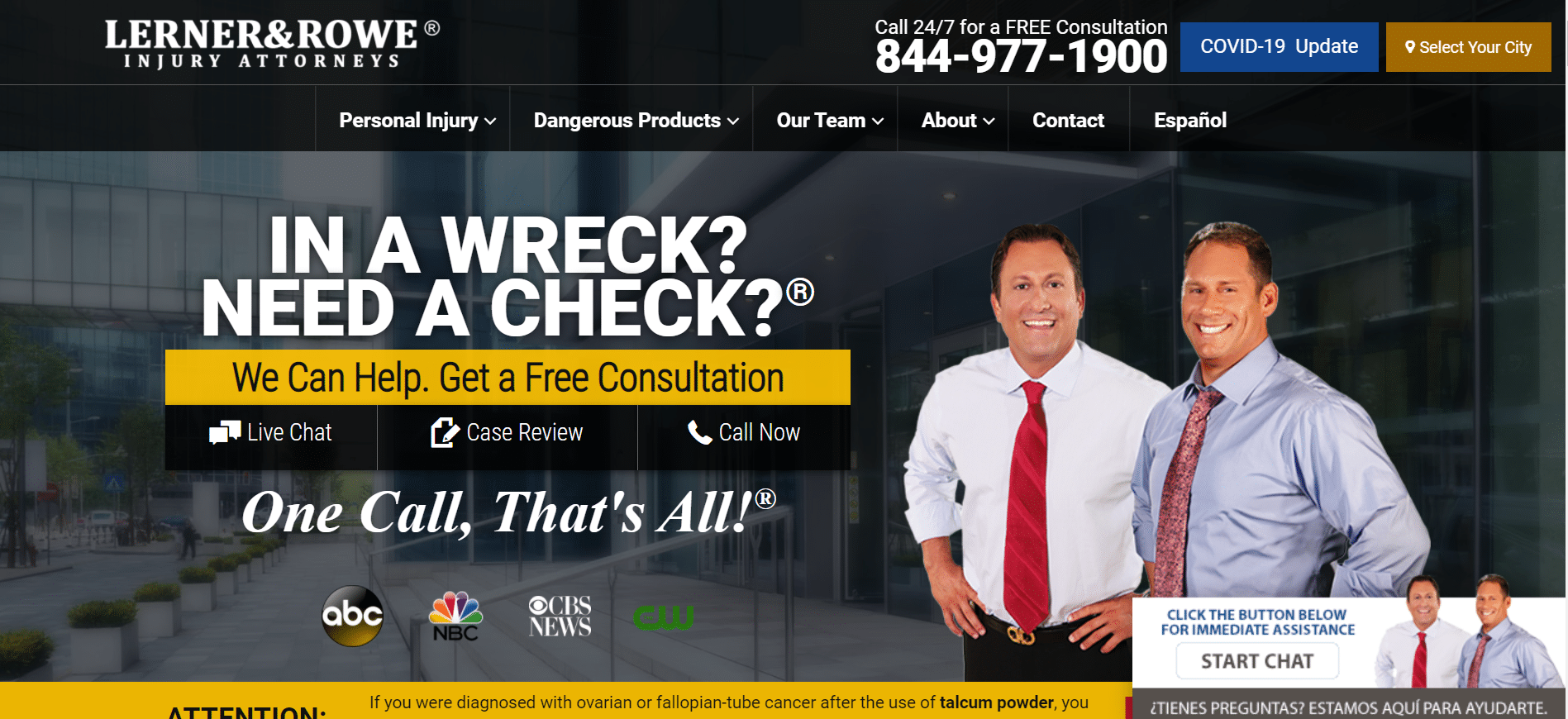
5) Lerner and Rowe
We’ve roasted this website in the past for its tacky design, many popups, and confusing layout. Those opinions are still true. However, when a Phoenix resident thinks of an injury attorney, it’s usually Lerner and Rowe. This firm’s copy, slogans, and marketing are absolutely brilliant. Plus, they use faces and multiple calls to action. The website still has too many popups, but its marketing is too brilliant to ignore.
6) Farar & Lewis LLP
Farar & Lewis LLP uses ample social proof (an experience badge, news outlets, pledges, case results, and testimonials) combined with powerful video marketing. The formatting can be a bit funky on some screens, but no website is perfect, and compared to many other injury law firm websites out there, Farar & Lewis LLP has the upper hand.

7) The Reeves Law Group
Why bury the lead? The Reeves Law Group puts the big number upfront with careful defensive verbiage that solidifies the client’s right to the money. It’s immediately followed by recognitions, win rate, and a contact form, all with a dramatic image of multiple attorneys. There’s no question that this website sells.

8) Lamber | Goodnow
Lamber | Goodnow is one of the top-ranking injury attorney websites in the Phoenix area, and it’s easy to see why. Although the featured image is blurry and the header font is a bit plain, the bulk of the website is well-built with strong SEO. The faces and social proof work well, and the content is digestible and well-organized. Overall, it’s a great injury attorney website.

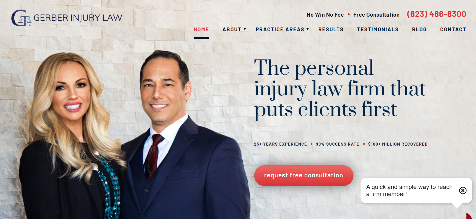
9) Gerber Injury Law
Gerber Injury Law ignores the industry standard of cluttered, noisy popups in favor of a sleeker, more professional design. Though it has some chunky copy, the website has a strong composition, great navigation, and some solid reviews. Injury attorneys should stray from the norm and toward Gerber.
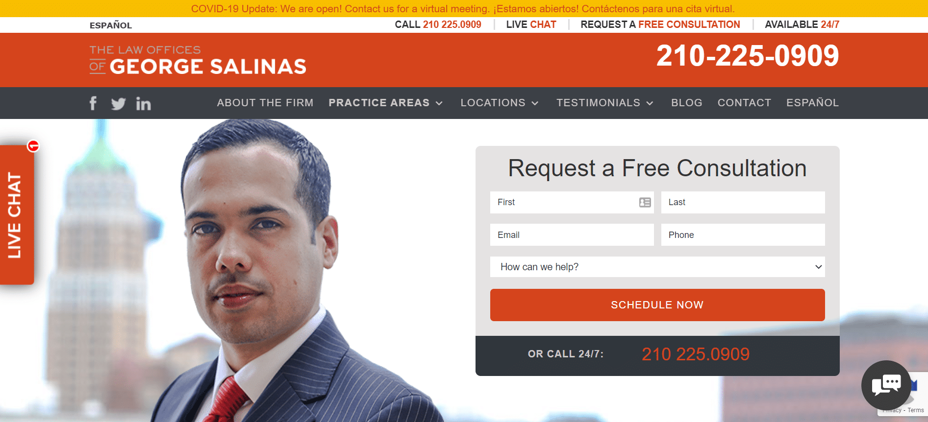
10) The Law Offices of George Salinas
A contact form above the fold? Yes please! With a flawless sales funnel, great faceshot, and a powerful translation feature, the George Salinas website gets clients what they need and looks good while doing it.
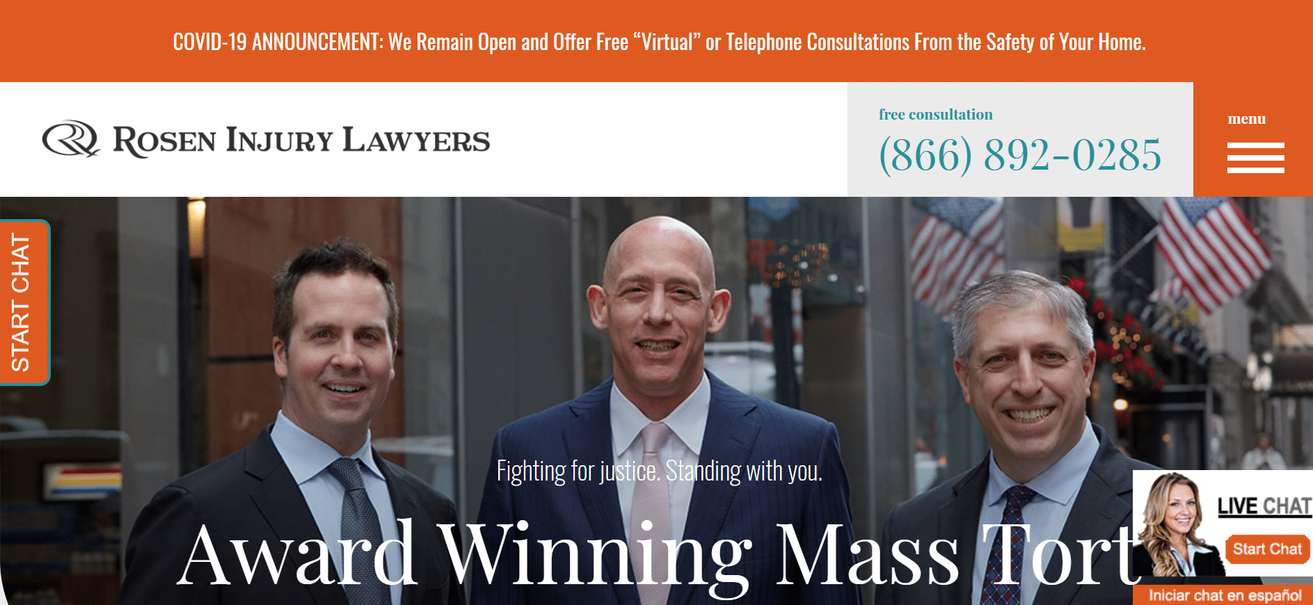
11) Rosen Injury Lawyers
Consistent orange branding, smiling headshots, and clear value statements make the Rosen Injury Lawyers website pop. Although the popup is pretty anoying, the rest of the refreshingly bright website stands out and makes the services memorable.
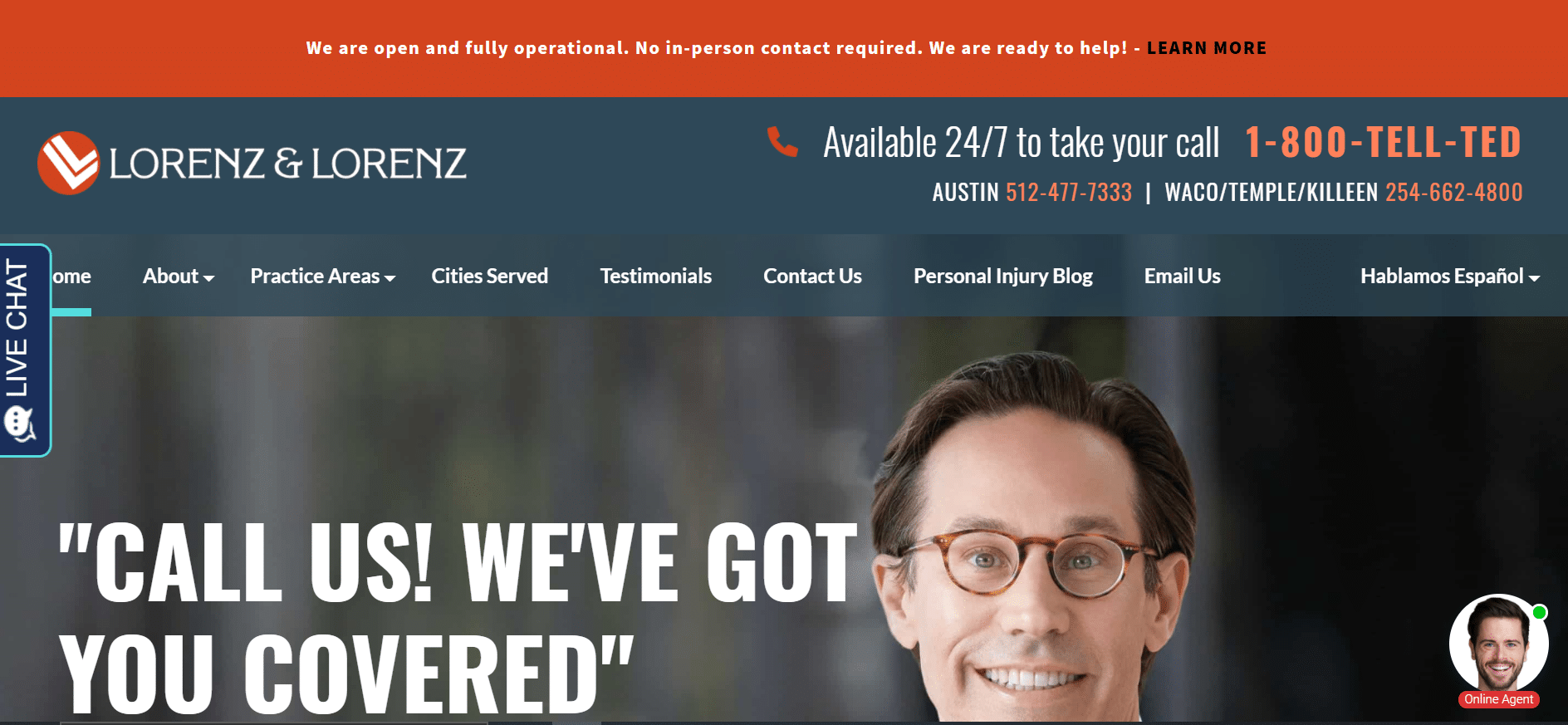
12) Lorenz & Lorenz
Lorenz & Lorenz finishes off the list with an all-around stunning personal injury attorney website. Lorenz maintains his brand without succumbing to tacky design like Lerner and Rowe. The angles and colors match the video brilliantly embeded in the landing page without looking too cheesy, and it all feeds into his sales funnel. The form above the fold, reviews, and information all have a strong impact. If only the header were thinner, more of Lorenz’s face would be visible, making the website even stronger.
Like these injury attorney websites? Hire an expert injury attorney website designer, liek Fyresite. To see what we can do for you, fill out the form below.
"*" indicates required fields