The trying website development process can turn people away from their dream website, partially because one slip-up can cost so much money.
However, most of the many mistakes can be avoided if you know what to look out for.
Of the plethora of mistakes that small businesses owners constantly make, these five should always be at the front of your list.
1. Not Having One
Because social media can reach so many people, it almost seems like it would be the only necessary tool to sell products. A lot of small business owners nowadays turn to Facebook and Instagram and solely rely on that to grow their business.
This is the first mistake.
Facebook and Instagram are wonderful tools to reach people and gain customers. However, if a business is serious about selling products, there has to be an external website for people to visit.
Visitors are going to be looking for information on products, services, business hours, locations, and everything in between. Having a website where all that information is available in a clean, simple design will help drive sales.
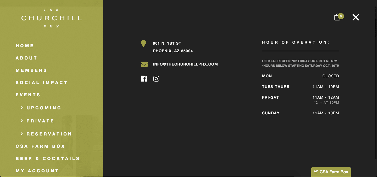
Make sure that they have a beautiful site to browse that is juicy with all the information they’re looking for.
Keep in mind, a website is an investment, not an expense. There is no shame in collaborating with a website developer so that your business can thrive online.
2. Ignoring SEO
Search engine optimization (SEO) is the process of helping customers find your business through an internet search.
Never underestimate how important SEO is for business. By using specific keywords, merchants can generate traffic that increases sales exponentially.
To learn more about successful SEO, read SEO Tips For 2020: How To Prepare For The New Decade
3. Toppling the Call-to-action Balance
Think of each individual customer as Goldilocks trying out the porridge that is your call to action.
With every “Get a quote”, “Contact me”, and “download this” there needs to be some sort of balance.
If your call to action is too little…
If your links are NOT clear, they won’t be clicked. It is that simple. Make sure you are letting visitors know what they’re looking for.
You can do this by installing a popup or two, giving them a few links to follow, or even by suggesting they sign up for an email list.
If your call to action is too heavy…
If your website is littered in personal advertisements, it’s likely that you are scaring away valuable customers.
Even if your website looks cluttered, your call to action is too messy for the visitor to find. Make sure your website is kept clean and you aren’t overbearing with your CTA.
The Ideal Balance
Identify your call to action and find the best way to approach it. Focus on keeping it clear and simple for viewers to understand.
After buttering up viewers with a big sales pitch, make sure to serve them up a big plate of call to action.
State Forty Eight has a beautiful web design and a well-balanced call to action.
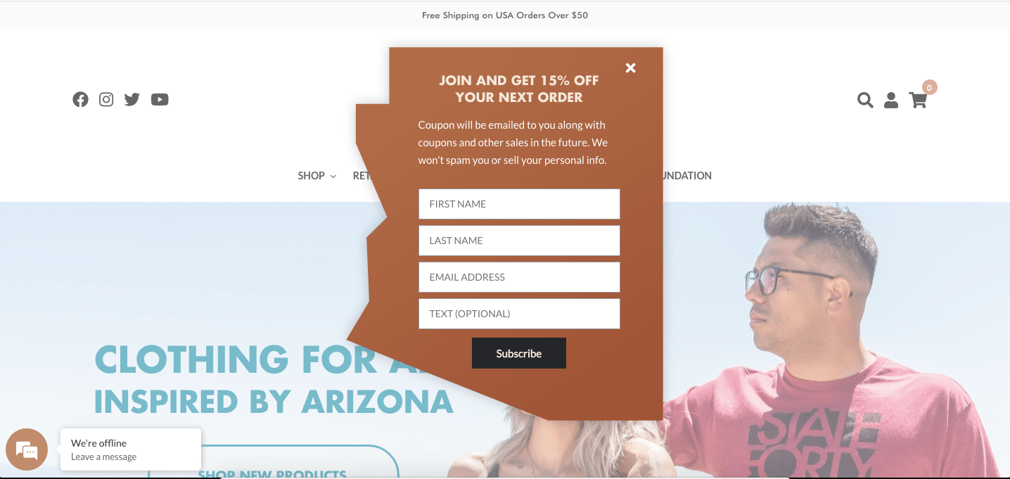
Popups aren’t the only way to reach out to customers. By having an option that takes visitors where you want them to go, your call to action is loud and proud.

4. Cluttering up Pages
Say this with me: I will avoid visual clutter at all costs.

It is so easy to get lost in meaningless content. Visual clutter takes away from the purpose of a business and distracts viewers.
Here are a few simple tips to help avoid clutter:
Tip One: Prioritize Content
Spring cleaning has never been more important. If things are old and outdated, get rid of it or replace it with fresher content.
And if you are finding things within your content that don’t serve a purpose, it’s time to get rid of it. Nothing should live rent-free on your website.
Tip Two: Logically Link items together
Logical navigation is such an important part of the viewer process.

LyleLondon is a great example of how landing page navigation should work.
By having a sidebar with all art types available to the viewer, the viewer is quickly able to determine which part of the website they are wanting to access. And by having a simple way to link it all together, there aren’t a bunch of links scattered around the website.
Tip Three: Keep it Simple
Don’t overthink it; simplicity is key. Keep that in mind when designing a website.
To fix a busy website, find simple designs and work with those. Some website builders provide templates which can be a great building block for design.
5. Not Maintaining Your Website
Website maintenance is crucial for successful website growth.
Maintenance includes things like security, optimization, website backups, and tests.
By keeping up with your maintenance, business owners are ensuring that the website is fully functional and optimized to make for the best experience possible.
For more tips and tricks on how to maintain a website, check out our recent article: Maintenance Tips For Your ECommerce Site.
Don’t Sweat the Small Stuff
Mistakes will always be made, so don’t get worked up if something goes wrong. Everyone is constantly learning, so make sure to keep up with all the new ways to enhance your website.
By taking care of your website, you will be taking care of business so make sure you keep your website as a top priority.
If you want help setting up the perfect website for your business, contact Fyresite today and get a quote.
 Lauren Lively

